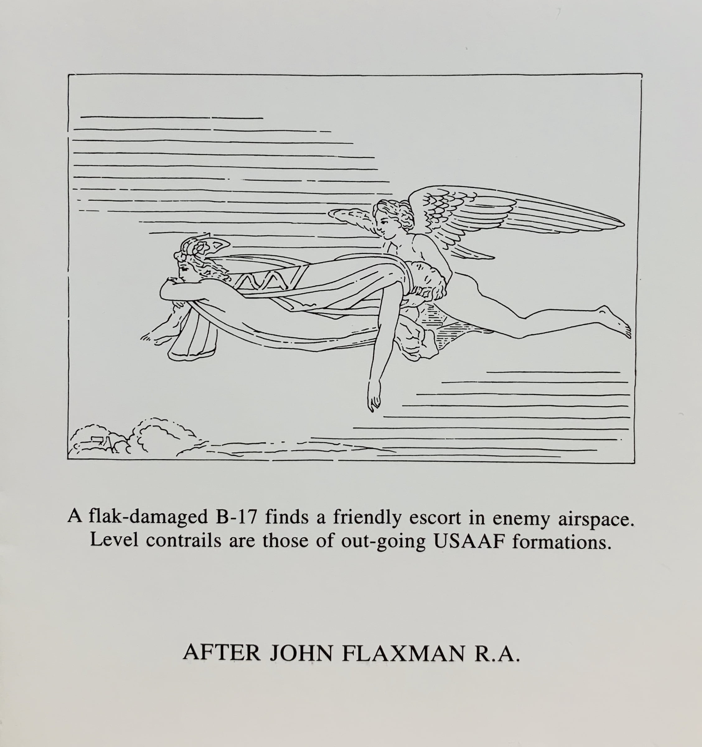
16 Feb 1943. 1996.
Little Sparta: Wild Hawthorn Press, 1996
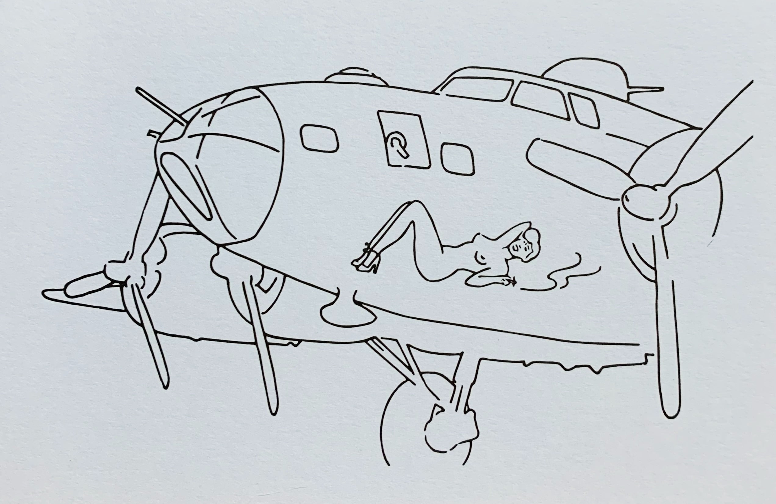
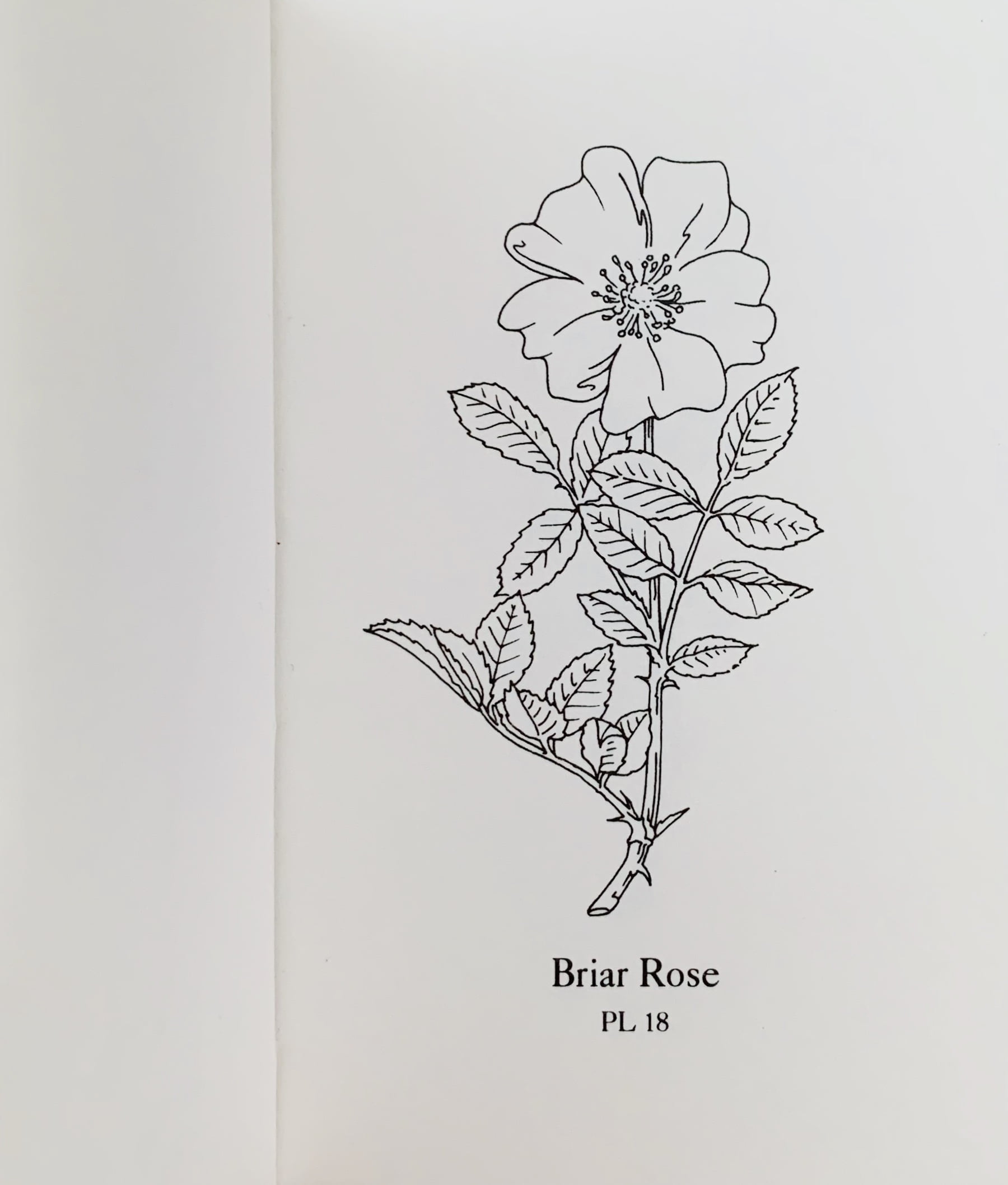
8.4 x 12.6cm, 4pp black on white folding card with the drawing by Gary Hincks of a second world war bomber with a woman as "nose art". The poem internally reads:
1943
Lovely ladies lolling in lingerie
on the noses of B17's. (sic)
The alliterative first line brings to mind real seductresses and the second clearly places the reality of the second world war habit of having female images painted on the front of the bomber planes.
VG+.
...

