Dunsyre: Wild Hawthorn Press, n.d. (1979)
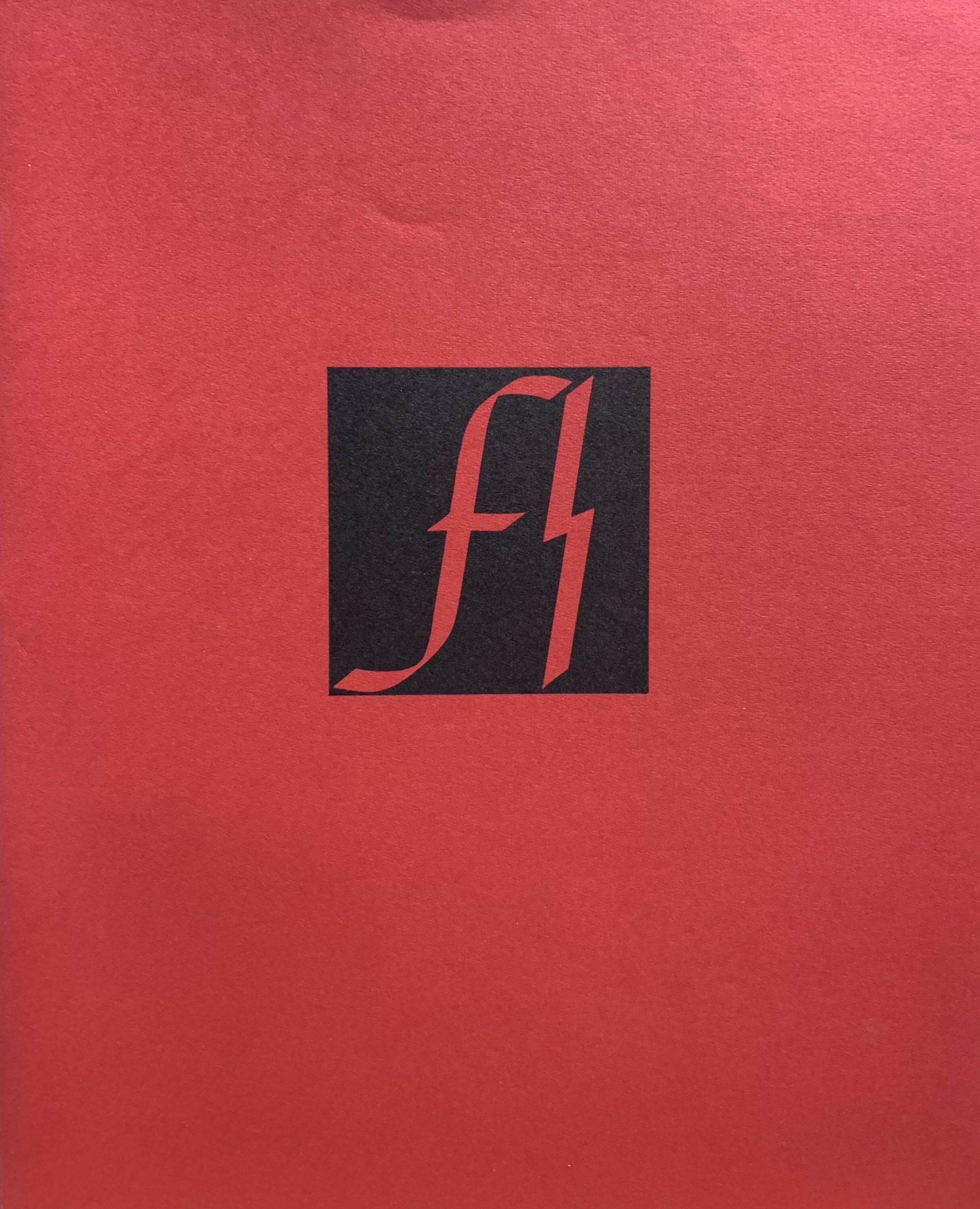
19.8x 16.6cm, 16pp plus card covers and printed dustjacket. Finlay's artist book examines six variations of the nazi SS logo - taking the original FF found in literature and noting how the letters were commonly substituted for SS in 17th century texts and, through typography developing the type into the double lightning strike of the notorious fascist organisation. Hence Finlay suggests there is some poetic equivalence between the evil of the Nazis and the "wildness" of nature - which Finlay makes clear in a note at the end of the book. (And anyone wishing to slur Finlay as being pro-fascist should read his description here of the SS as "notorious". Typography by George L.Thomson. VG+. Scarce.

...

Little Sparta: Wild Hawthorn Press, n.d. (1976)
15.3 x 15.3cm, green on white ceramic tile with typography by George L. Thomson - the various port letters of Scottish fishing boats are placed in a circular design (similar to Sea Poppy and earlier prints) to create a "world" or to remind one of the way stars circle in the sky over time.

...

Dunsyre: Wild Hawthorn Press, 1973
14 x 9.5cm, 24pp plus card covers and printed dust jacket. Artist's book where Finlay has listed a number of scenarios where an X might be created - each slightly different. The pages being drawn by George L. Thomson.
From a letter to Robin Crozier in 1970 - Finlay explained the idea: "Finlay says "I must stress that I don't consider this booklet profound. Everyone knows that nuance exists. On the other hand, I get pleasure from showing how much one can change a thing while scarcely from the spot , as it were. If we make dramatic (moving) differences between the visual representations of the Xs, we will undermine the whole point. If, for instance, "Two" and "Duet" are just noticeably not the same 2 crossing lines, we can rely on the words to complete the distinction, without taking it further than that. Likewise, "Duck-pond" needn't really try to depict the wakes left by 2 swimming ducks, but just by the merest alteration in the lines, allows the words to modify the image. Though obviously, if we had a blue rectangle on white one, there, and could have the lines white instead of black that would be pleasing.".
Finlay initially intended printing the book in 1970 with Crozier but changed his mind later for some unknown reason. VG+ although the cheap staples are showing some rust.

...

Shopping cart0
There are no products in the cart!
Continue shopping