Posted at 14:04h
in
Artist's Books
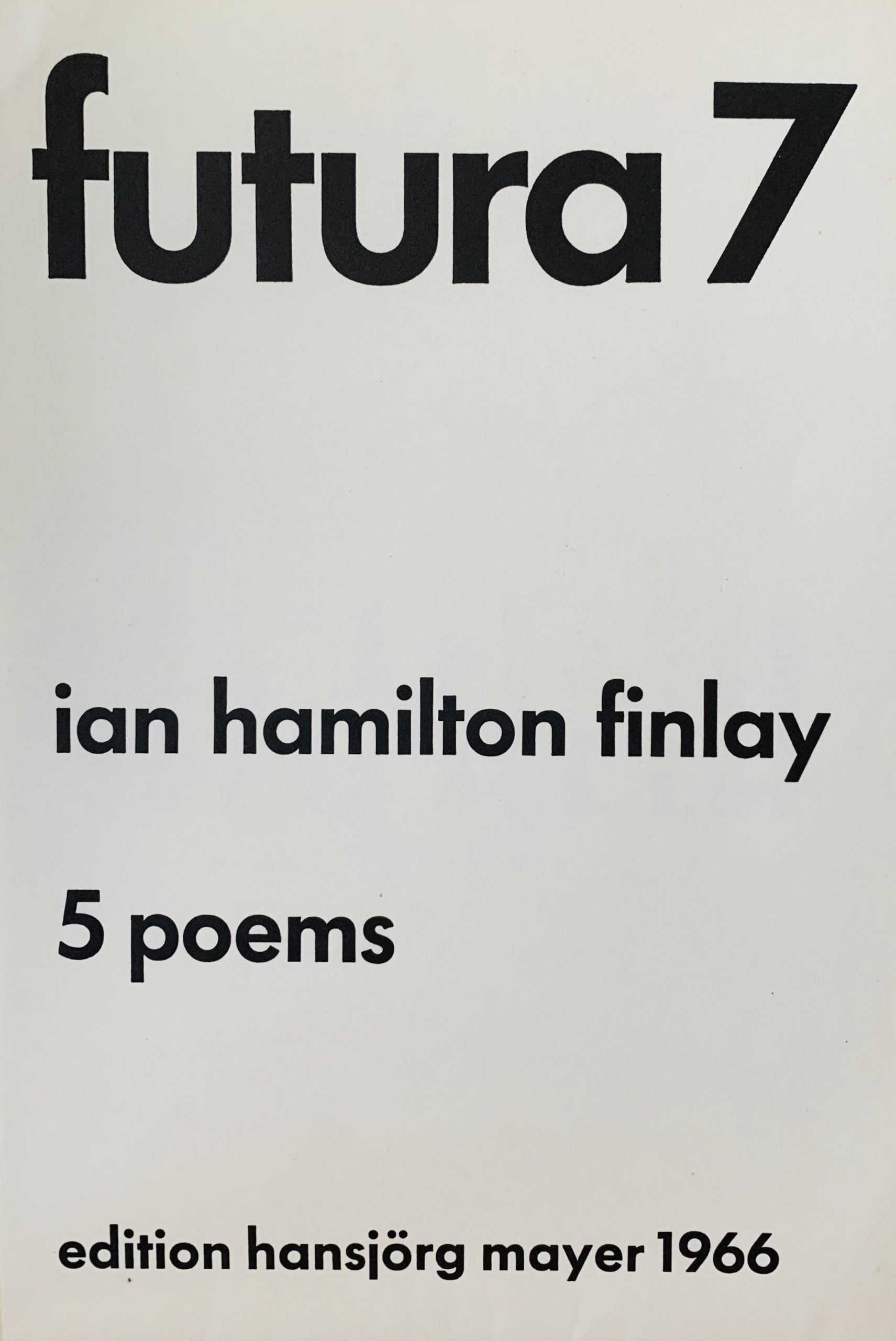
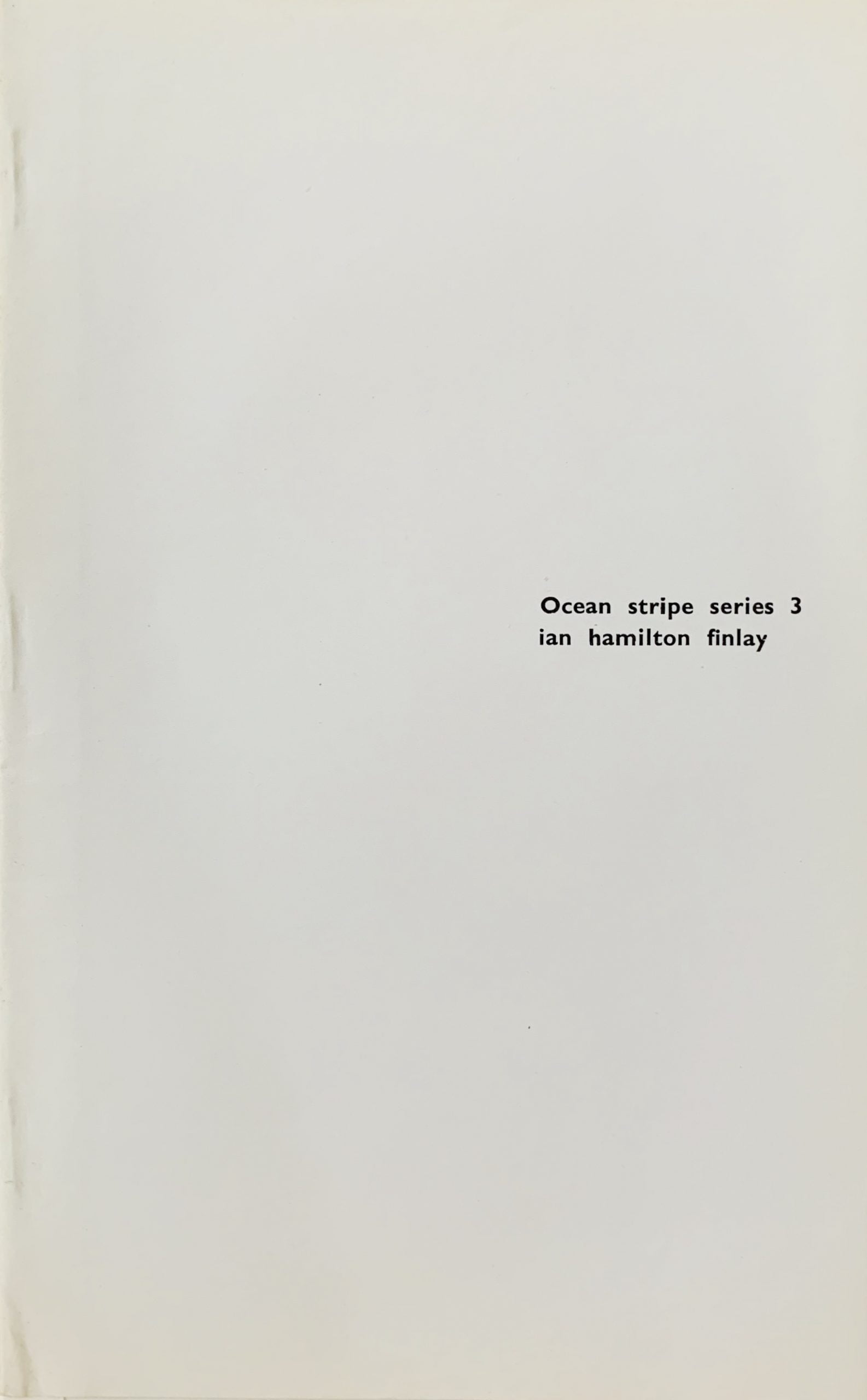
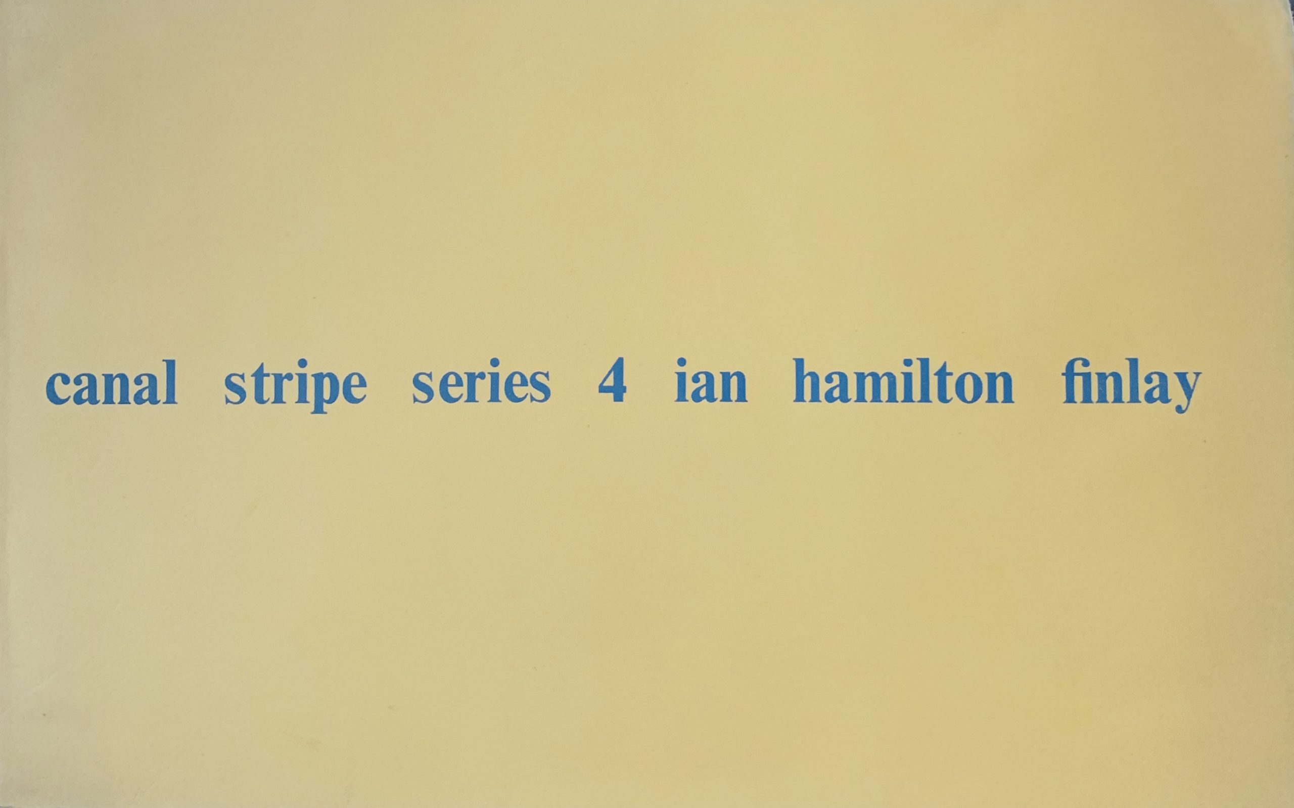
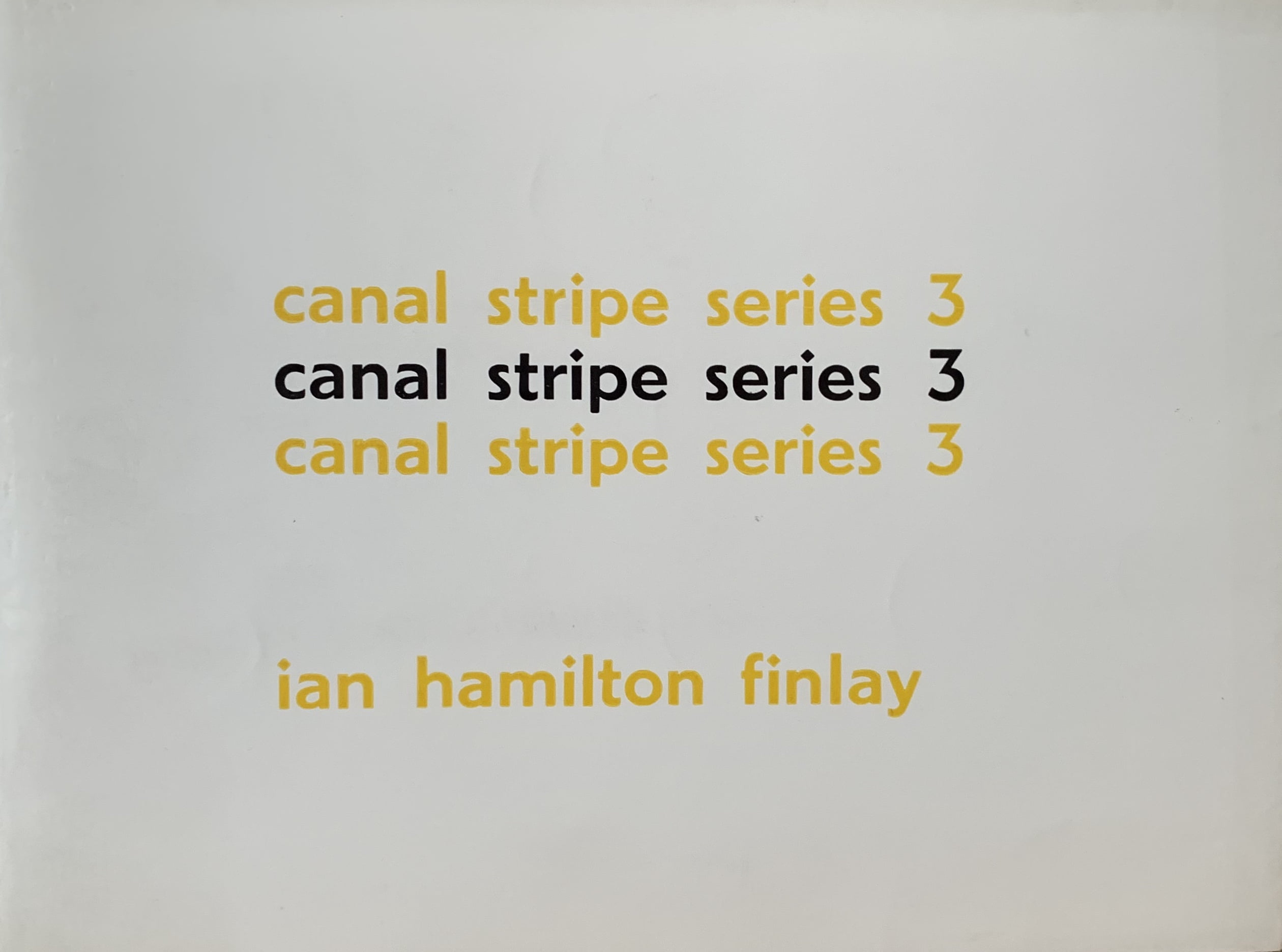
Edinburgh: Wild Hawthorn Press, 1964
15 x 20cm, 32pp. Original wrappers and typographic dustjacket. The first of a number of artist's books using the "Canal Stripe" title (there presumably were others that were not published given the first is number 3. Each of the first eleven pages have one word printed on them - the first four words are hayboat, cathedral, housemill, windstack and then followed by haymill, cathedral, housestack, windboat, and then, haystack, cathedral, houseboat. A final double page has haystack, cathedral, houseboat, windmill.
The first thing to note is the placing of the words on the page are in a continuous line much like a straight canal waterway. The one word that does not change is Cathedral - a large land based landmark - but the other three works are constructed by moving the prefixes "hay", "house" and wind" around in front of the word endings "stack", "boat" and "mill".
The word change creates new hybrid scenes - the houseboat passes the housemill and cathedral, the boat becomes a windboat in a second scene and so on. Finlay uses this trick often in poetry and concrete works - the slightest change to a letter or a word entirely changes the meaning of the text. The signifier to signified relationship is disrupted by the most minor of alterations.
...