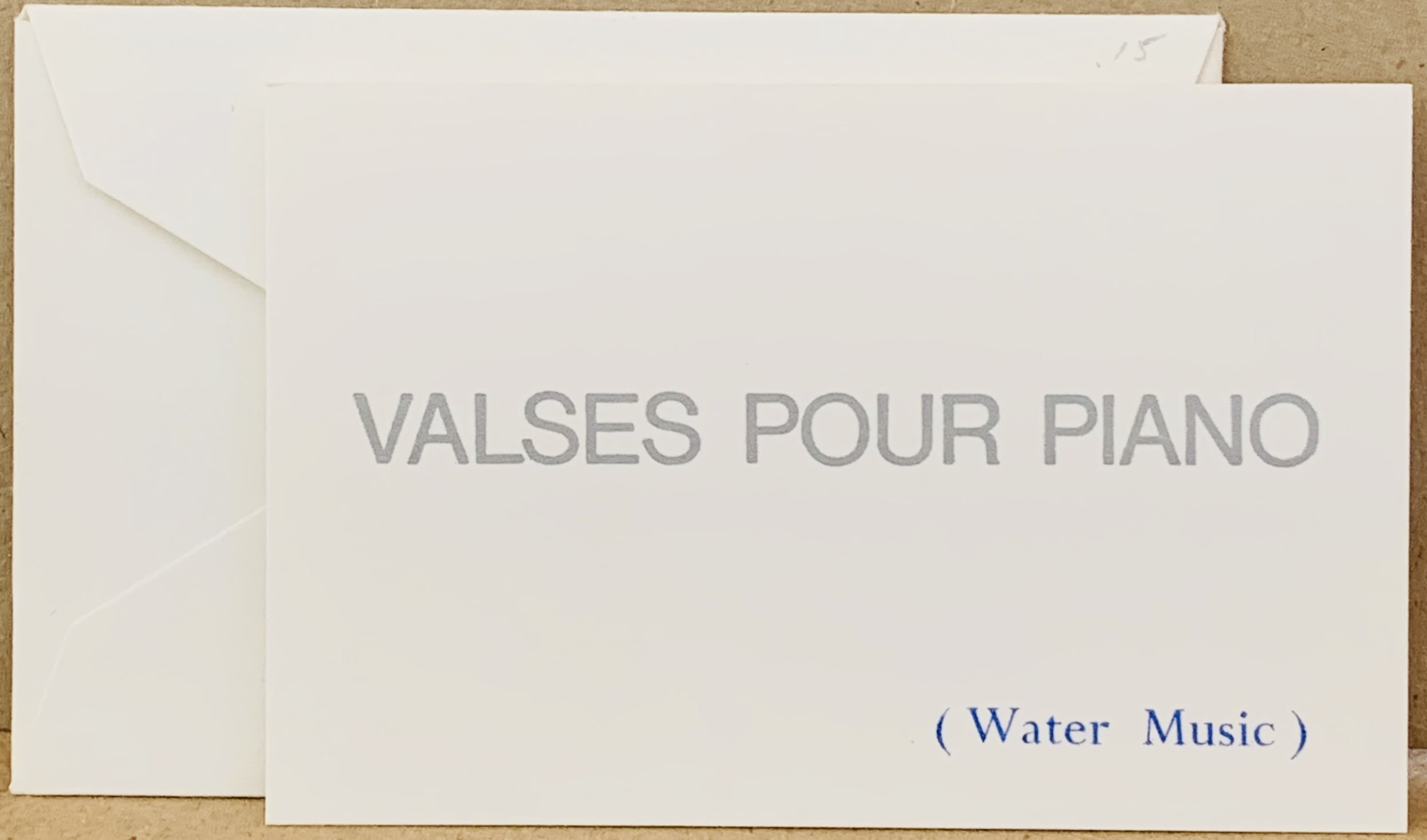
Dunsyre: Wild Hawthorn Press, 1968
9.8 x 25cm, 2pp. Finlay in many of his early cards finds the spaces between banks of canals, or between features of the landscape irresistible. Here the words THE LAND'S SHADOWS in red are split with four others in a different colour which read Drift Trawl Ring Seine. Words associated with sailing are thus flanked by the dark areas of the landscape (from hills or banks - one does not know) hence painting a picture using words. VG. Murray 4.12. ...

Dunsyre: Wild Hawthorn Press, 1968
16 x 16cm, 2pp. Green on blue card - the front of the card has a circular design made up of fishing boat names typographically set by Alistair Cant on Finlay's instruction. The pattern creates both a planet or the movement in the stars as they appear to spin around the boat as night passes. Stars for boats are essential to allow passage - until modern methods of navigation they were the sailor's only orientation. The choice of the boat names chosen by Finlay reinforces that - all have the word STAR in them e.g. Morning Star, Day Star, Fortune Star and so on.
This is the second of two cards with a similar intent - the other uses the letters and numbers of the boats - here the attractive names people give their vessels are used instead.
The title Sea Poppy refers to the yellow hornpoppy which only grows on sea shores - again a clear nautical reference.
This design and others like it was used by Finlay in different formats including wall works, object multiples, printed posters and cards. ...

Dunsyre: Wild Hawthorn Press, 1968
16 x 16cm, 2pp. Black on orange card - the front of the card has a circular design made up of fishing boat letters and numbers that allow unique identification of any particular vessel typographically set by Alistair Cant on Finlay's instruction. The pattern creates both a schematic planet or the perceived circular movement in the stars as they appear to spin around the boat as night passes. Stars for sailors are essential to life - until modern methods of navigation they were the only orientation available to the crew and captain of a ship.
The title Sea Poppy refers to the yellow hornpoppy which only grows on sea shores - again a clear nautical reference.
This design and others like it was used by Finlay in different formats including wall works, object multiples, printed posters and cards....

Dunsyre: Wild Hawthorn Press, 1968
17 x 12.5cm, 2pp. The card is one of a series that joins boat names together to tell a quasi-story or visual poem. Here Be in Time leads onto Fruitful Vine. The rhyme is by luck but together it creates an optimistic epigram and metaphor. Fine example. Murray has this as Card 4.9. Murray mis-identifies (not unusual) the date here - on the back it is clearly 1968 but the Catalogue Raisonne has it as 1967. ...

Dunsyre: Wild Hawthorn Press, 1968
17 x 12.5cm, 2pp. The card is the first of a few that join boat names together to tell a quasi-story or visual poem. Here Anchor of Hope/ Daisy/ Good Design indicates a daisy in the ground that is well rooted - hence a "good design" and is in some way a metaphysical comment on evolution's creation. The card's title has an Asterix which leads to the note "in a tidal bowl, Peterhead" - a clarification that these are boats. Fine example.
Murray has this as Card 4.8. Murray mis-identifies (not unusual) the date here - on the back it is clearly 1968 but his Catalogue Raisonne has it as 1967. ...

Brighton: Brighton Festival, 1967
13 x 19cm, printed manilla envelope content of six artist designed cards. Finlay has Star Steer and there are other works by Augusto de Campos, Eugene Gomringer, Jose Lino Gruynewald, Dom Sylvester Housedard, Gerhard Ruehm. There is also an English translation of "From Line to Constellation" by Eugen Gomringer - a manifesto of sorts from 1954.

It is worth noting that Finlay is here amongst those regarded as the giants of the visual poetry movement - a movement that became most prominent in South America but by 1963 Finlay was also producing such works and here is recognised his prominence in the British scene.
All VG in envelope that has a few marks on the back and is stamped "School of graphics Chelsea School of Art".
...

London: Chelsea School of Art, 1966
16.4 x 15.9cm. One of Finlay’s earliest paper sculptures - a fold out card publication jointly designed with and printed by Ed Wright at Chelsea School of Art. This is the red version: black print on red card. VG condition. Murray 5.3.
There were three variations - blue, yellow and red each printed black. These are now every hard to find.

...

London: Chelsea School of Art, 1966
16.4 x 15.9cm. One of Finlay’s earliest paper sculptures - a fold out card publication jointly designed with and printed by Ed Wright at Chelsea School of Art. This is the yellow version: black print on yellow card. VG condition. Murray 5.3.
There were three variations - blue, yellow and red each printed black. These are now every hard to find.

...

London: Chelsea School of Art, 1966
16.4 x 15.9cm. One of Finlay’s earliest paper sculptures - a fold out card publication jointly designed with and printed by Ed Wright at Chelsea School of Art. This is the blue version: black print on blue card. VG condition. Murray 5.3.
There were three variations - blue, yellow and red each printed black. These are now every hard to find.

...

Edinburgh: Wild Hawthorn Press, 1965
22.8 x 11.3cm, 4pp. Inner pages are black, text is only on front and back of card.
The text is printed blue on the front of the card and yellow on the back. The text is as follows:

how blue!
how far!
how sad!
how small!
how white!

and the back is the same only the ! is replaced by a question mark.
The front of the card is an exclamation about the experience of looking at things - the sky is blue, it is far away, it seems sad (blue) and yet small and white (clouds). The back by a simple change of punctuation indicates doubt.
The title of the card references the Russian artist Kasimir Malevich and the name he gave to the abstract art he developed from 1913 characterised by basic geometric forms and colours. The world is a simple place it seems to say.
This is the last of Finlay's earliest Standing Poems - he turned to publishing more standard formats of postcards for a while but returned later with D1 and the 4 sails works to the format.

...

Edinburgh: Wild Hawthorn Press, n.d. (1965)
22.8 x 11.3cm, printed 1pp. Folded on both sides allowing the card to stand as intended. Printed olive green and blue on white.
JOINT WITH AS ISSUED:
13 x 11.4cm, 1pp diagrammatic card with a key to the various hearts in the standing card.

This (officially the third Standing Poem) is related to the earlier Standing Poems in various ways - firstly that the sides of the sheet bend in to allow the work to stand up, secondly a repeating pattern of shapes (roughly formed hearts) are printed in a lattice pattern over the sheet.
The Standing Poem 2 versions both have hearts as one of their motifs. It is almost as each card in turn was an evolution from the previous one (which is a reasonable argument and reflects the fact that the earlier cards had images on them that "evolved" within the card).
The colours used here differ though - olive green and blue on white is attractive but doesn't tend to evoke any particular meaning.
The separate key card that Finlay added to the paper sculpture indicates the hearts are all different and have titles - they are Little Heart, Wooden Heart, Pond Heart, Owl Heart, Jersey Heart, Umbrella Heart, Bobbin Heart and End Heart. It is hard to see any reason why these names are chosen. Other than the lazy distribution of the hearts (again somewhat loosely reflecting a constellation) it seems nothing more than a love poem of sorts. But a little thought reminds one that there are physical elements of the prefixed objects that look heart like - an owl's forehead, the point of the unfurled umbrella, a neckline from a Jersey and so on. Finlay loves a visual pun or simile and here it is if obscured.
This is a scarce card - Murray in his flawed catalogue raisonne claims it as the fourth ever card published but it is more accurately the sixth if one includes the earlier typescript from 1963 in this collection. VG+ condition.

...

Edinburgh: Wild Hawthorn Press, n.d. (1965)
5.8 x 14.2cm, printed 1pp. Folded on both sides allowing the card to stand as intended. The inner images are of an apple and stalk in black which metamorphoses step by step into a heart. Alongside that graphical change the word LOVE slowly emerges also first with a l then LO then LOV then LOVE. On each step the letter shapes added have some similarities with the red apple shape changing - for example the V in love appears as the top of the round apple indents in a V shape as part of the way to the final image. This is then mirrored by a second exact group of images and text in parallel.
The previous standing card (Standing Card 1) involved a pear appearing and disappearing - here an apple has a similar fate. In a simple card expressing love is a depth of metaphor and physical similarities. Like much of the best of Finlay the work has multiple readings.
This is the second version of this Standing Poem 2 - it is slightly larger than the earlier (?) version, the colours are blue and black and printed on light yellow card. The black colour of the apple/heart image is a single tone in this one (in the other card they are red and black). The text L LO LOV LOVE is in italic on this version. It may be that this card was designed before the red/black version but there is no record of whether that was the case or not so it is moot. The fact it is a slightly more simplistic design perhaps suggests it was first but traditionally this is usually regarded as the second version.
This is a scarce card - Murray in his flawed catalogue raisonne claims it as the third ever card published but it is more probably the fifth if one includes the earlier typescript from 1963 in this collection. VG+ condition.

...

Shopping cart0
There are no products in the cart!
Continue shopping