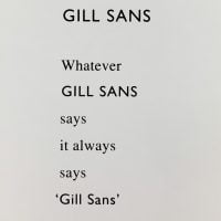
GILL SANS. 1995.
£15.00
Little Sparta: Wild Hawthorn Press, 1995
Two different cards – one is 9.4 x 8.3cm and the other 8.3 x 5.2cm
The first card has a text:
GILL SANS
Whatever
GILL SANS
says
it always
says
‘Gill Sans”
The second card has a design by Gary Hincks, where the Underground sign has the station “GILL SANS” on it.
Gill Sans is the name of a sans-serif font family based on a design by the artist and typographer Eric Gill. It was originally inspired by another font by Edward Johnston in 1916 – an “Underground Alphabet” which Gill had helped develop as a younger man.
The font was very successful and was marketed for its clarity and lack of fuss: this seems to have caught Finlay’s interest in the short poem whereas the second card is a clear reminder of the origins of the letting style. Both are VG+.
In stock
Related products
-

KRIS KRINGEL’S KESMES KORALS OR 12 DAYS (OF XMAS). 1970. SIGNED BY COBBING.
£120.00 -
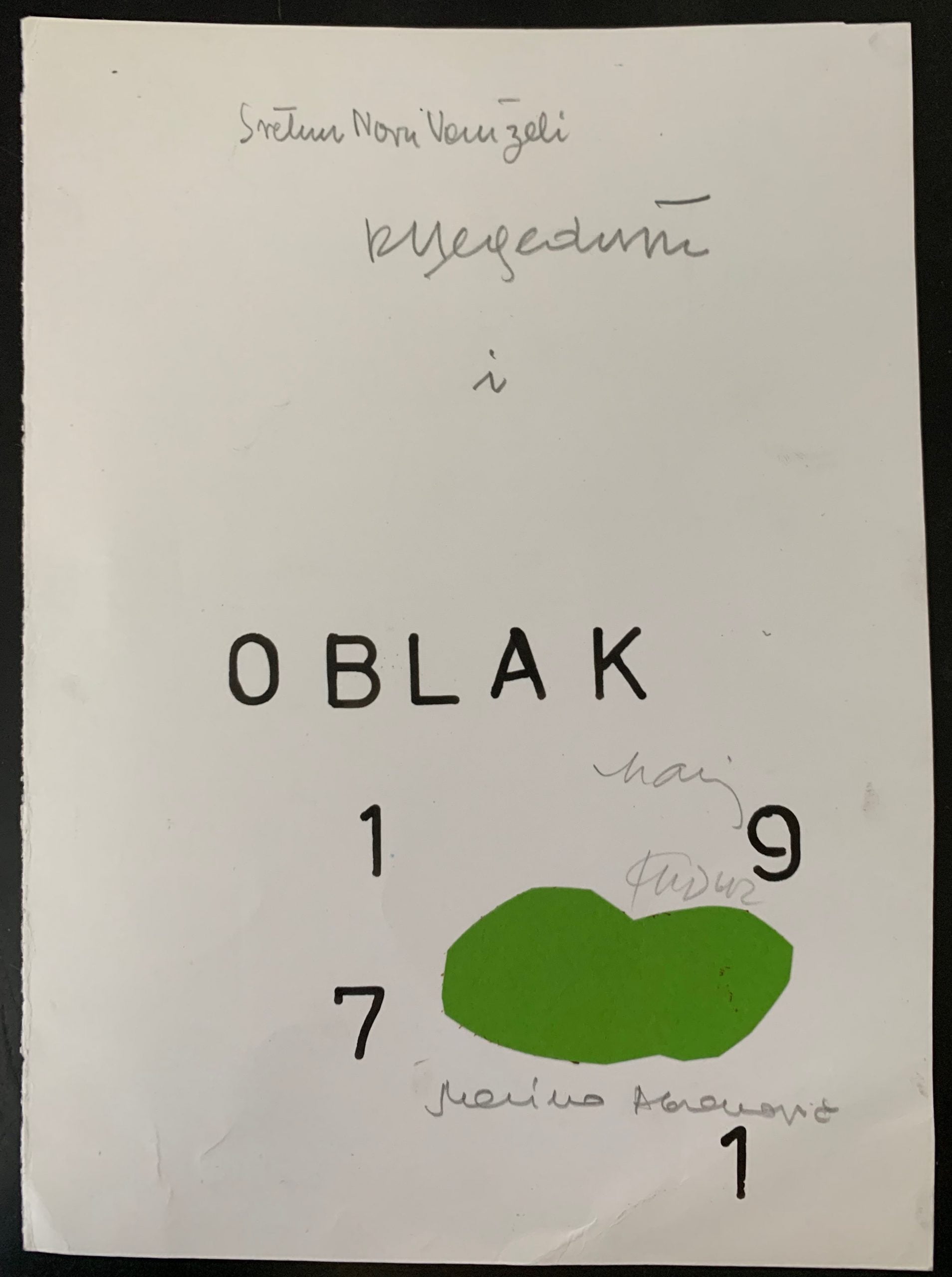
ZELENI OBLAK (GREEN CLOUD). UNIQUE COLLAGE BELGRADE 1971. THE EARLIEST KNOWN WORK BY ABRAMOVIC AVAILABLE FOR SALE
£17,500.00 -
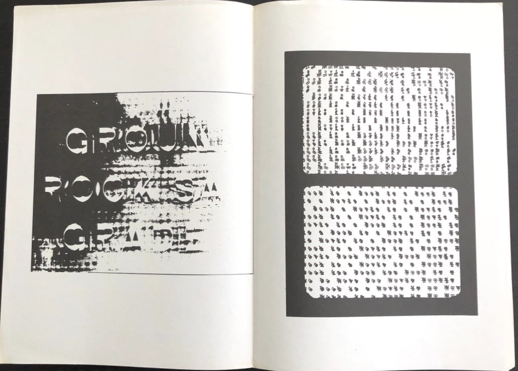
GROUND ROCKS A GRADE. SIGNED BY COBBING.
£150.00 -
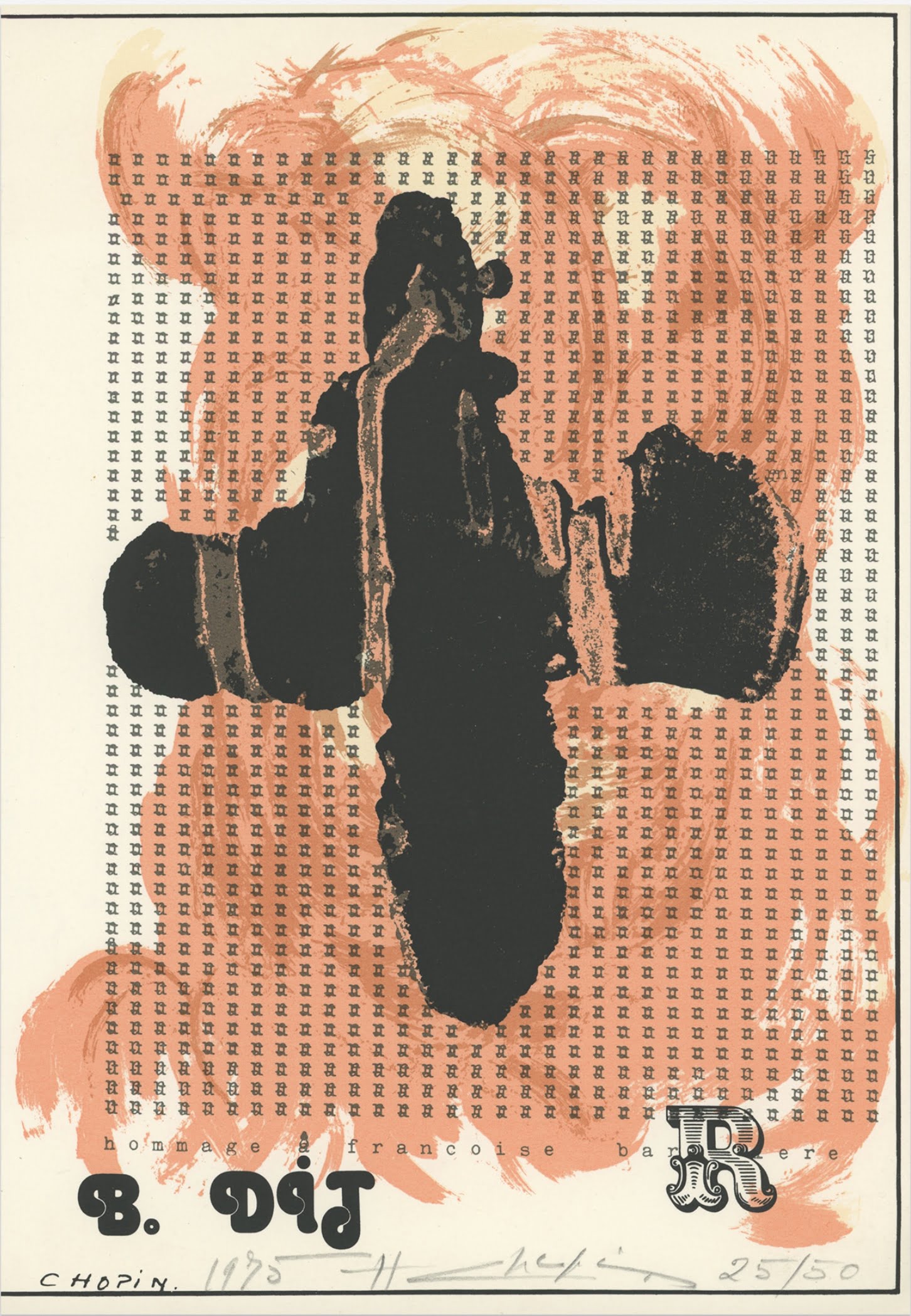
HOMMAGE A FRANCOISE BARRIERE. 1975.
£395.00