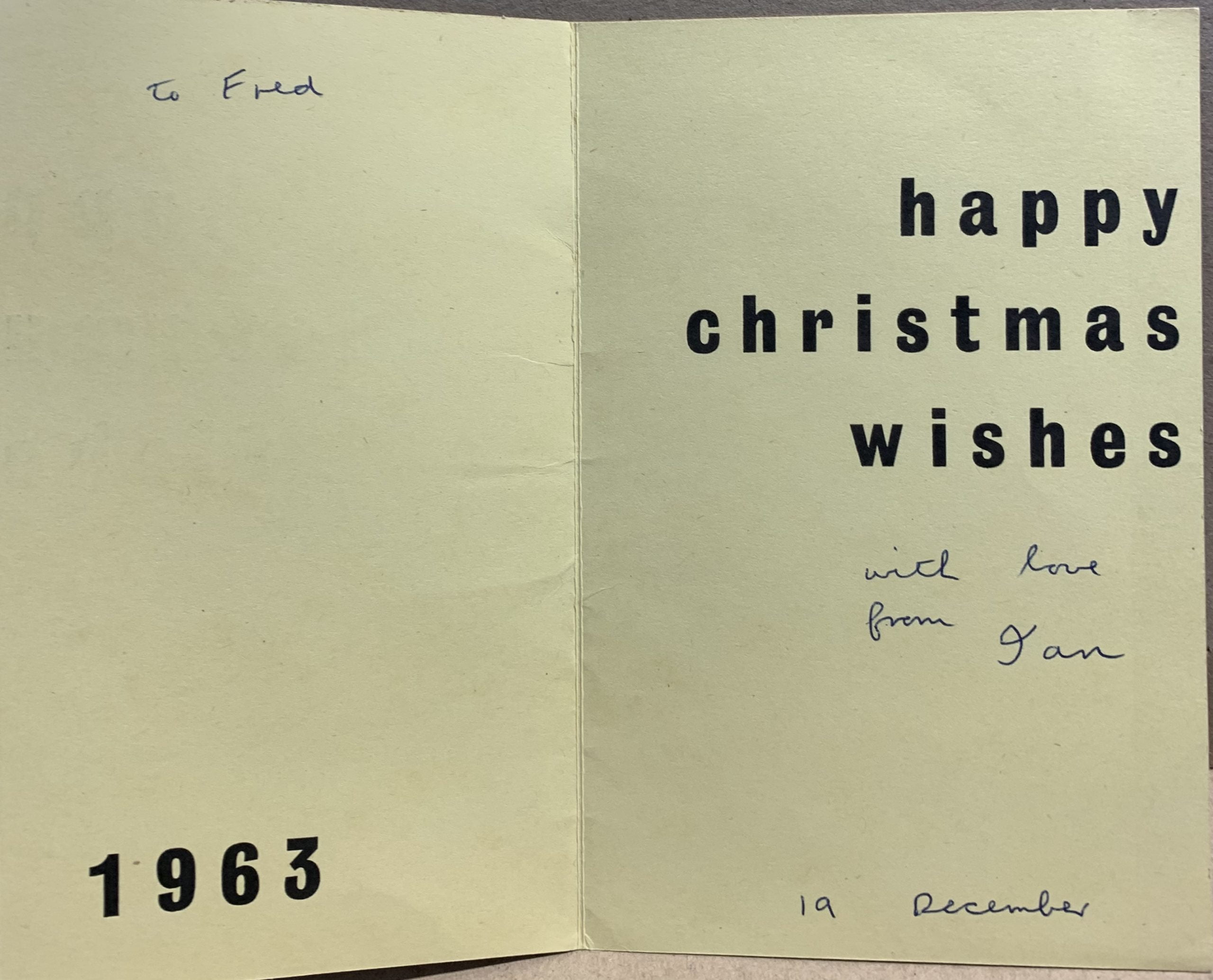
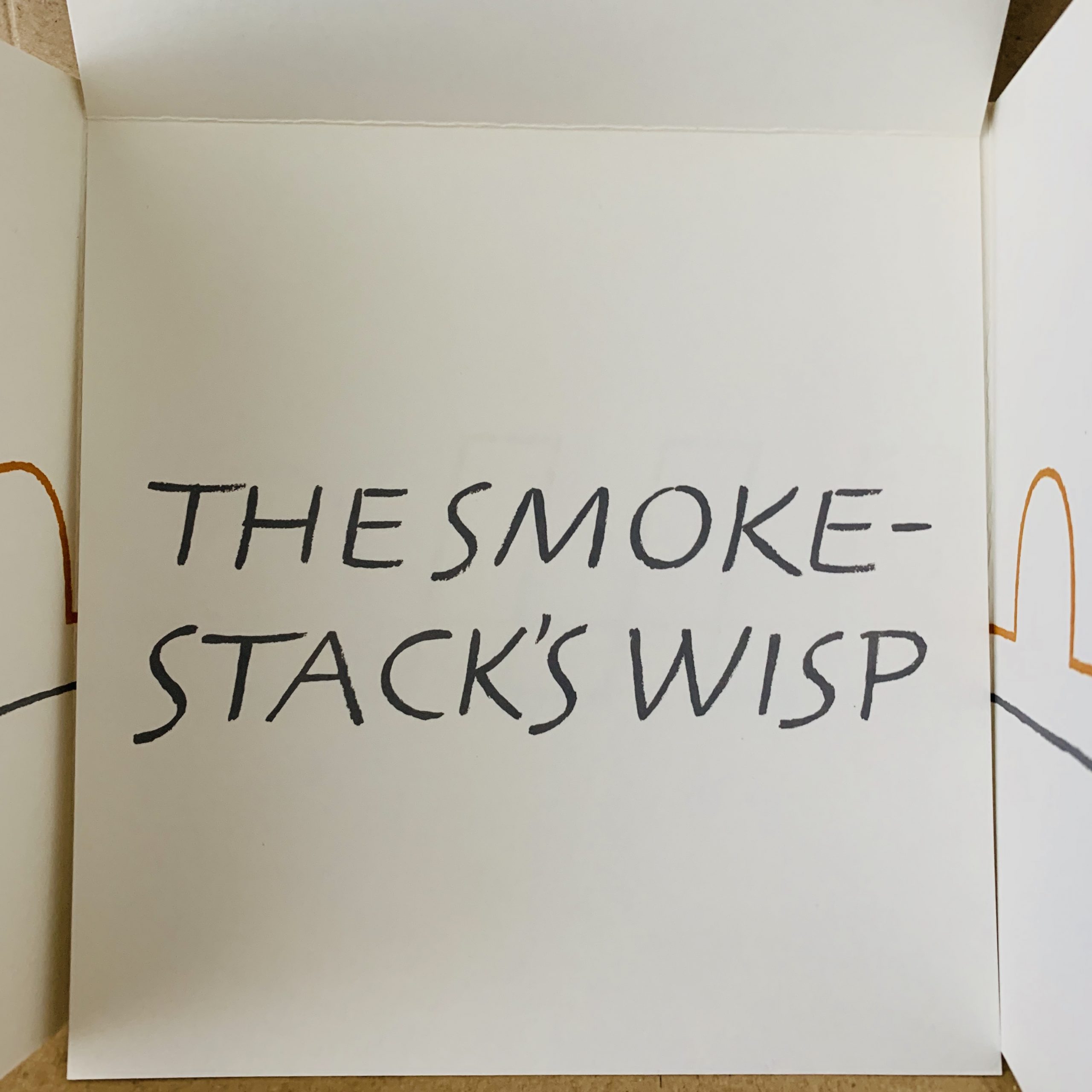
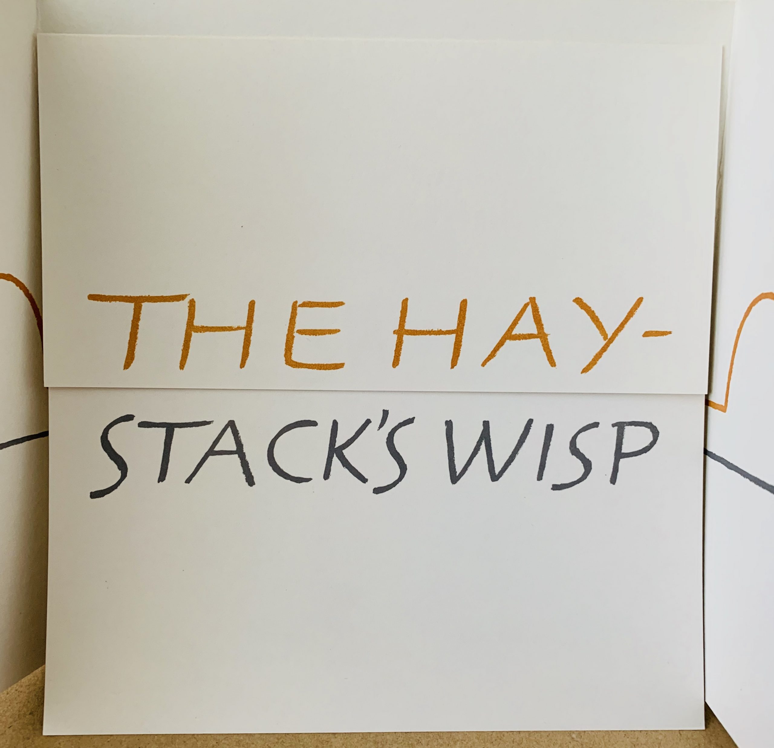
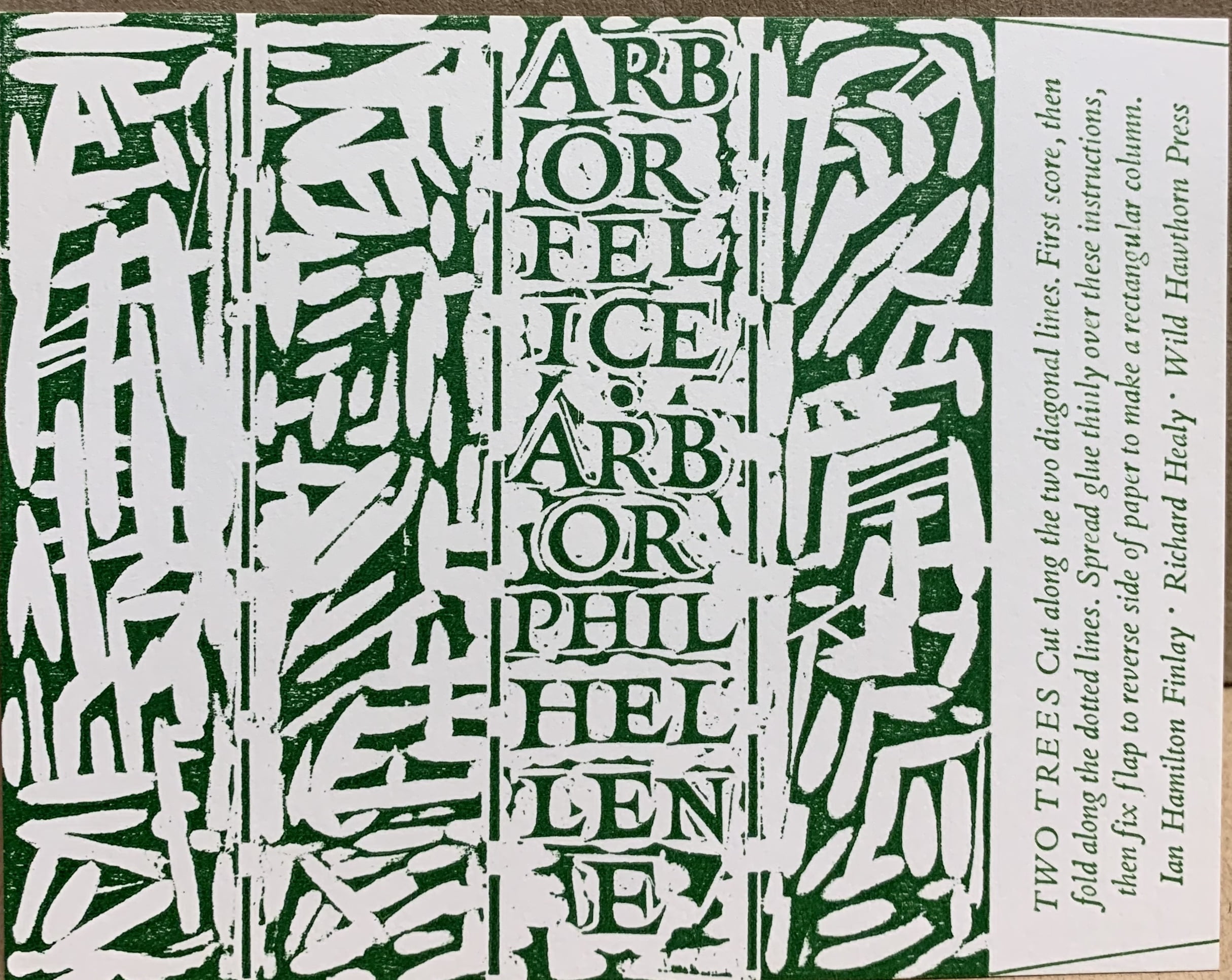
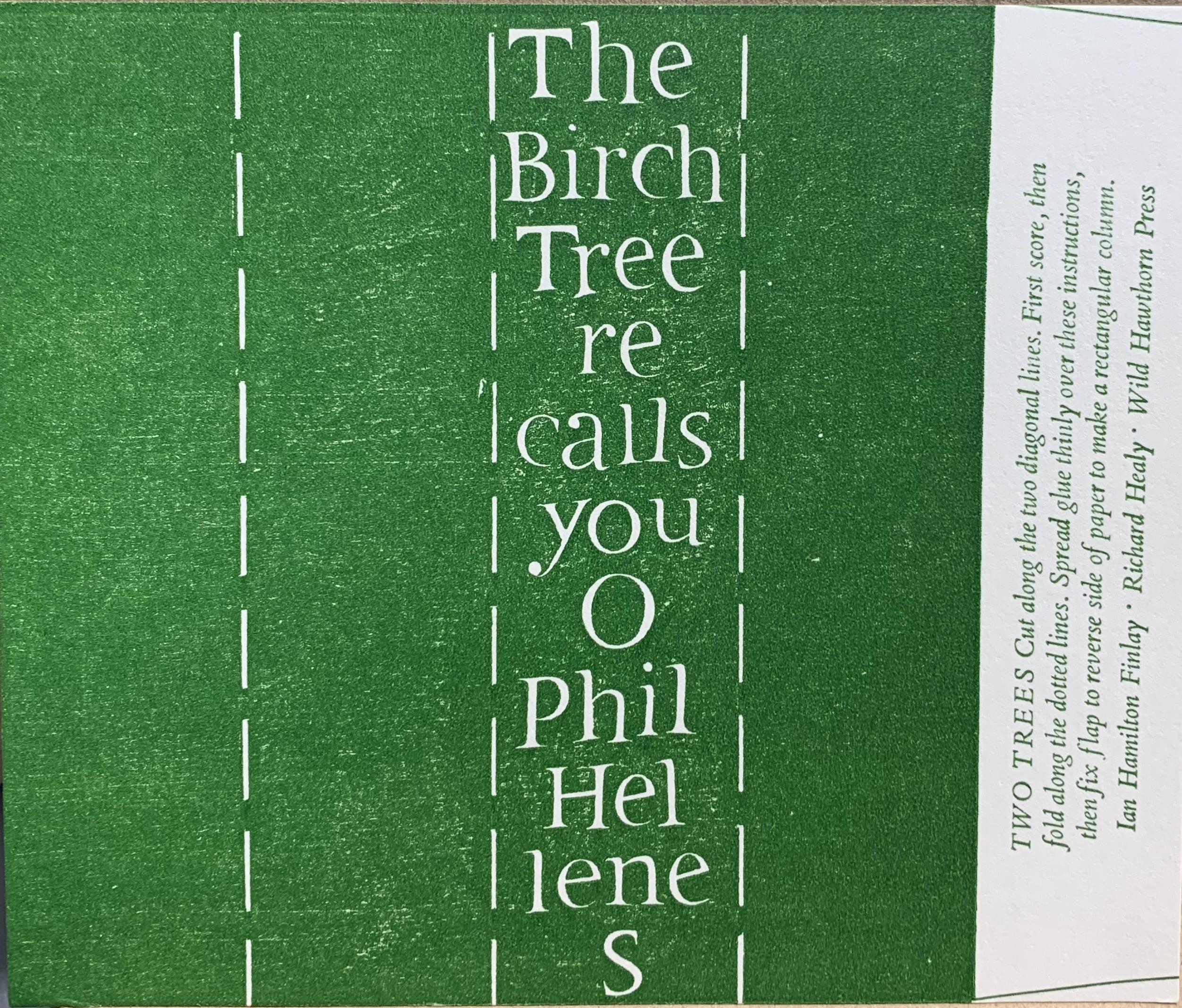
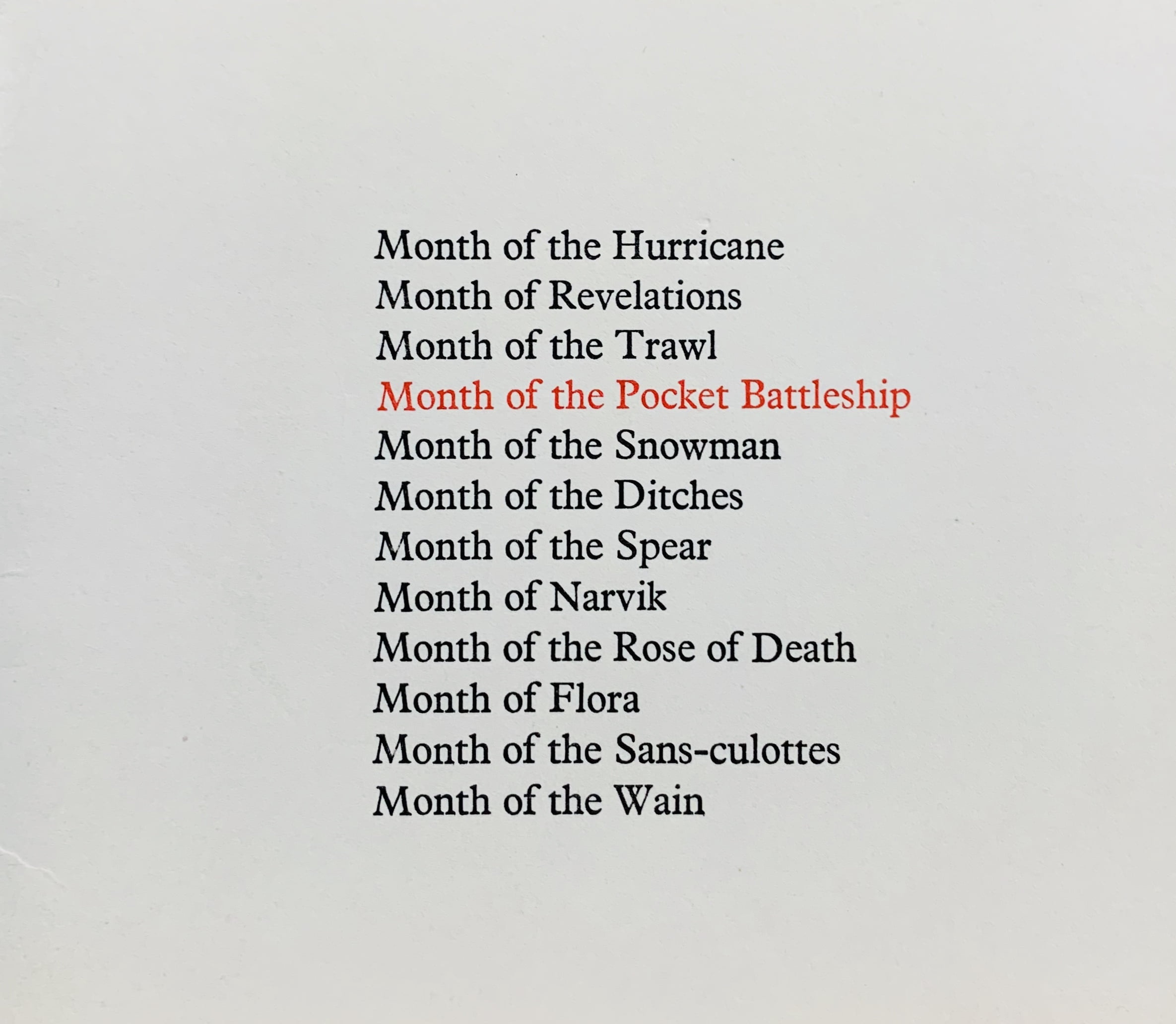
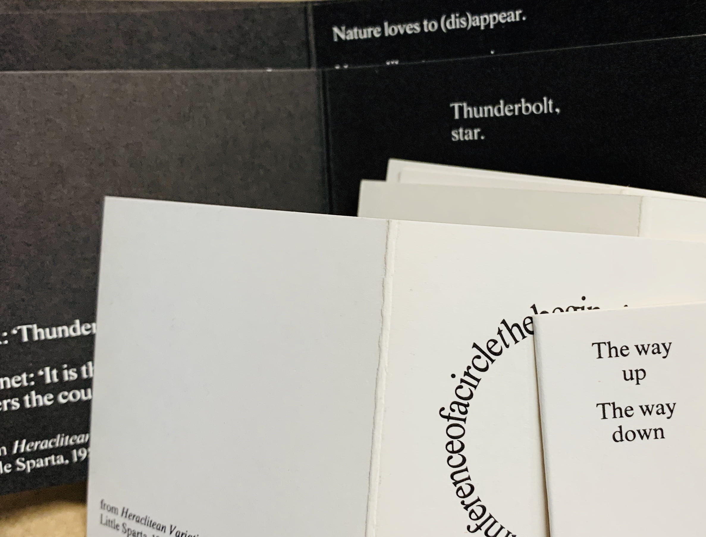
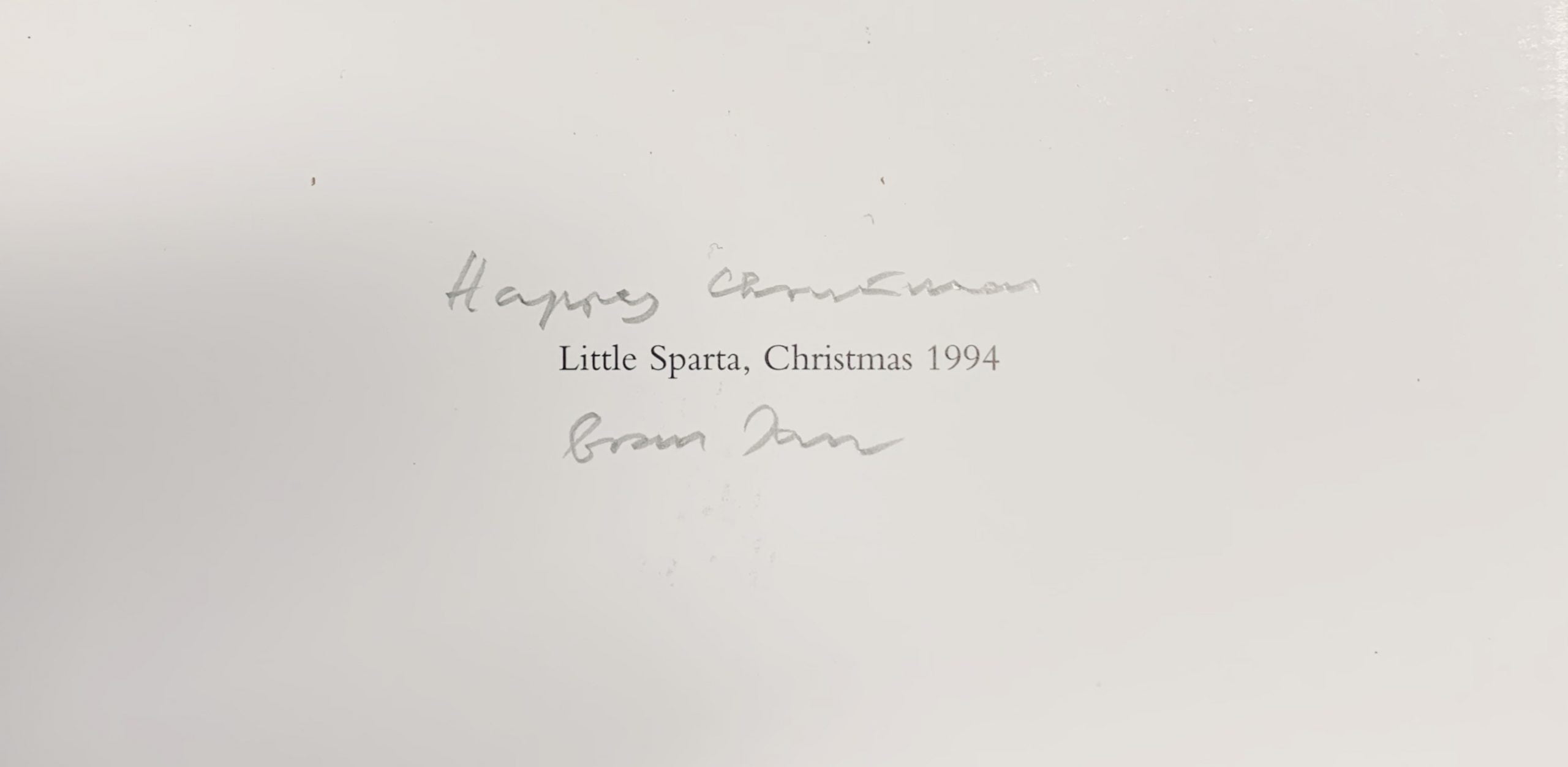
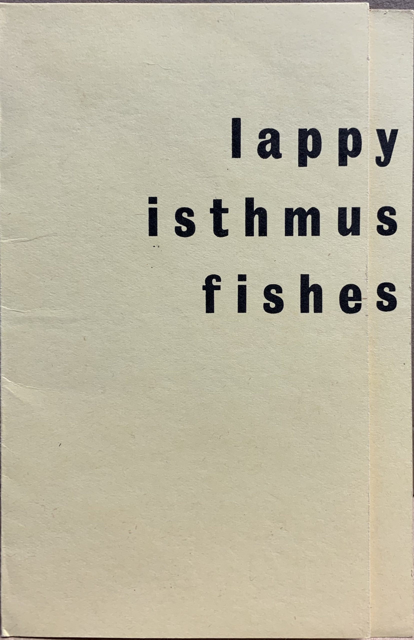
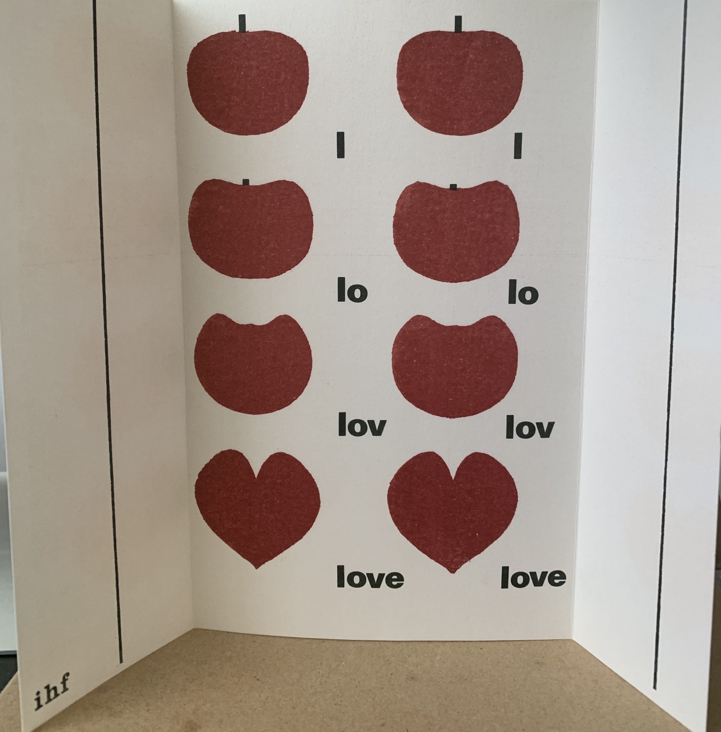
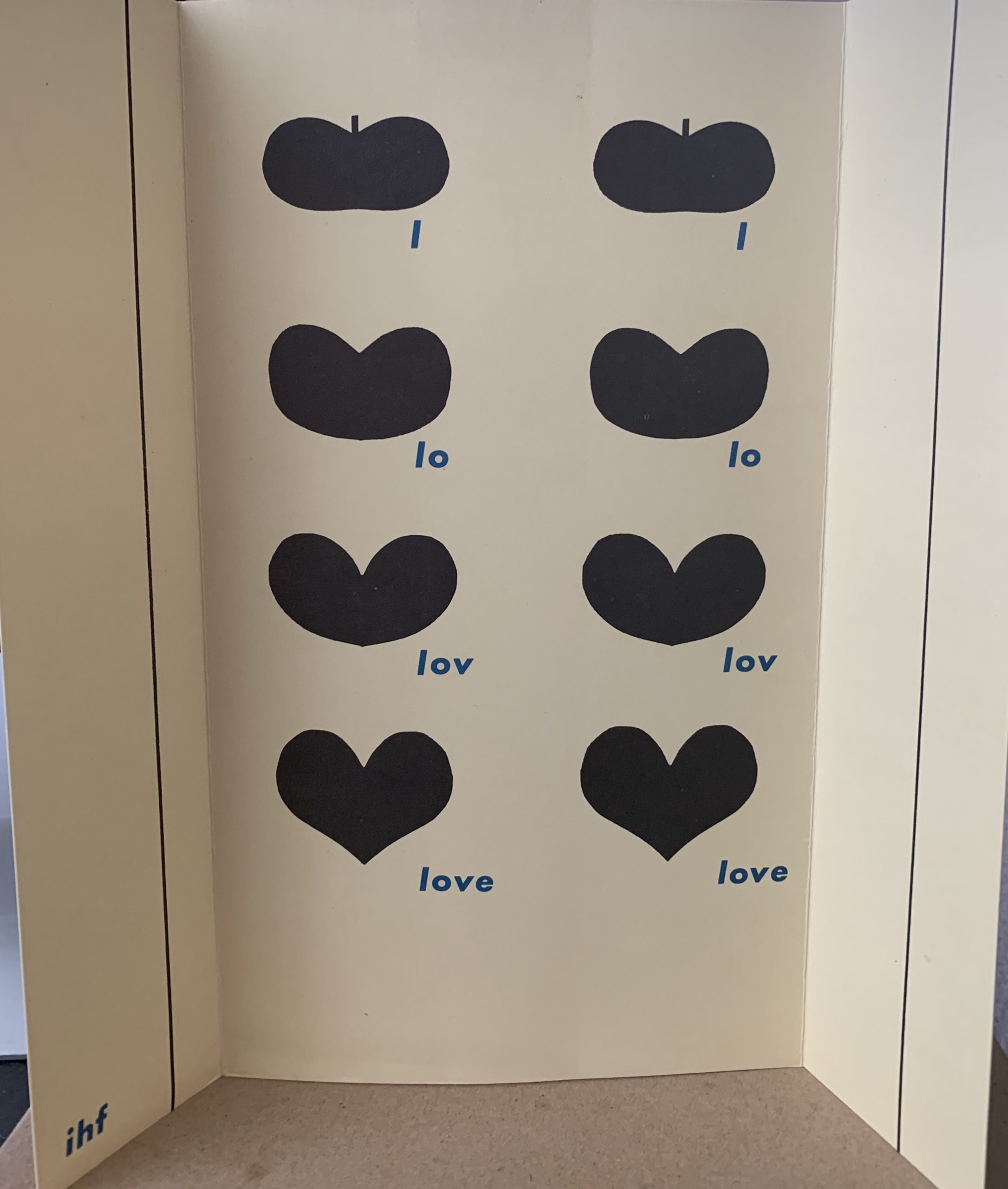
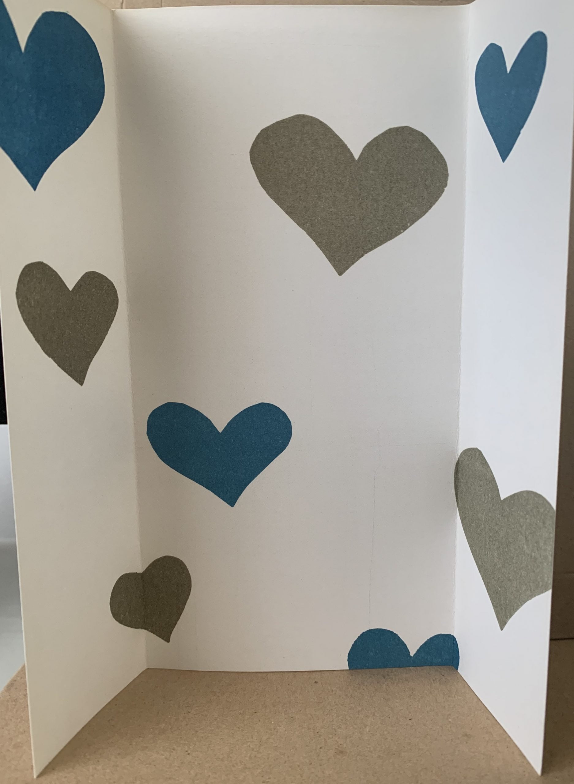
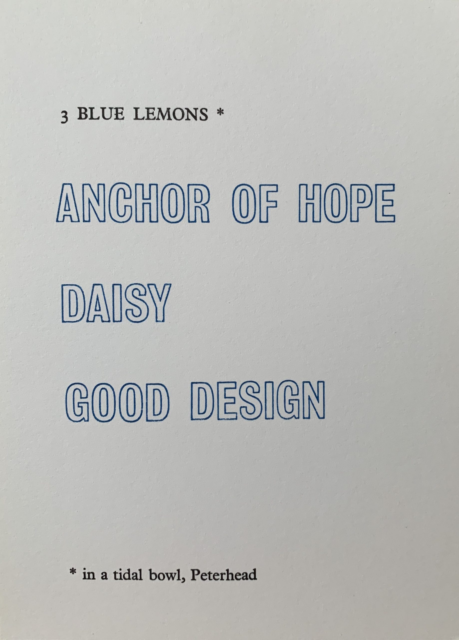
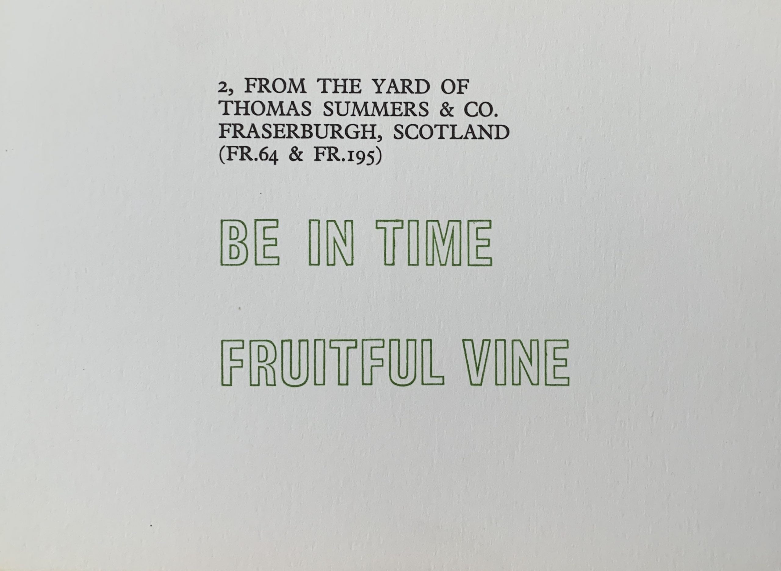
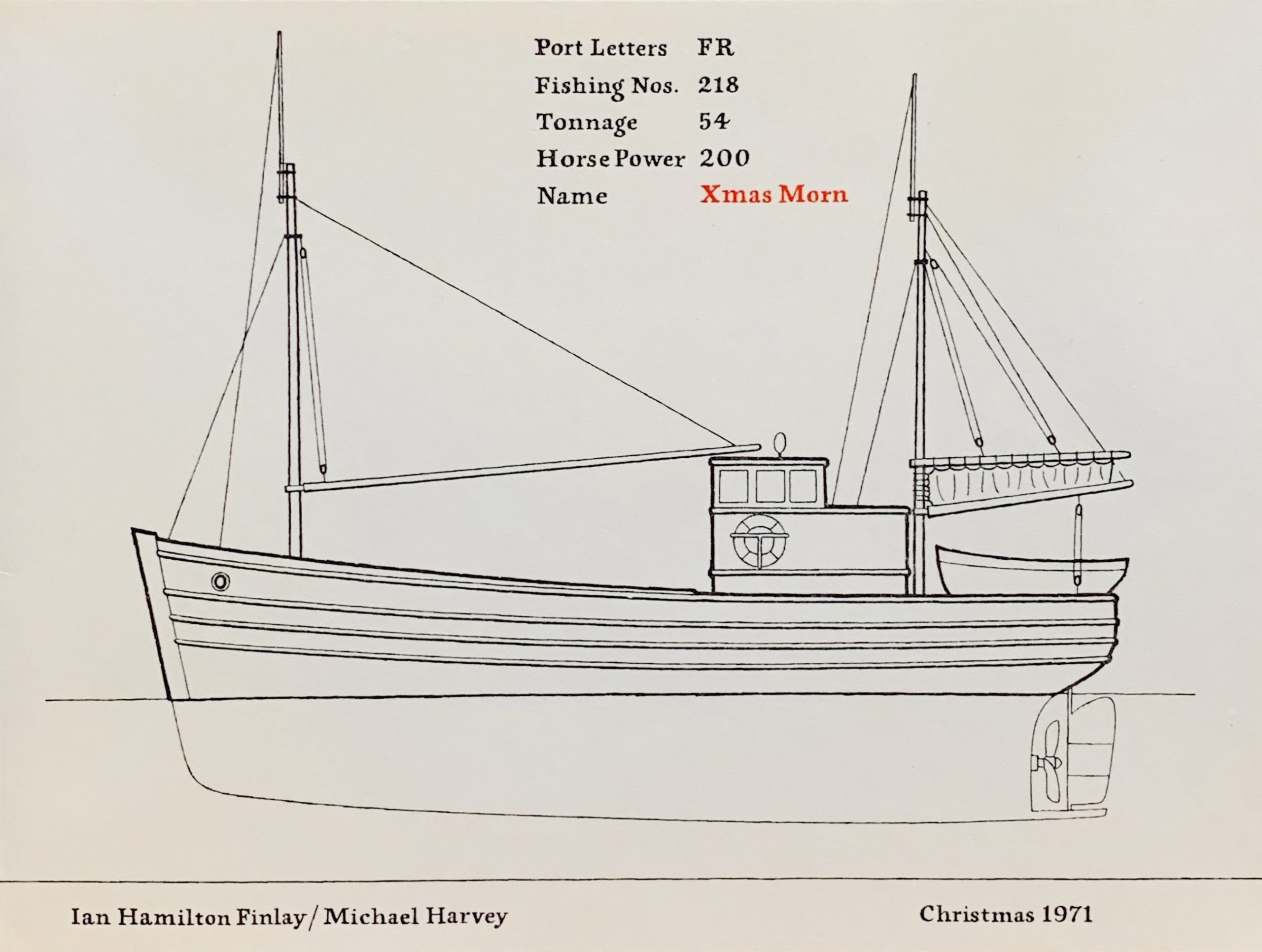
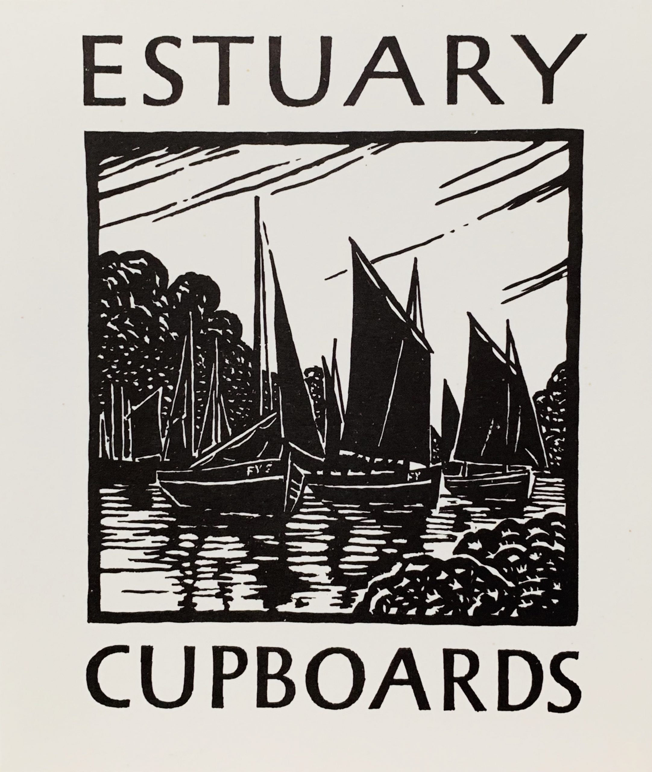
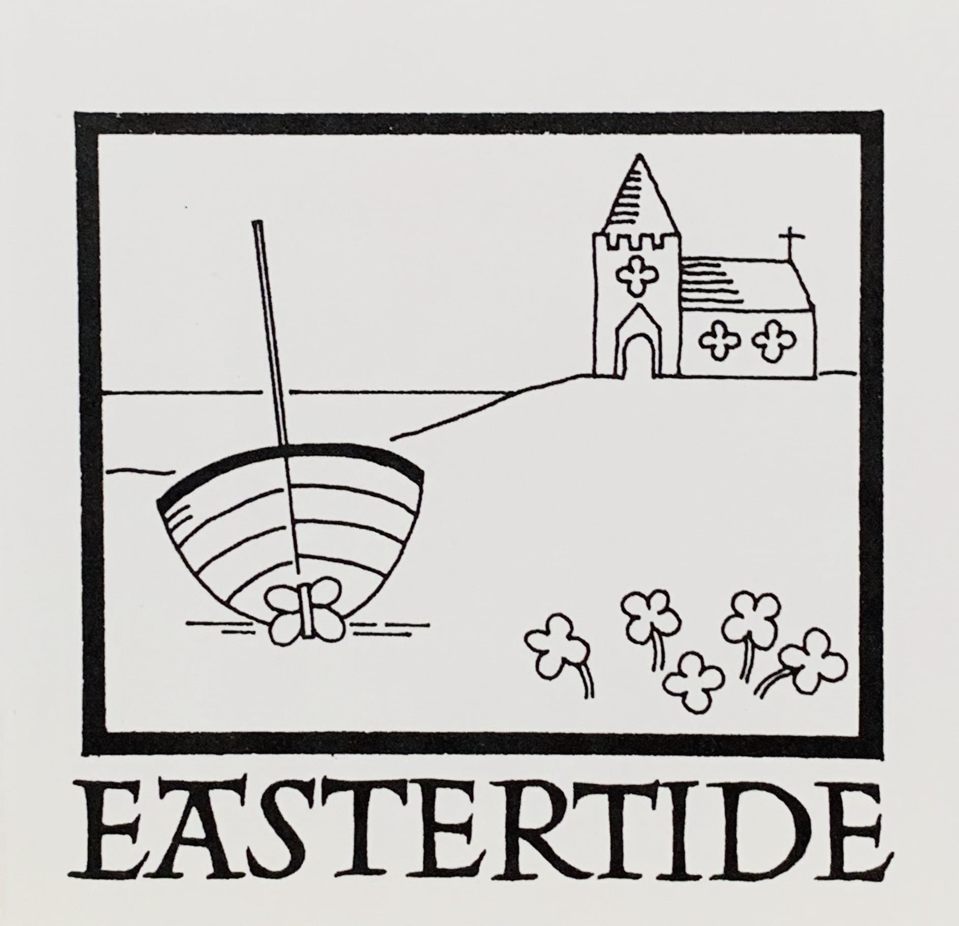
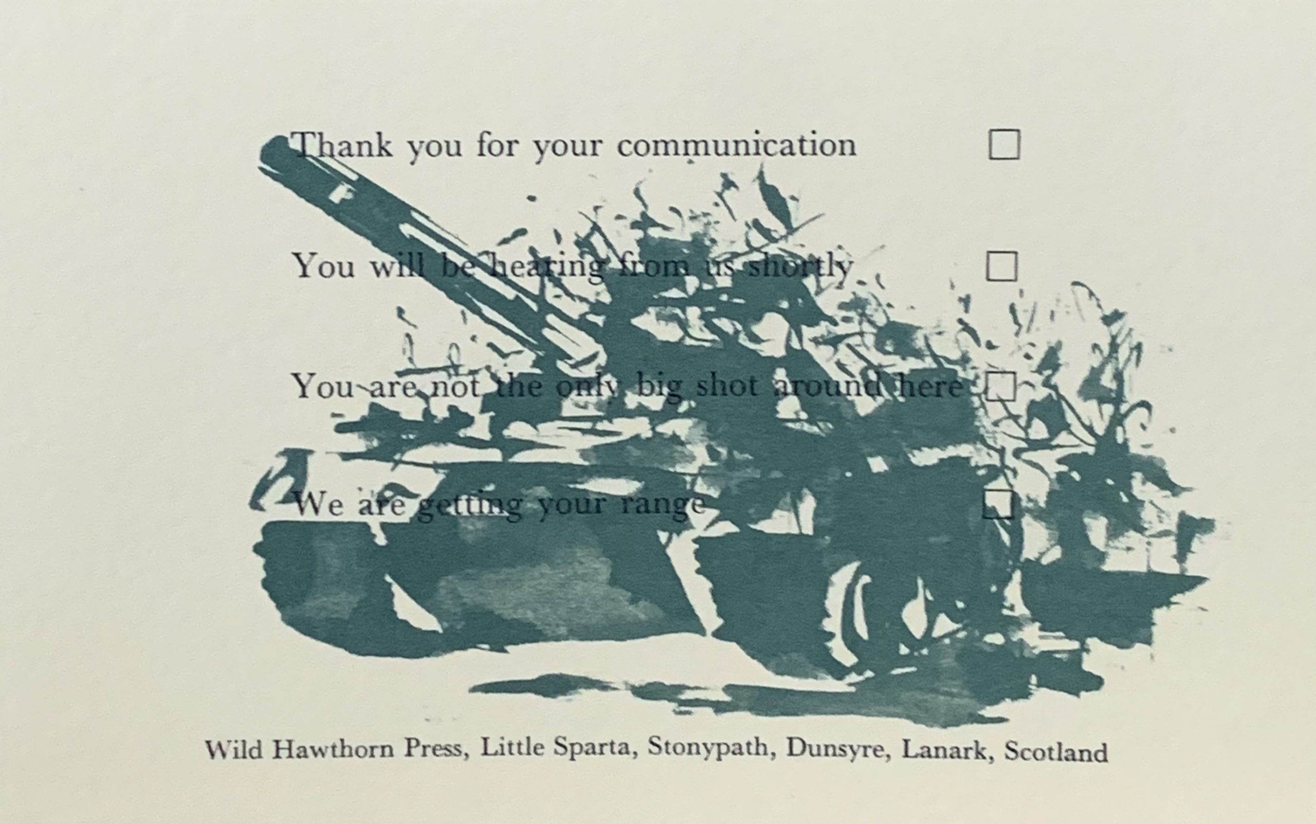
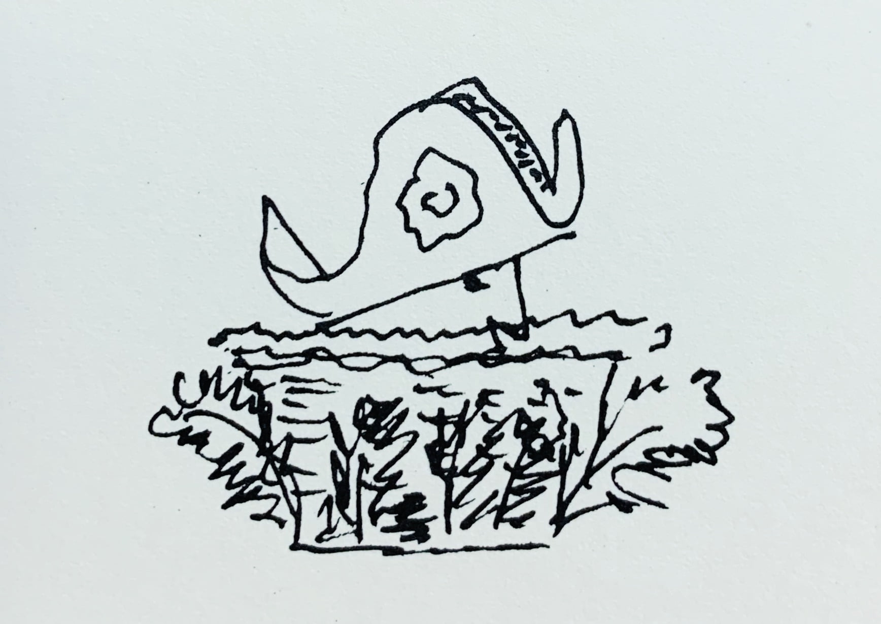
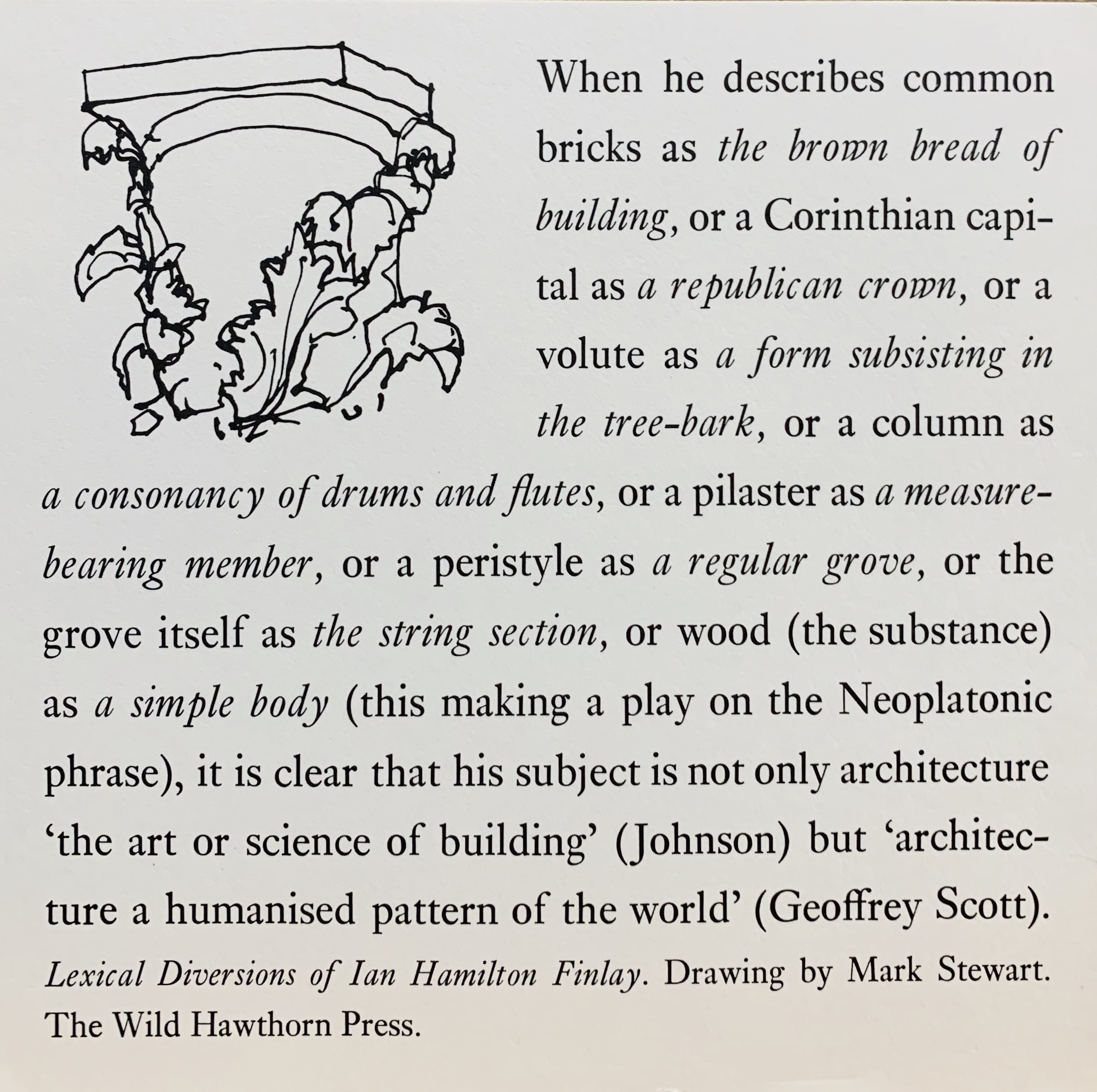
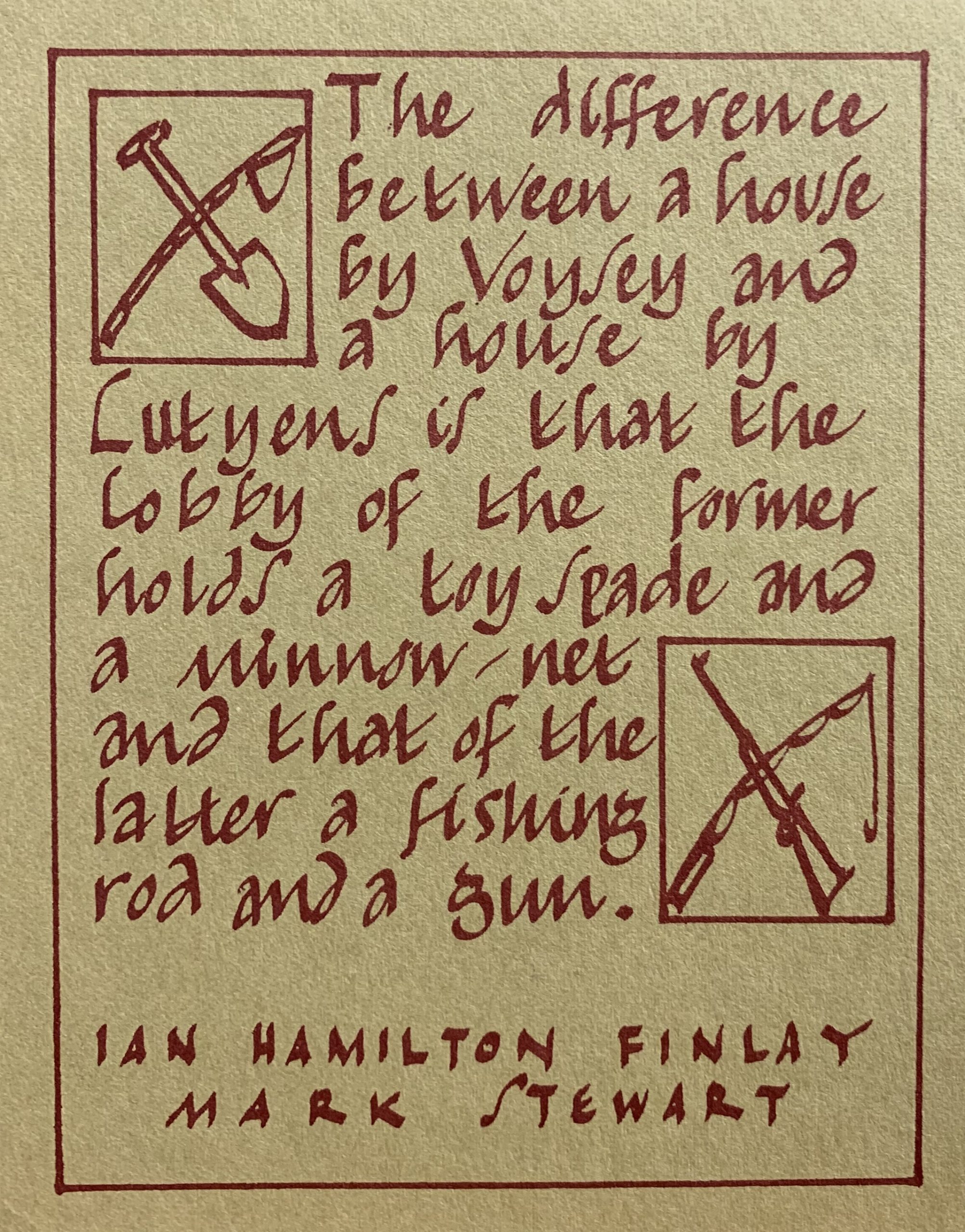
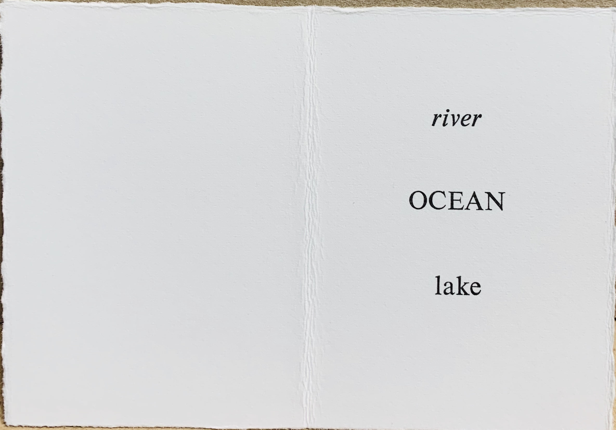
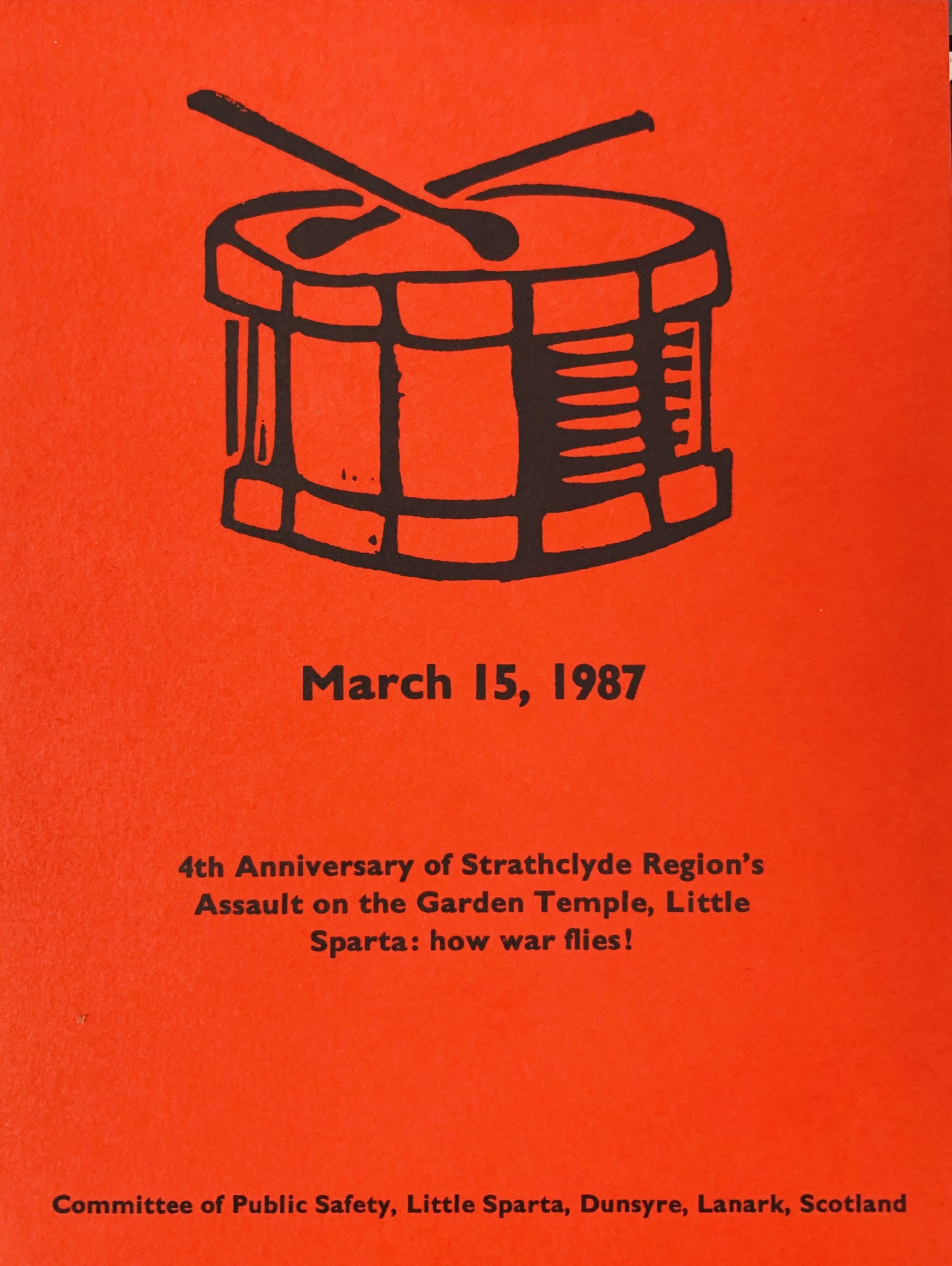
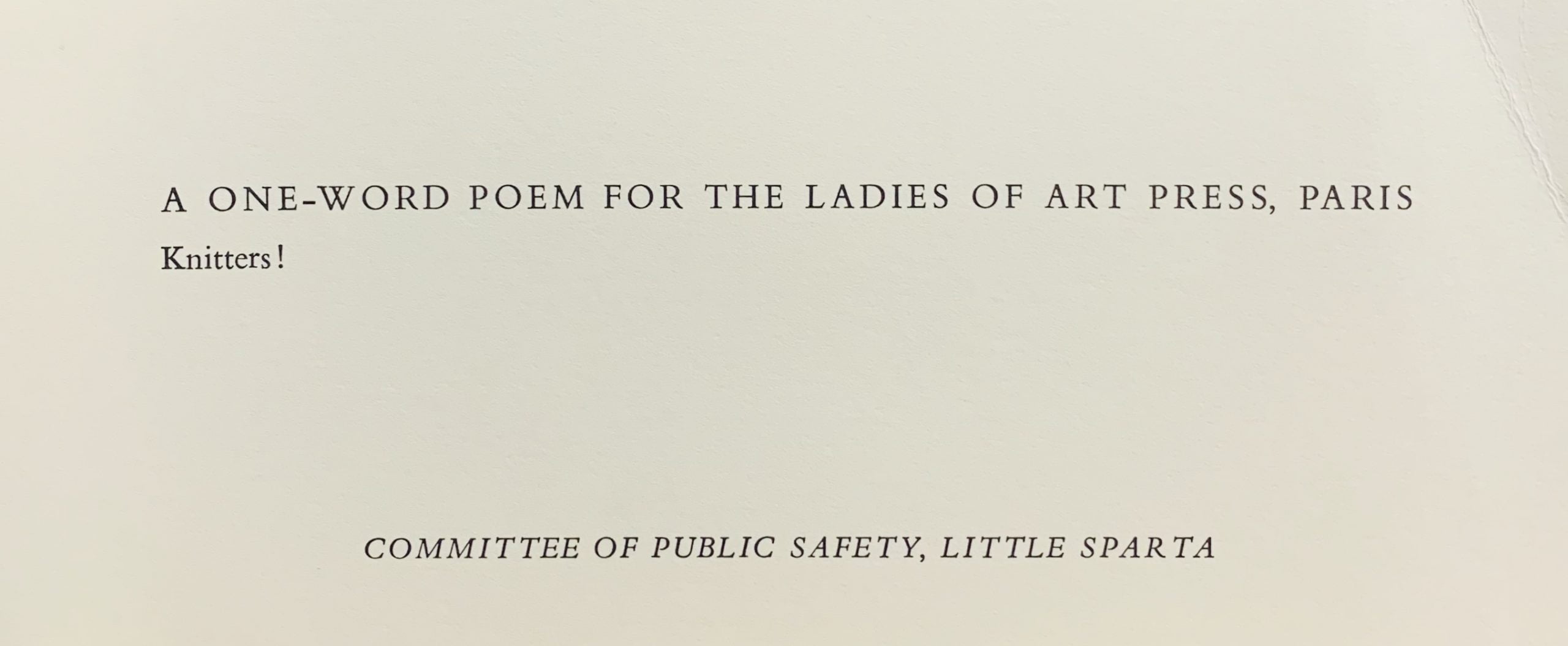
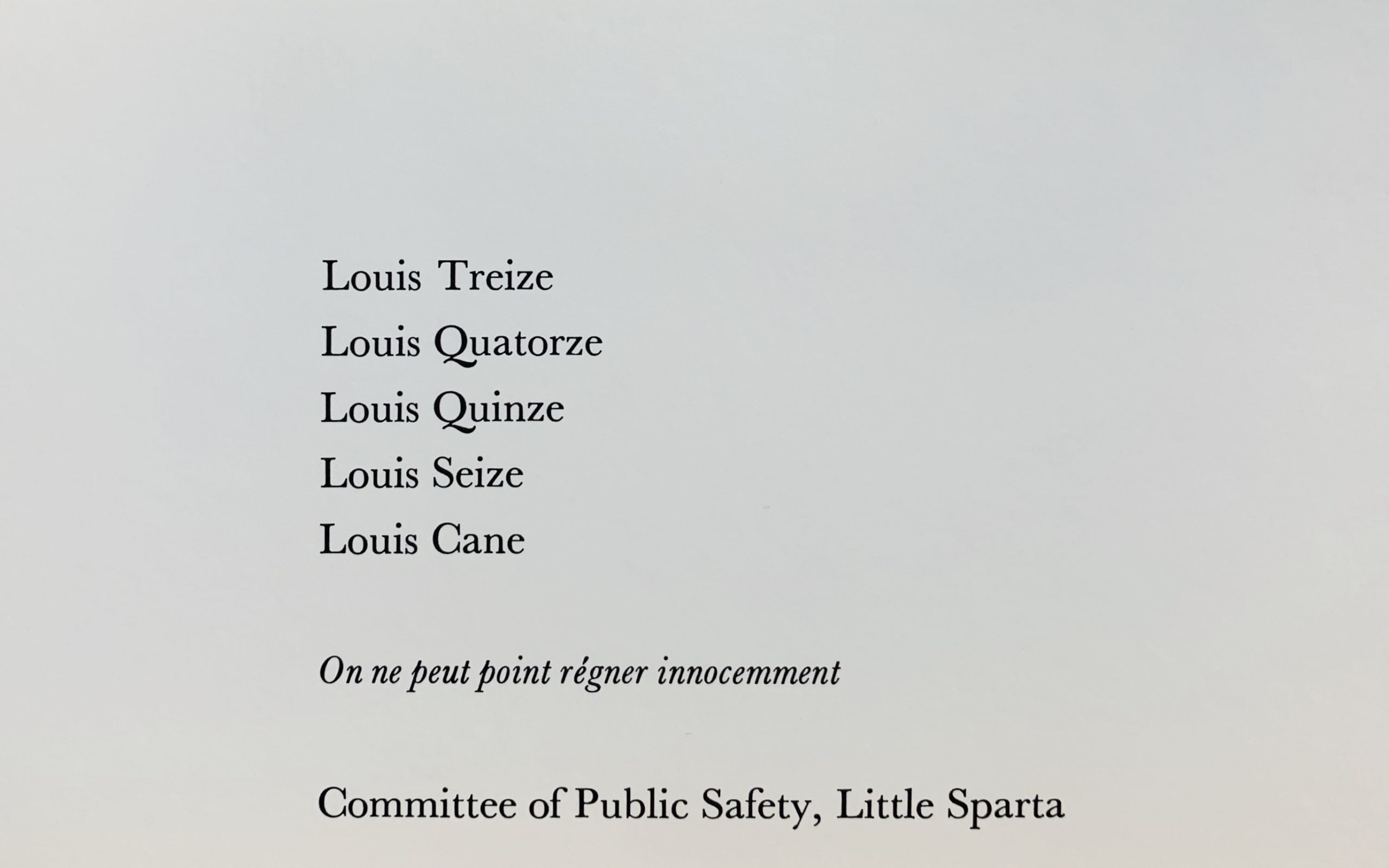
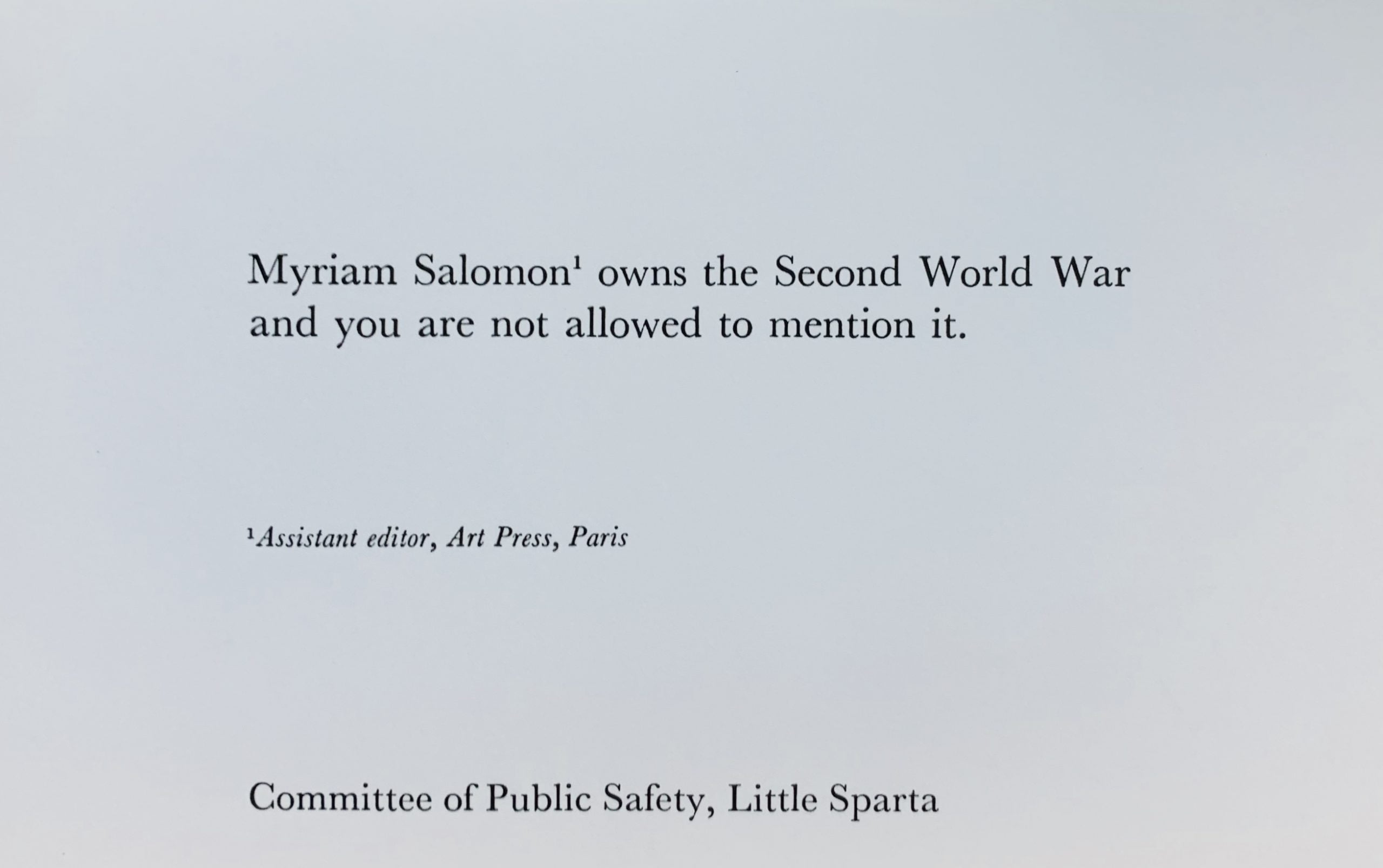
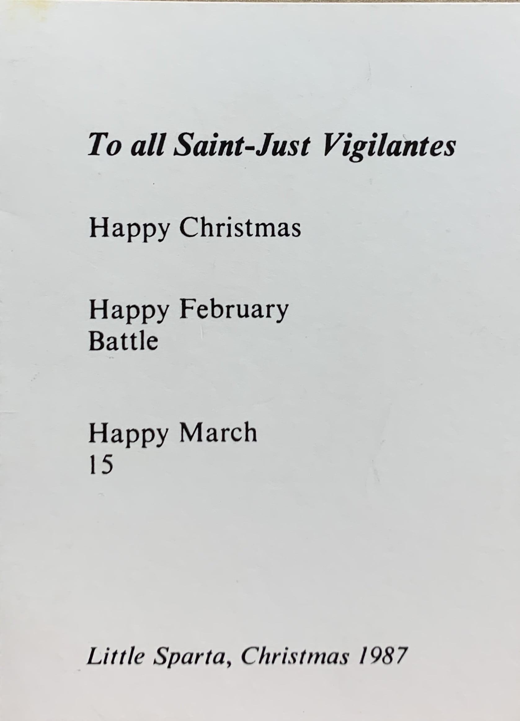
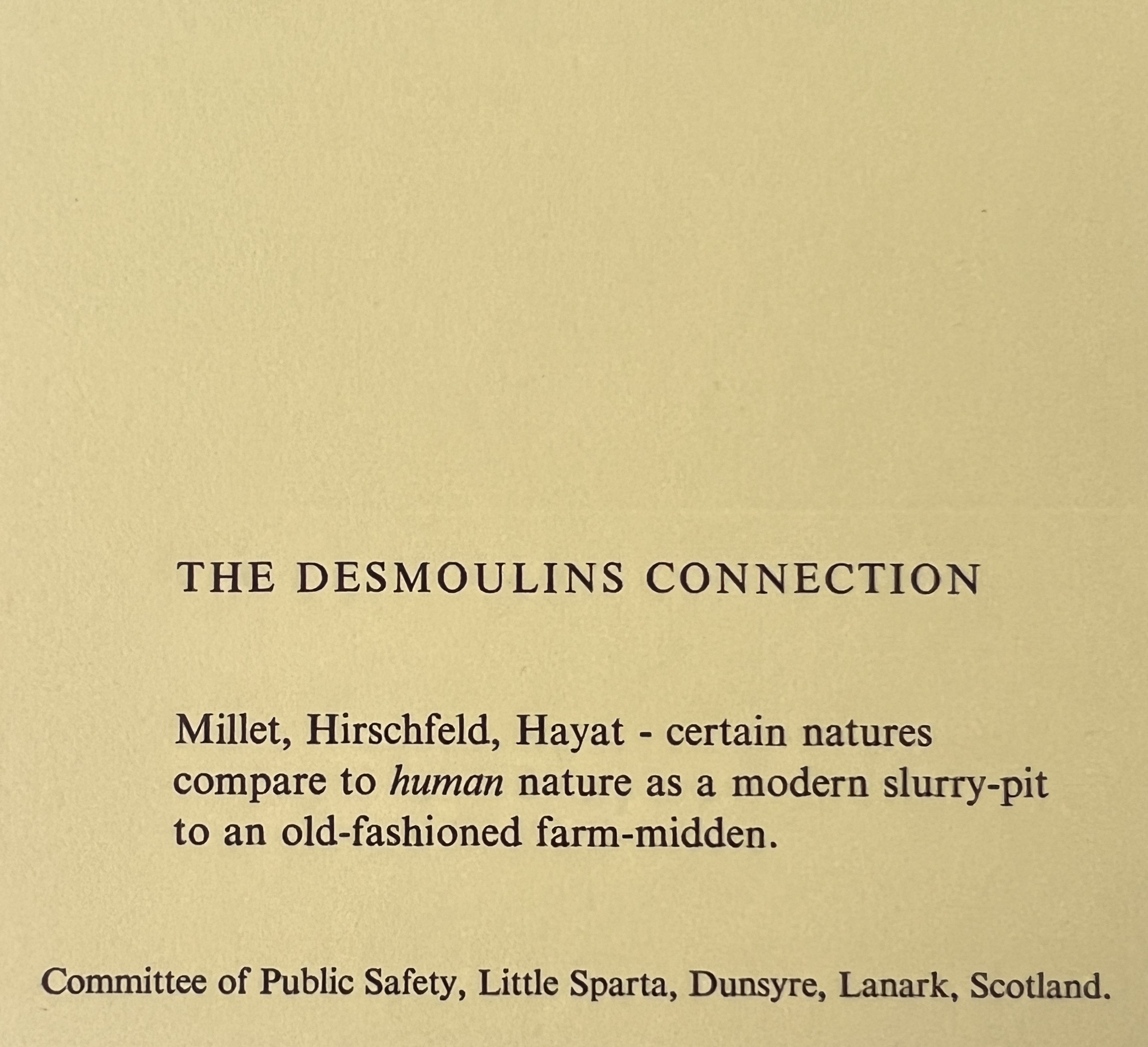
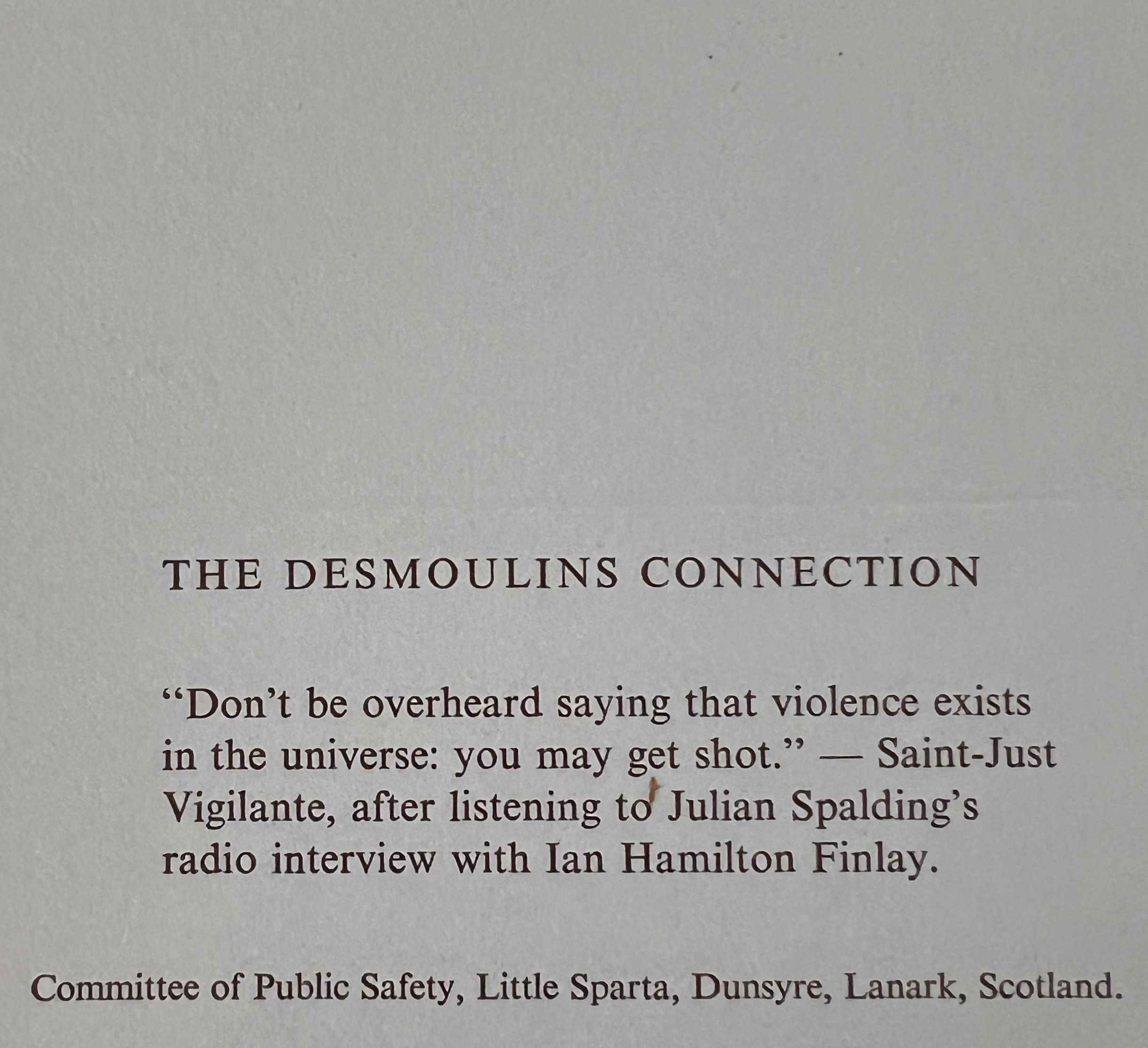
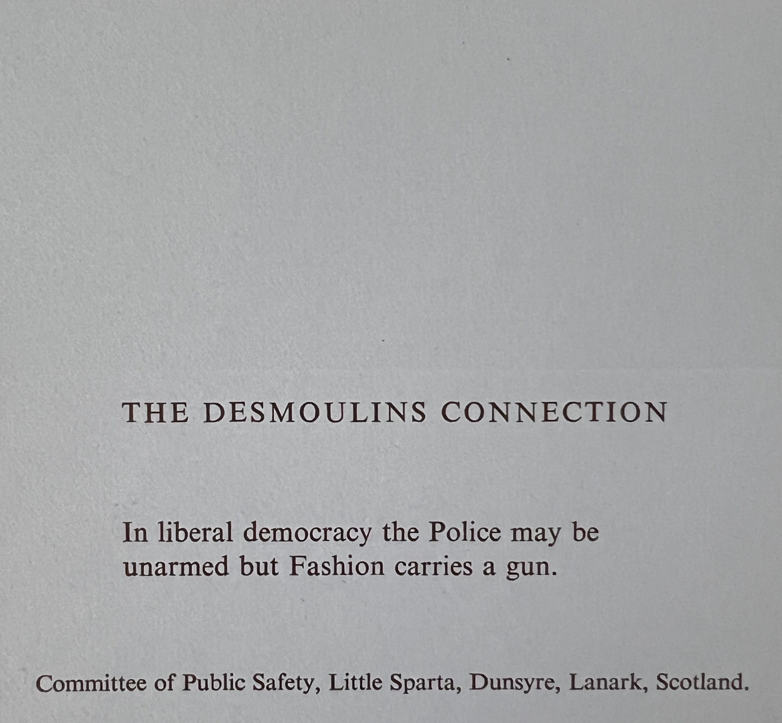
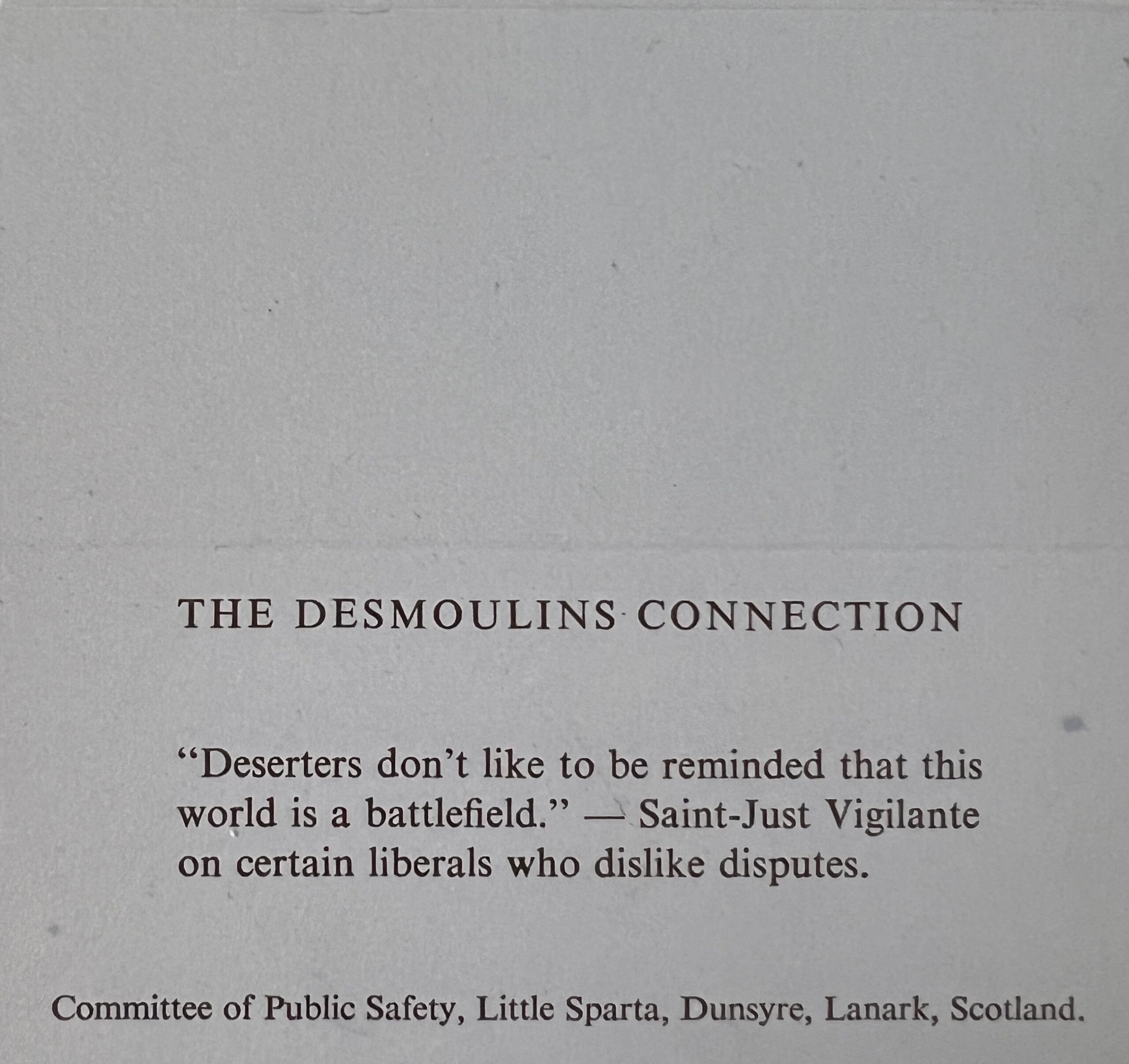
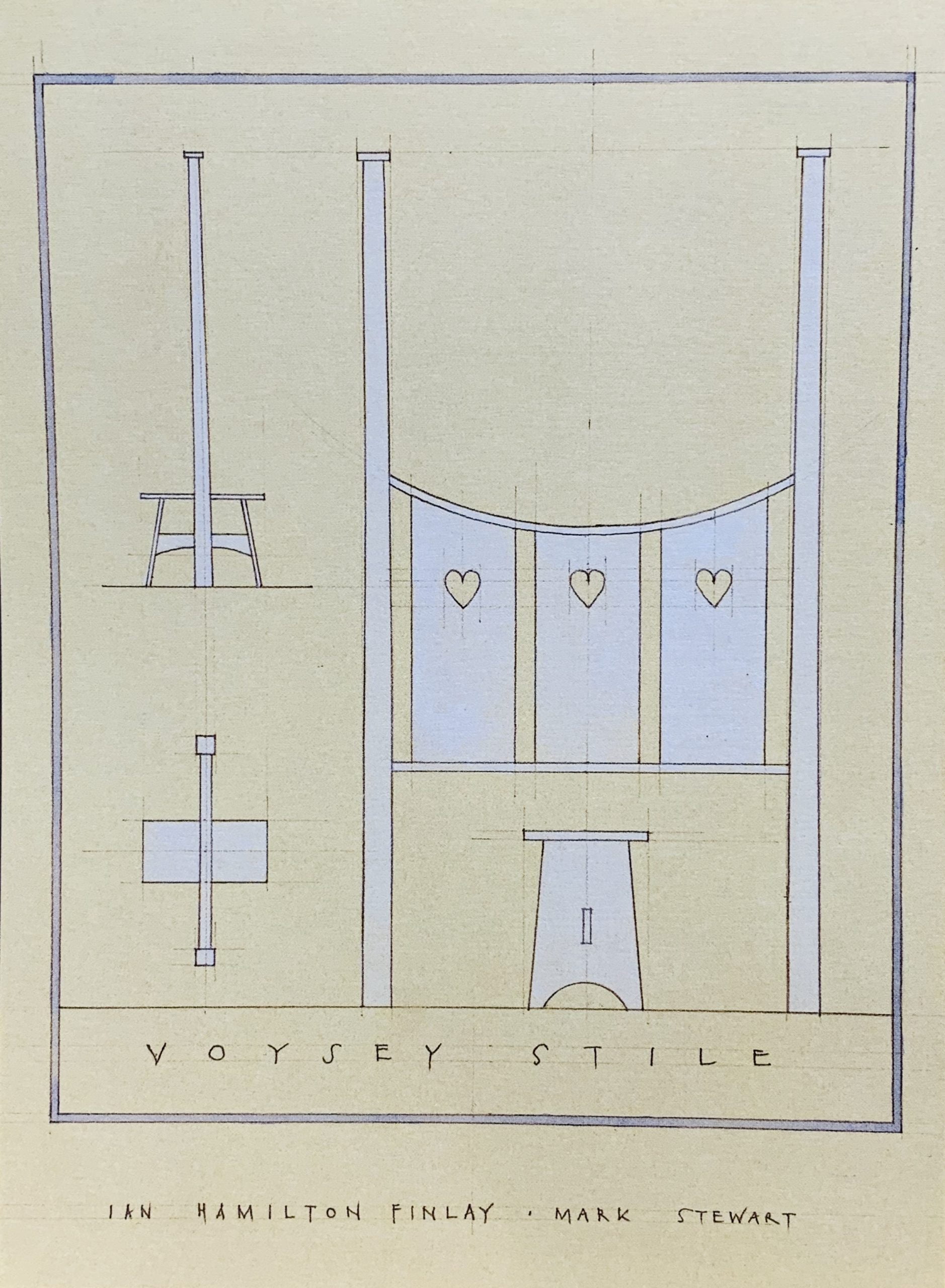
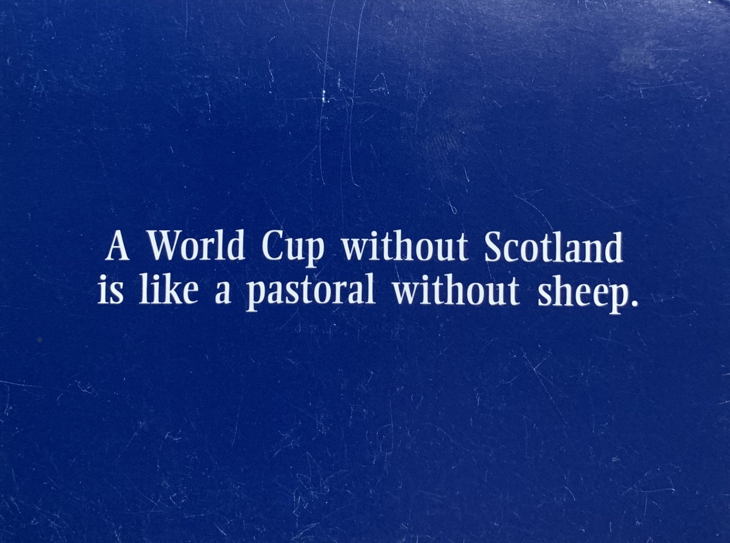
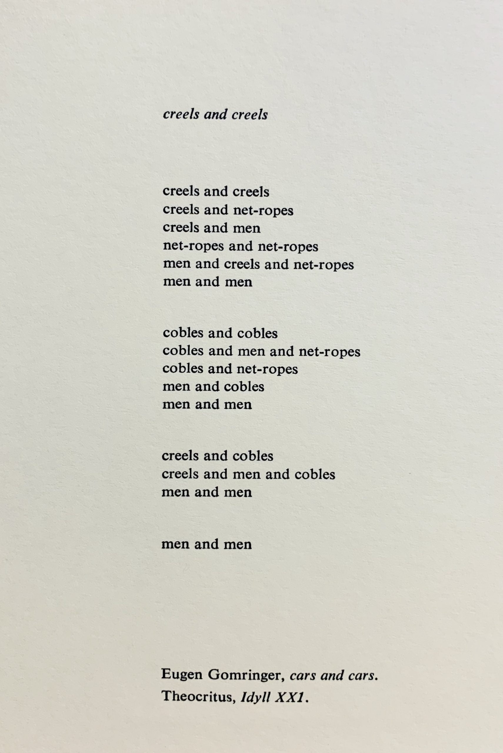
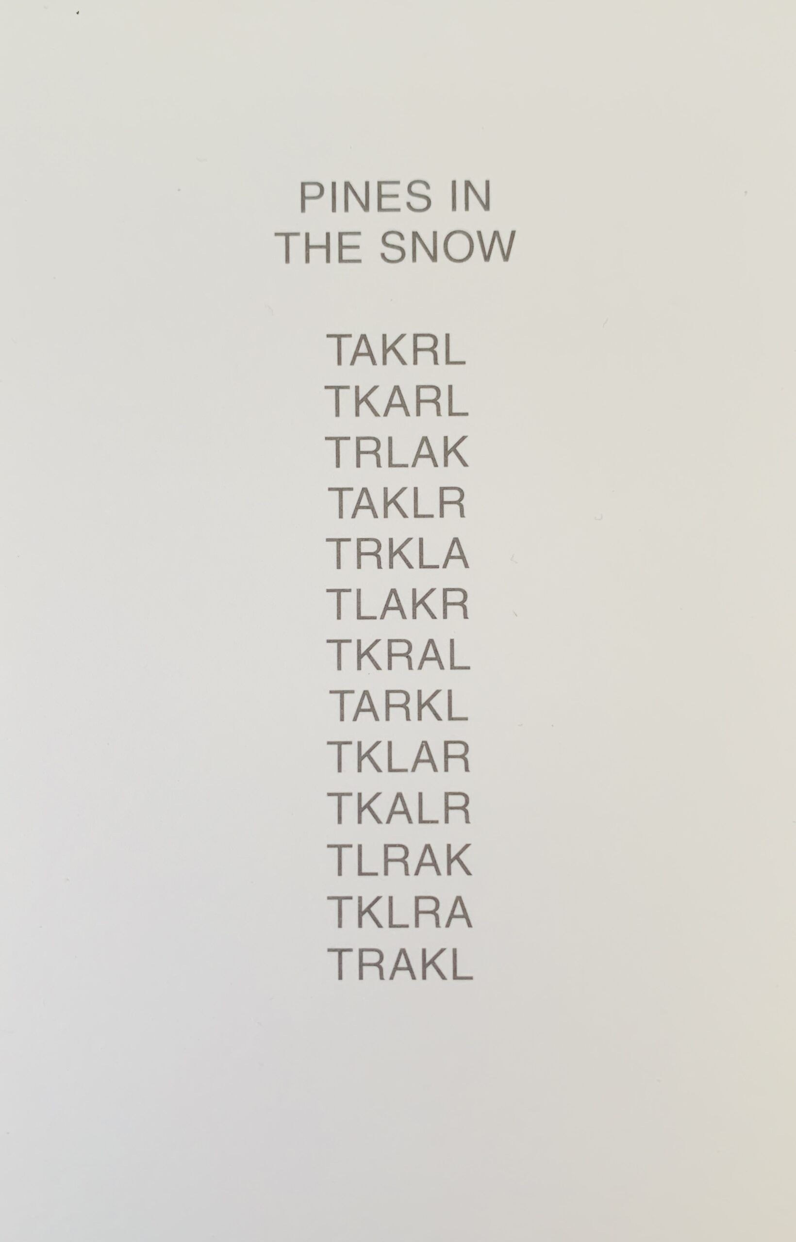
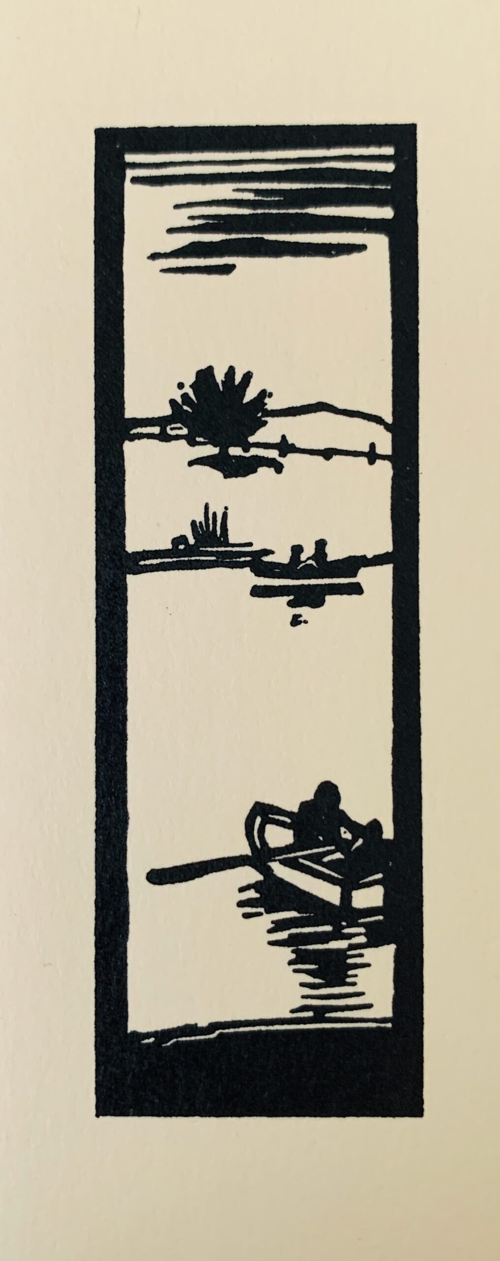
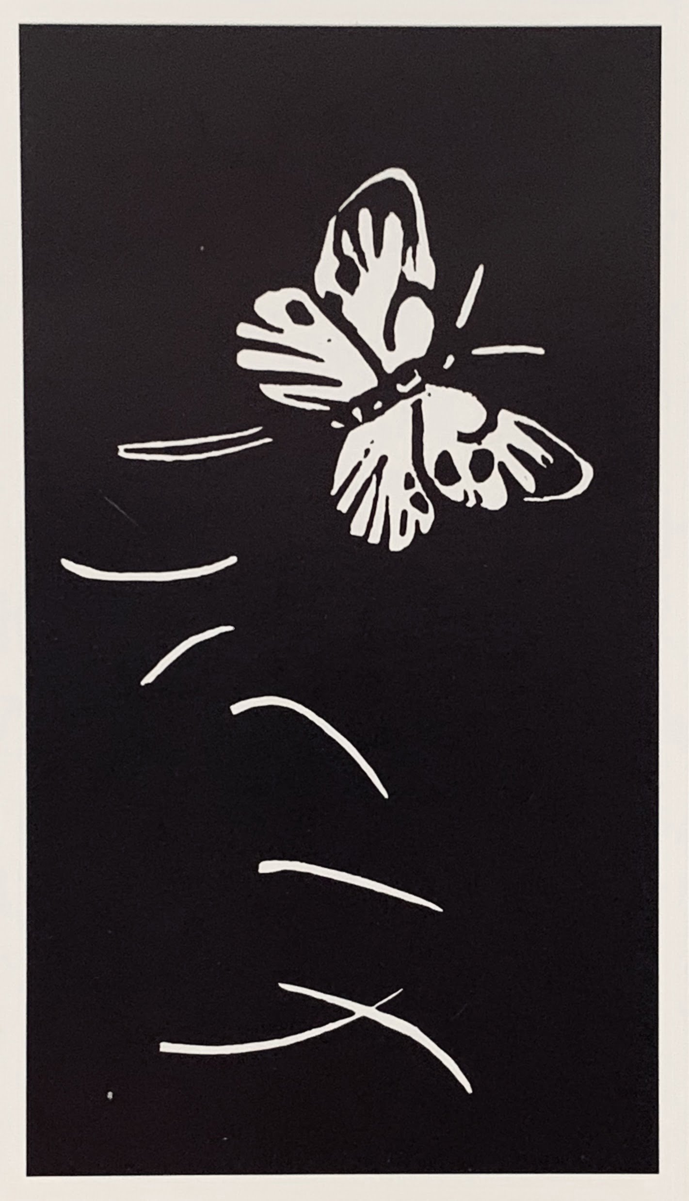
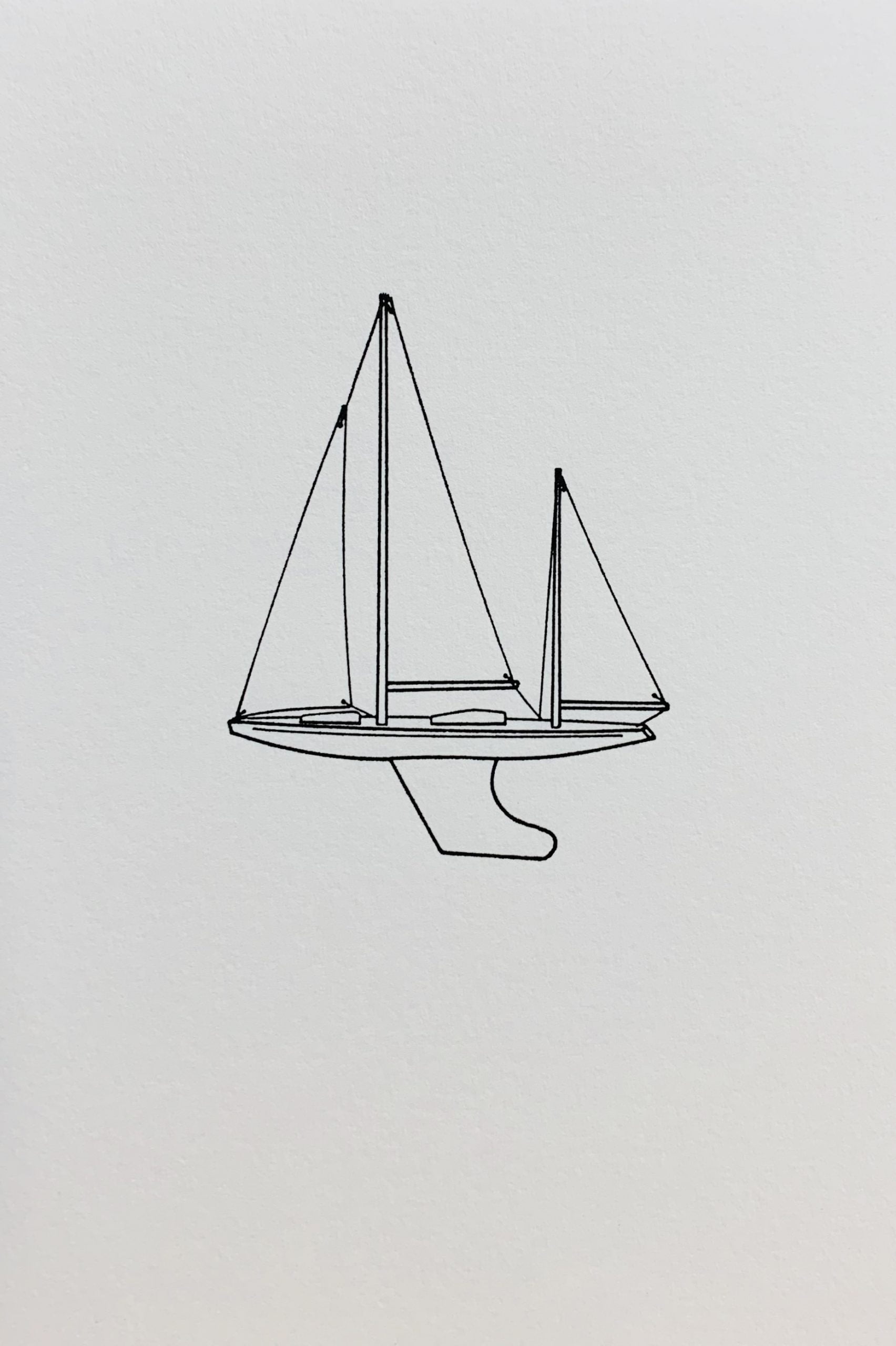
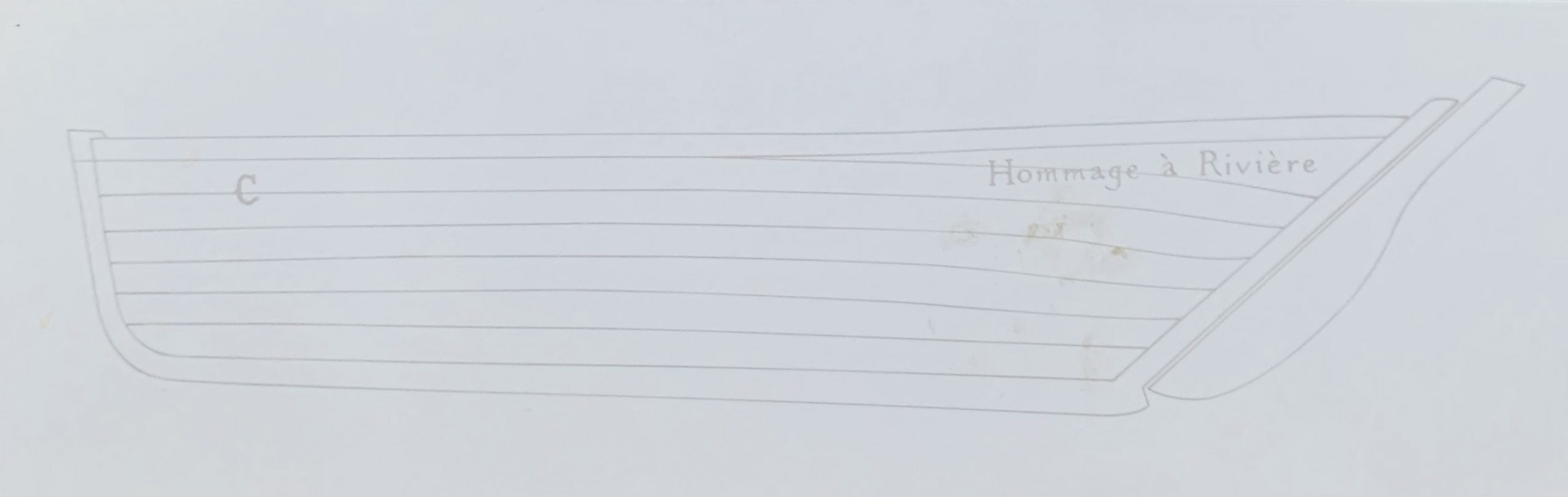
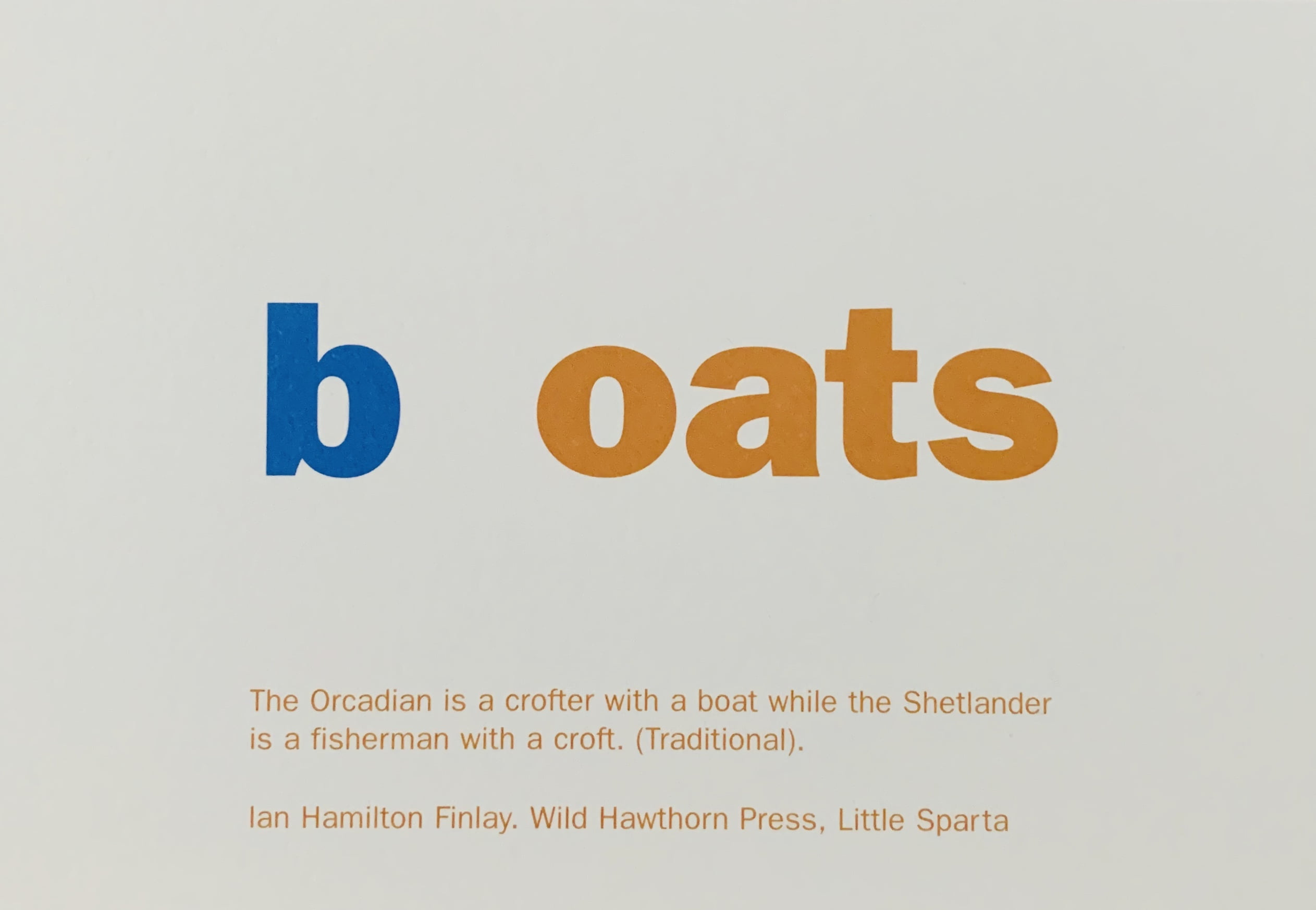
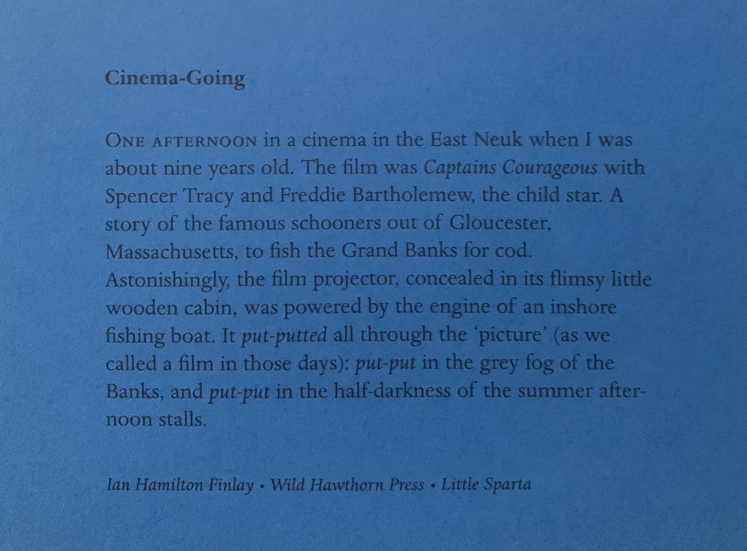
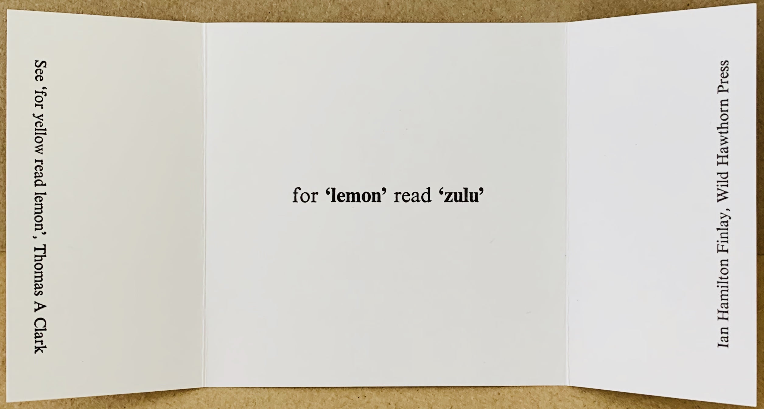
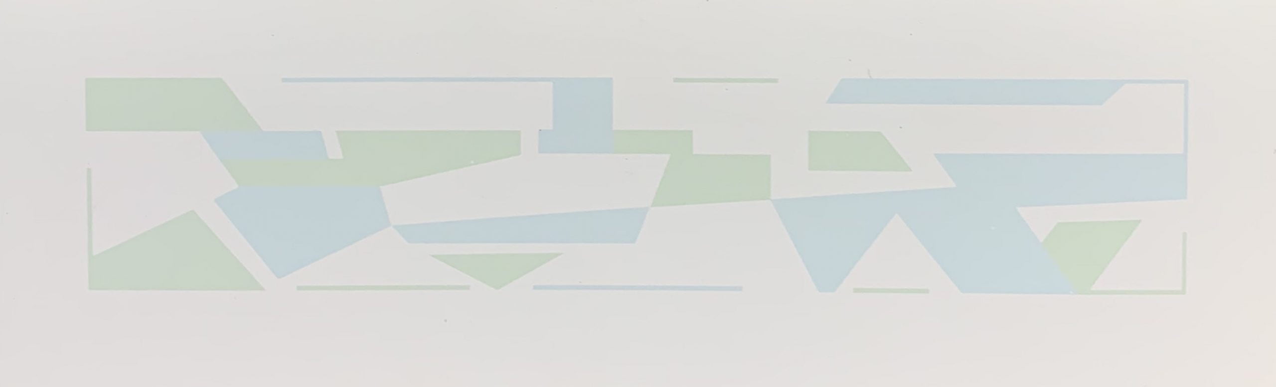
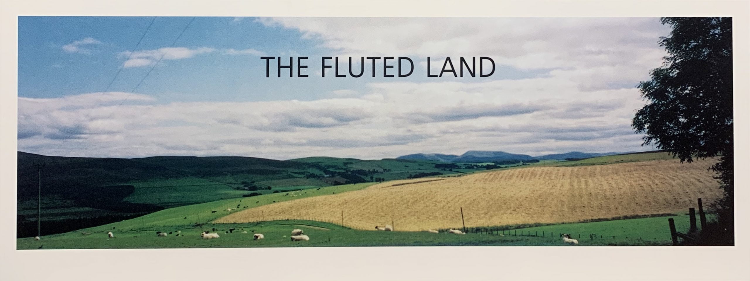
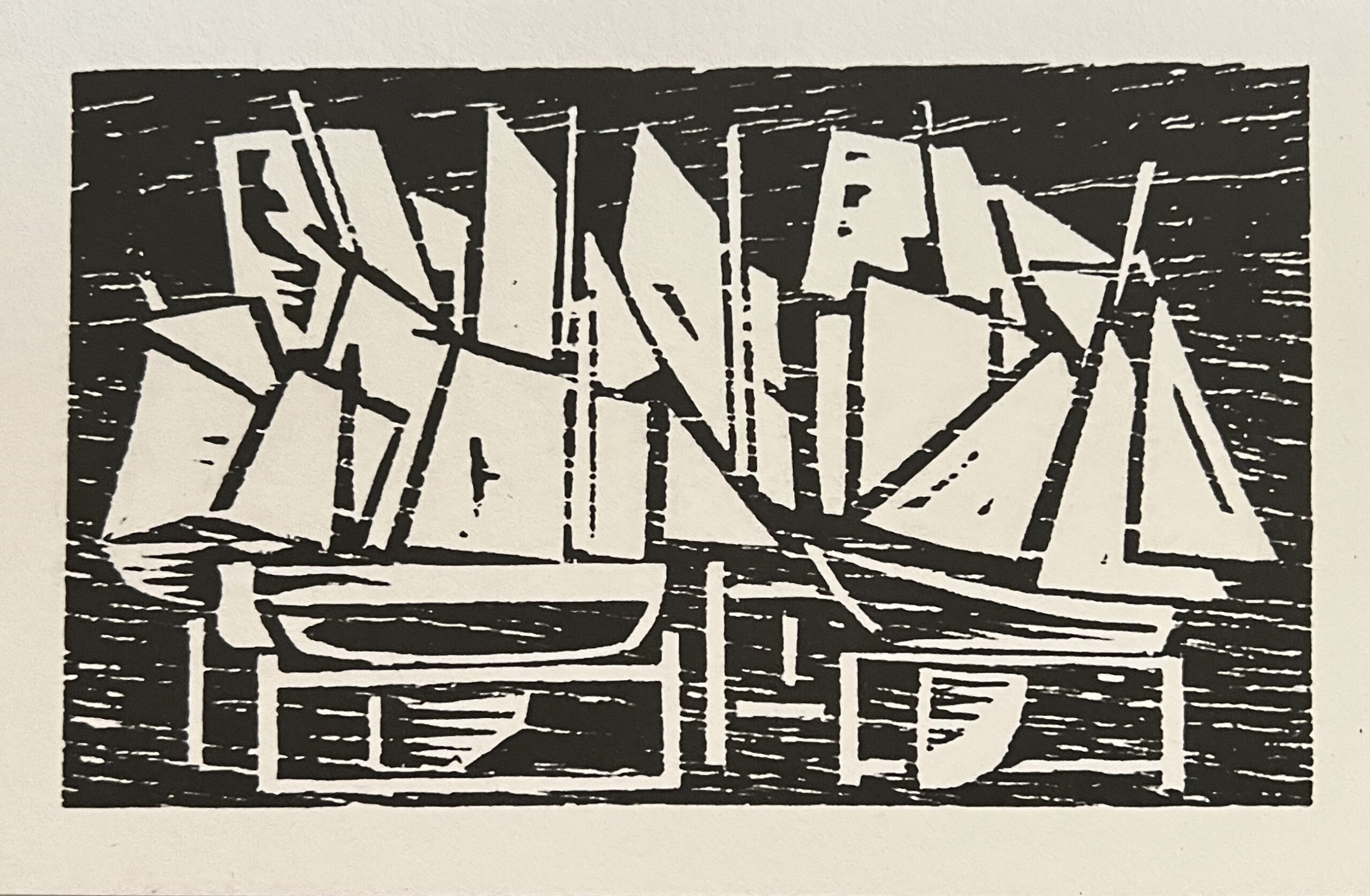
LAPPY ISTHMUS FISHES/HAPPY CHRISTMAS WISHES. 1963. (NOT IN ANY CATALOGUE RAISONNE)
N.p.: s.p. (Finlay), 1963
15.5 x 10cm, 4pp (asymmetric fold). Black on yellow card.
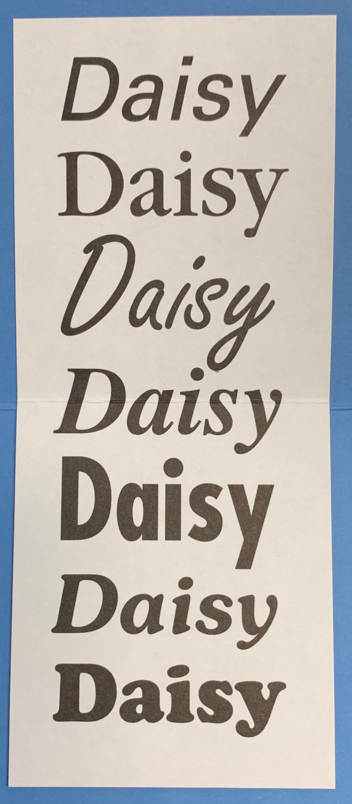
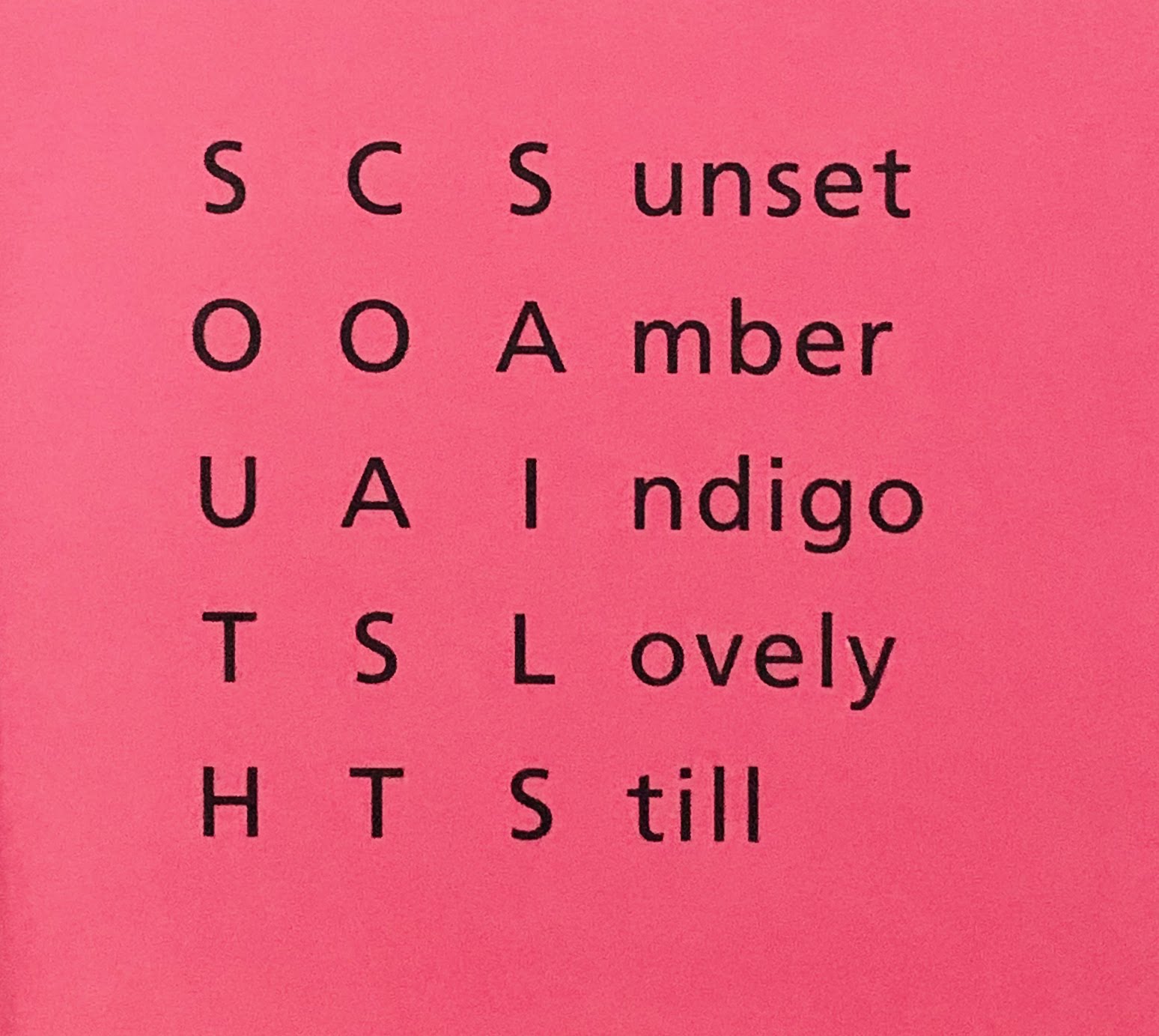
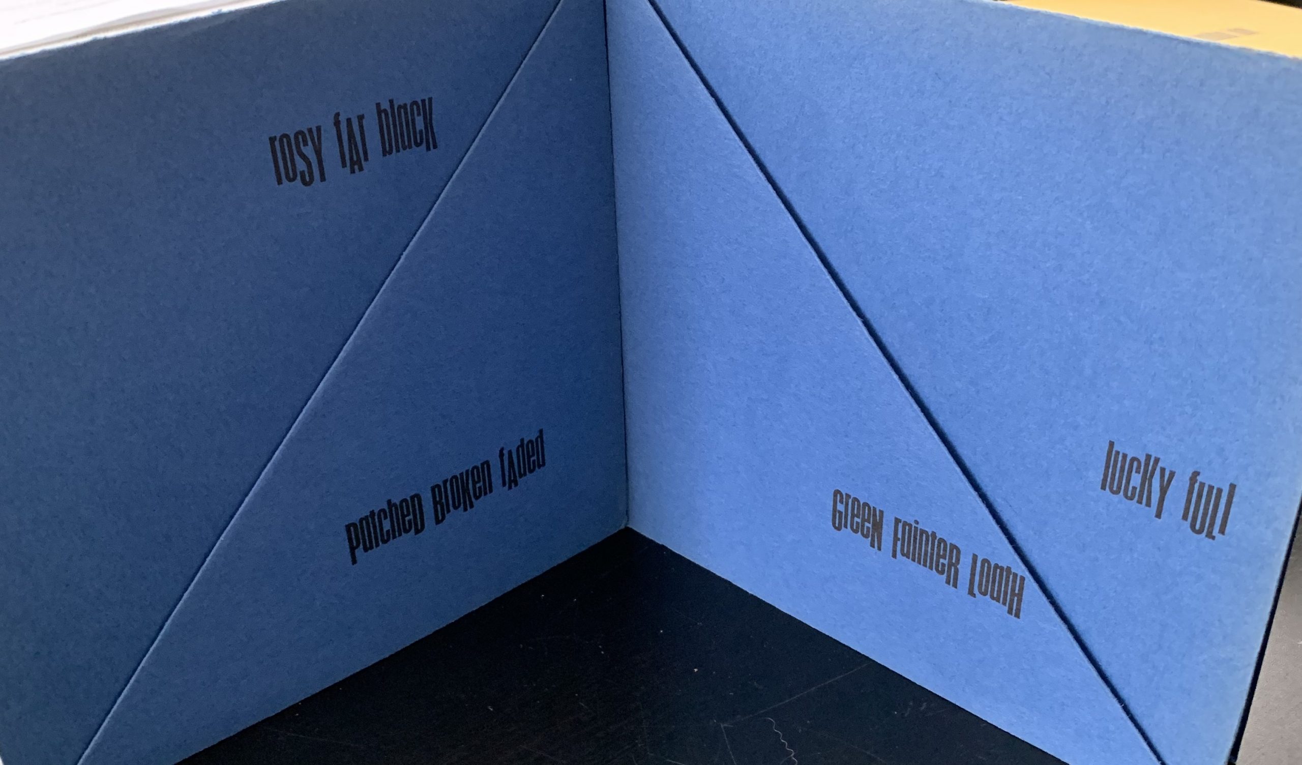
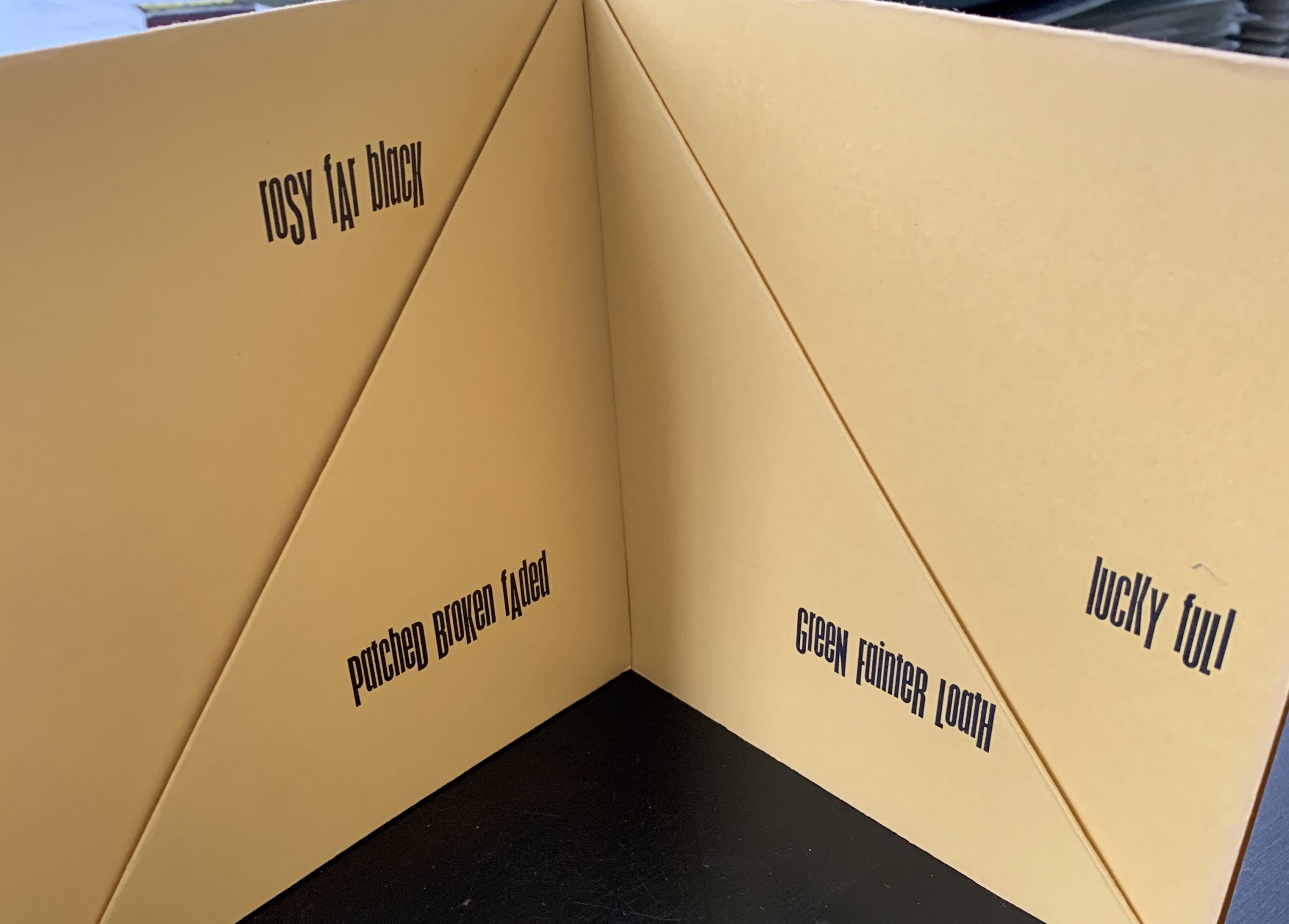
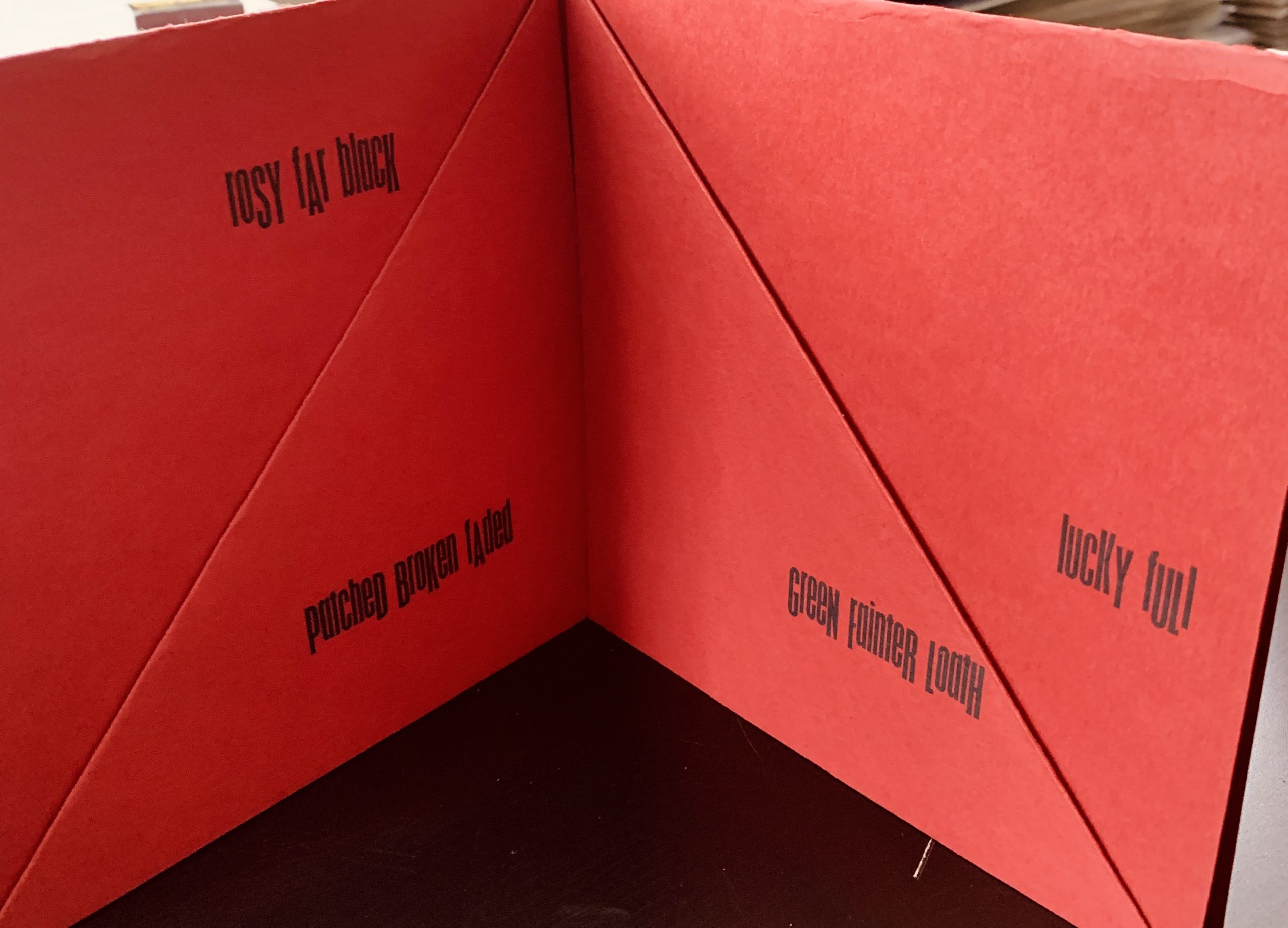
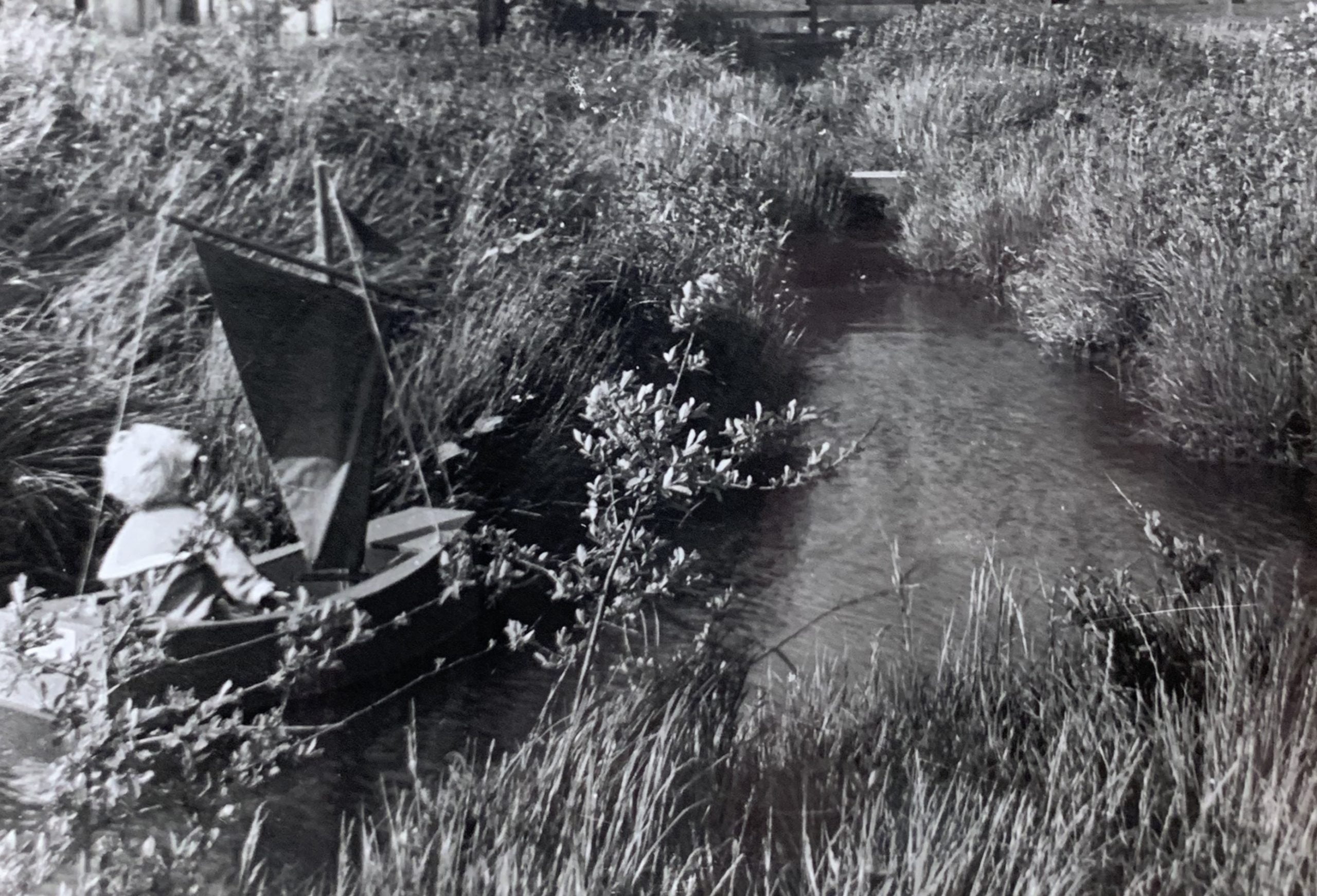
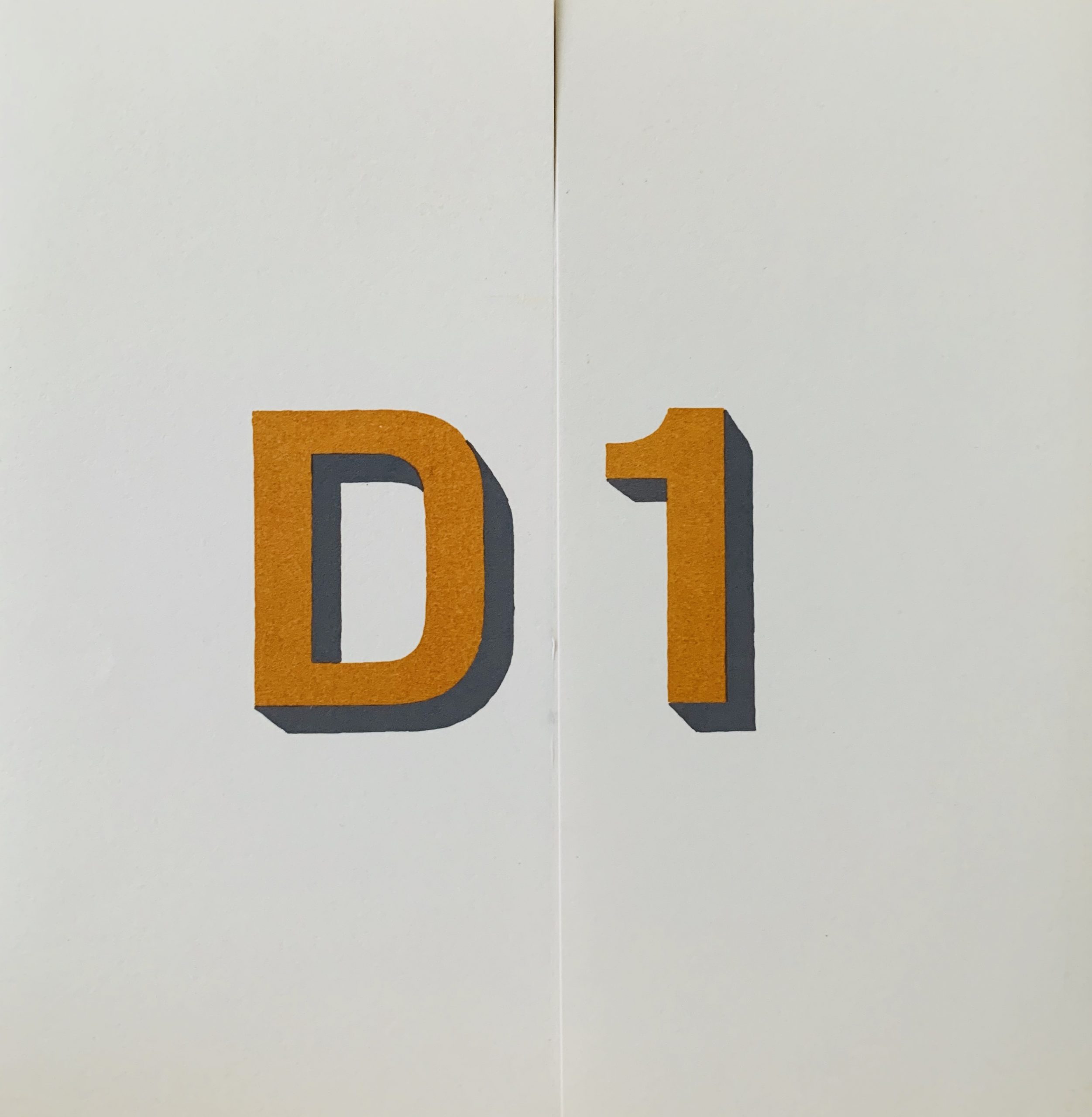
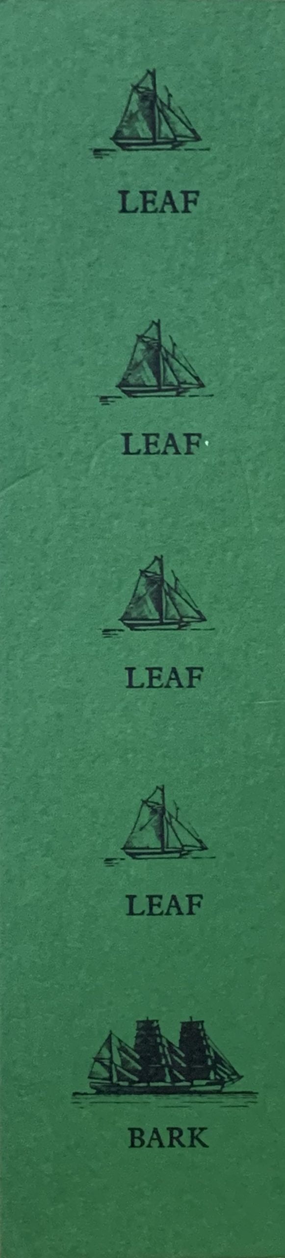
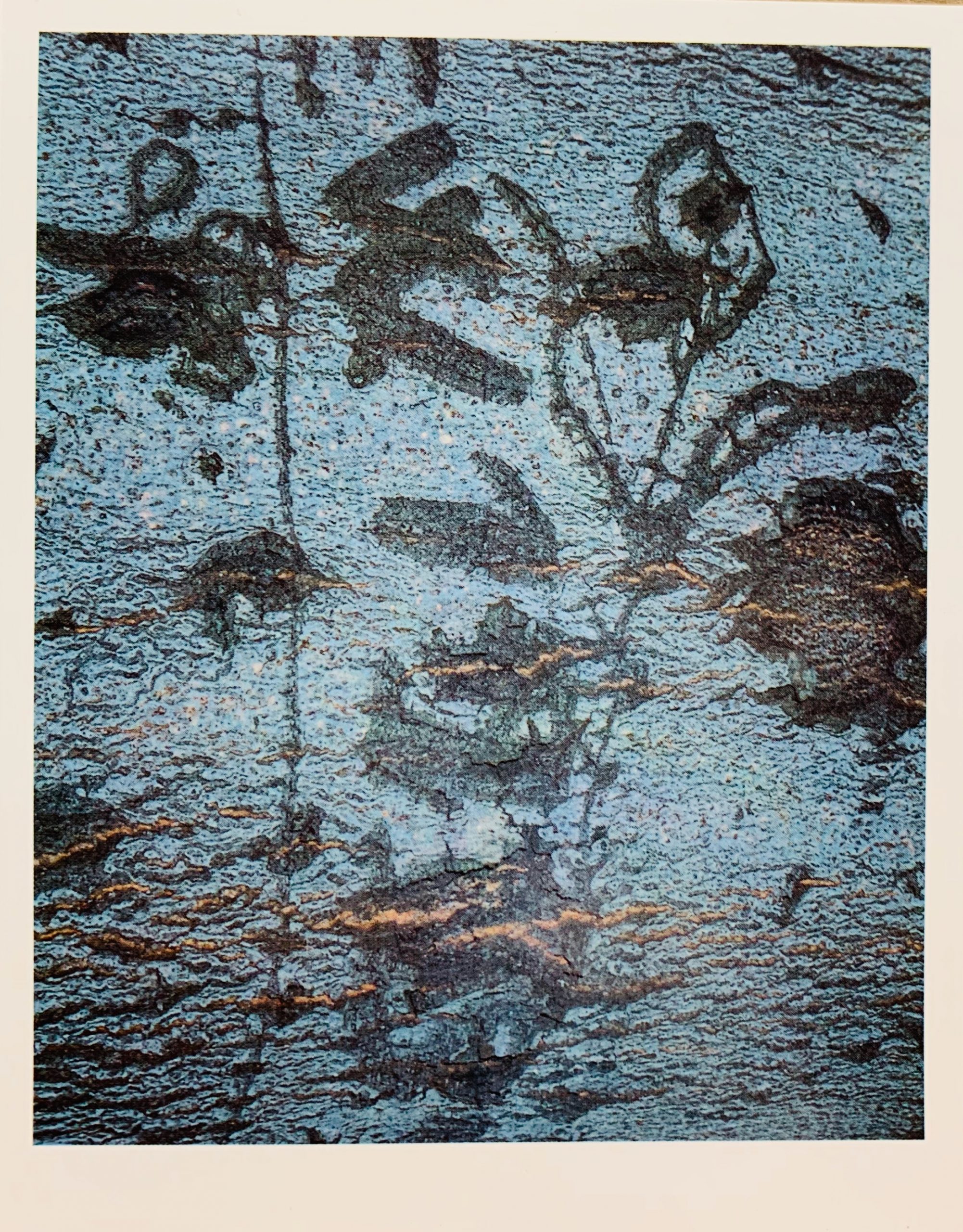
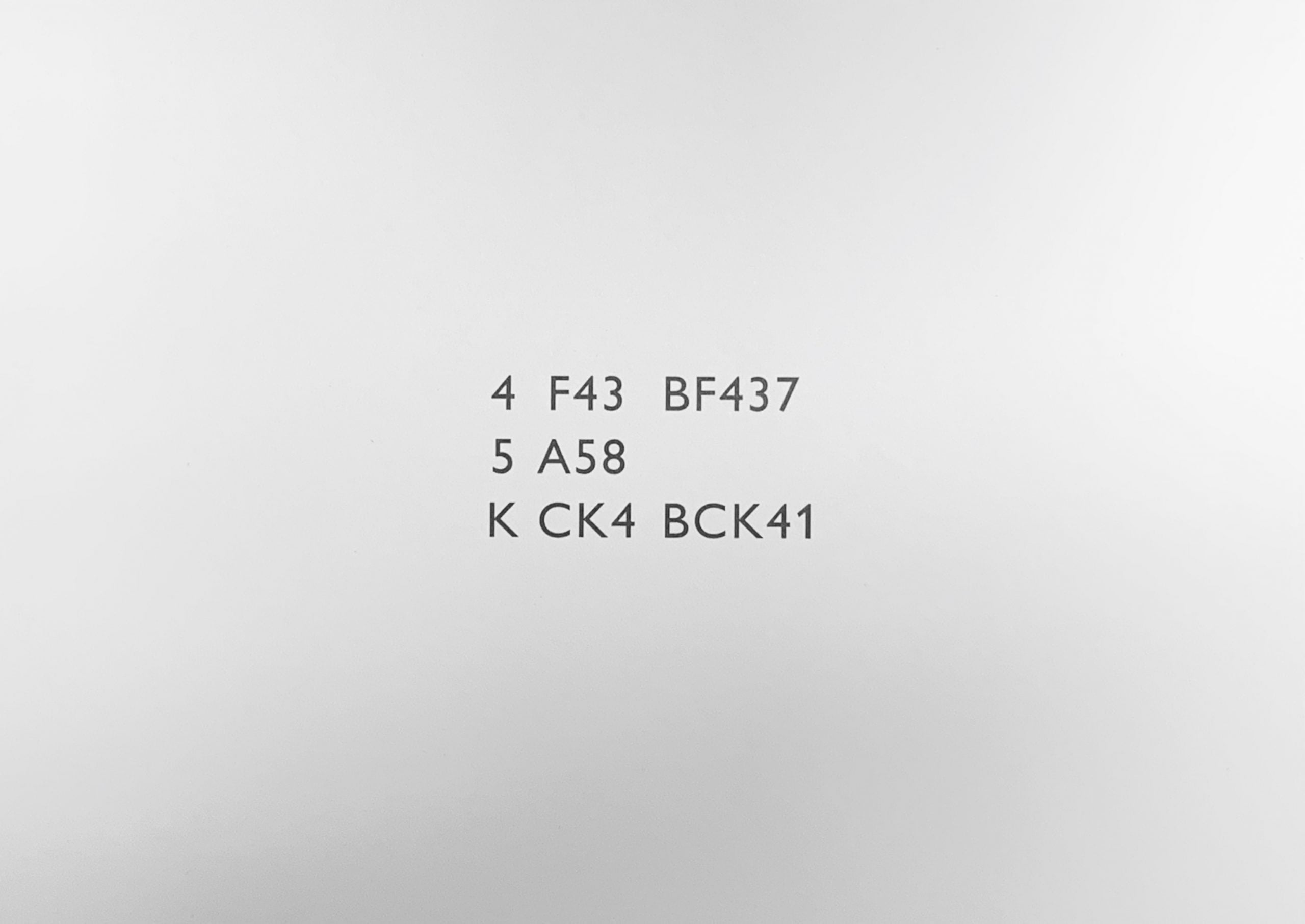
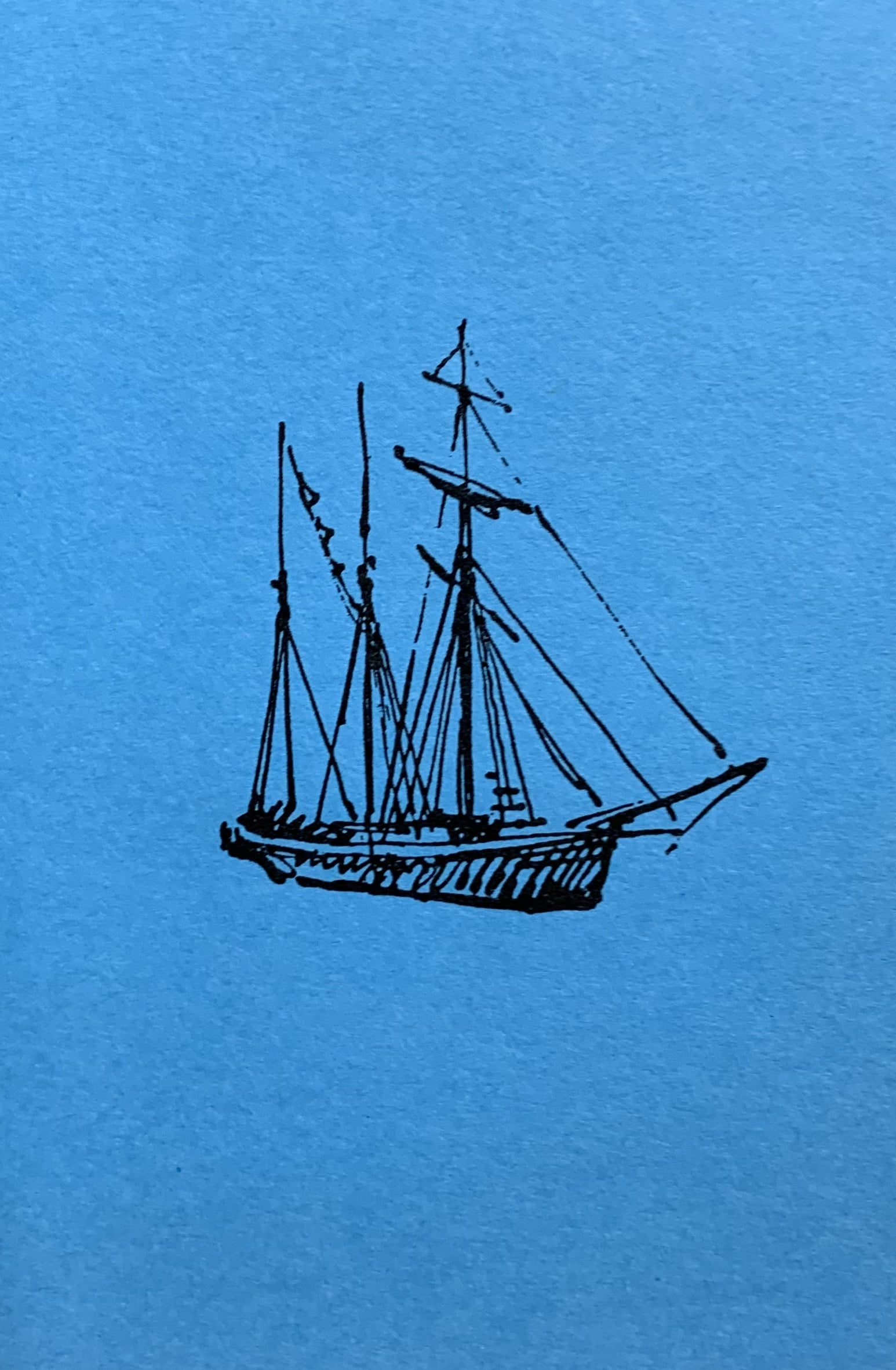
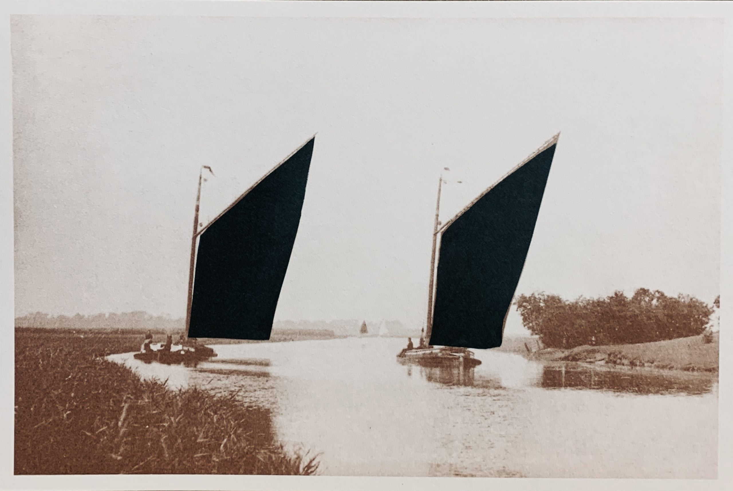
One of Finlay’s most early of concrete works, this Xmas card has the two texts printed in such a manner that the overlapping front of the card reads LAPPY ISTHMUS FISHES but when opened HAPPY CHRISTMAS WISHES.
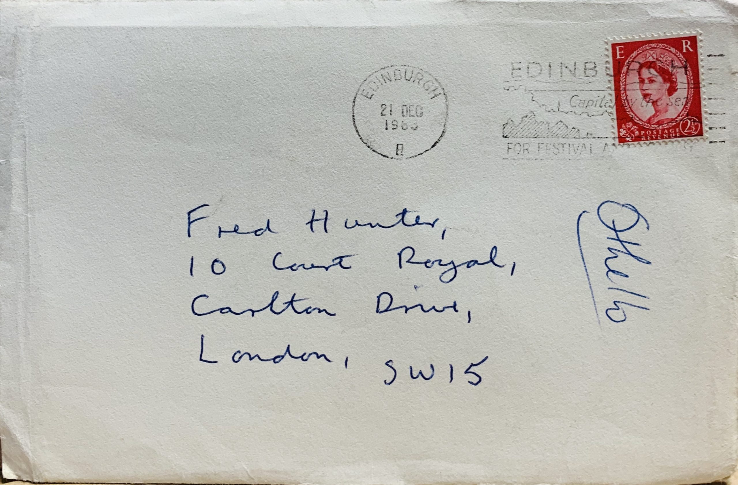
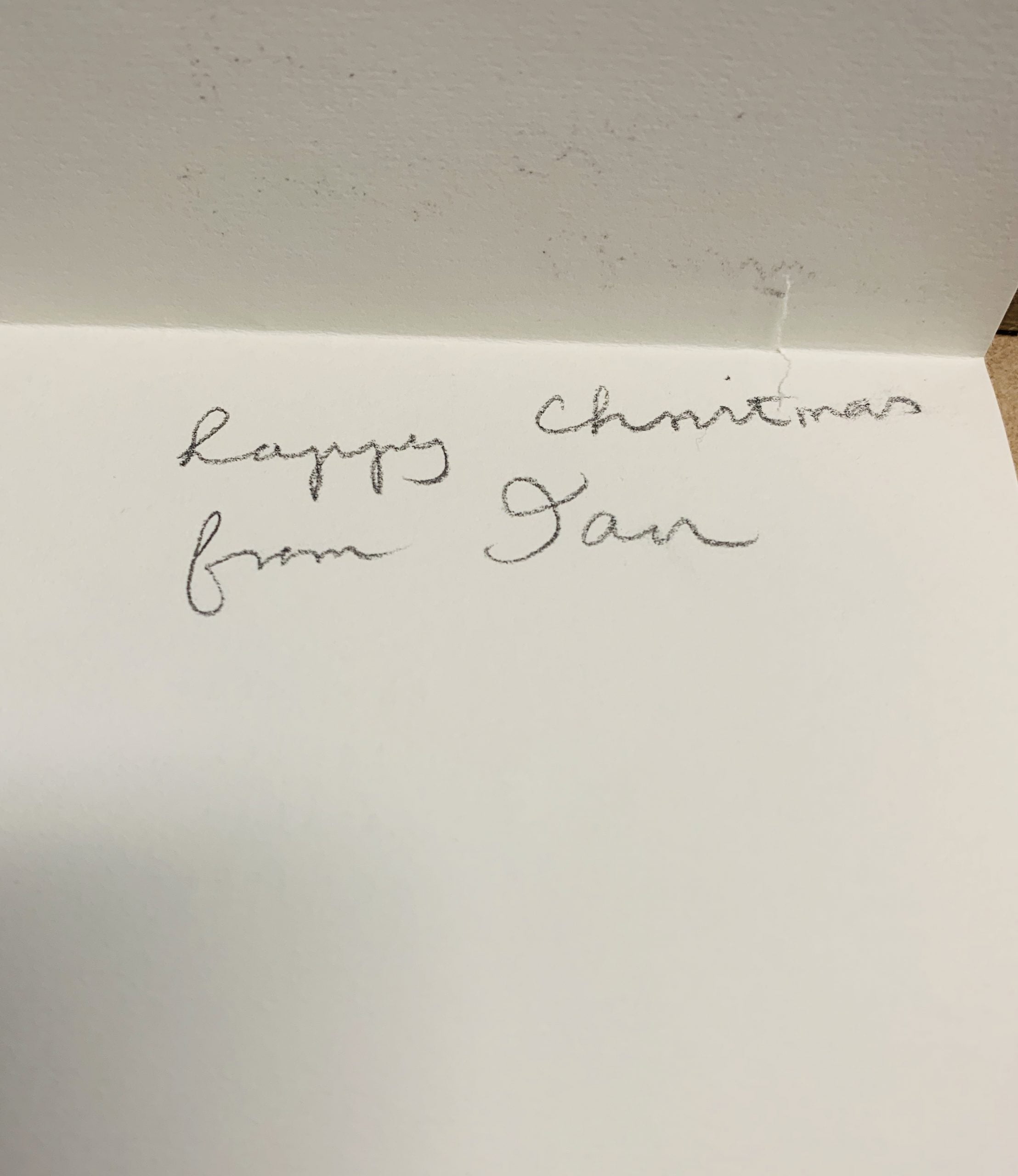
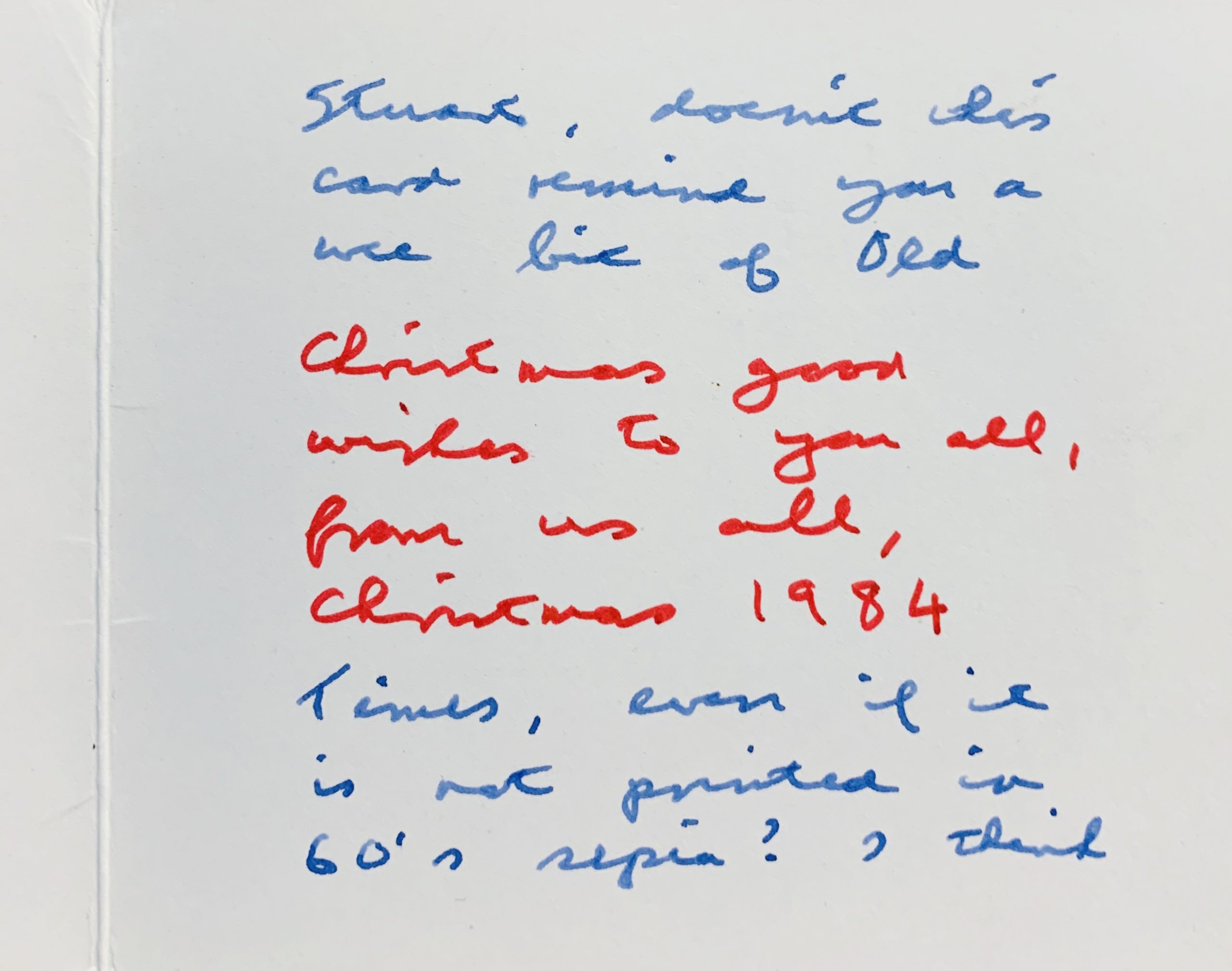
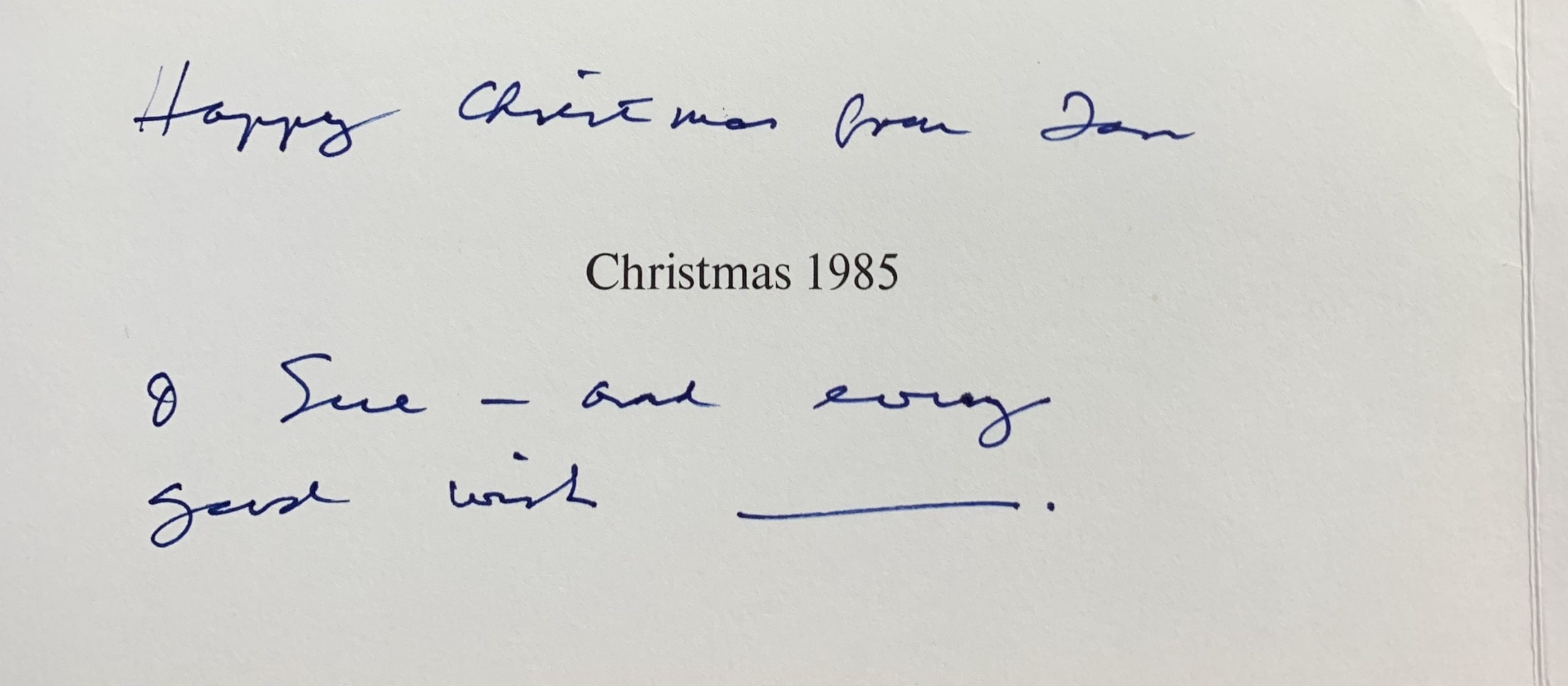
The text references the format of newspaper headlines (which Finlay used in several early postcard and bookworks) and suggests the unlikely idea of circulating fish found near a long strip of land which when opened reveals the season's greetings. This card is not found in any catalogue raisonne and is very rare. This example has a handwritten and signed greeting from Finlay.
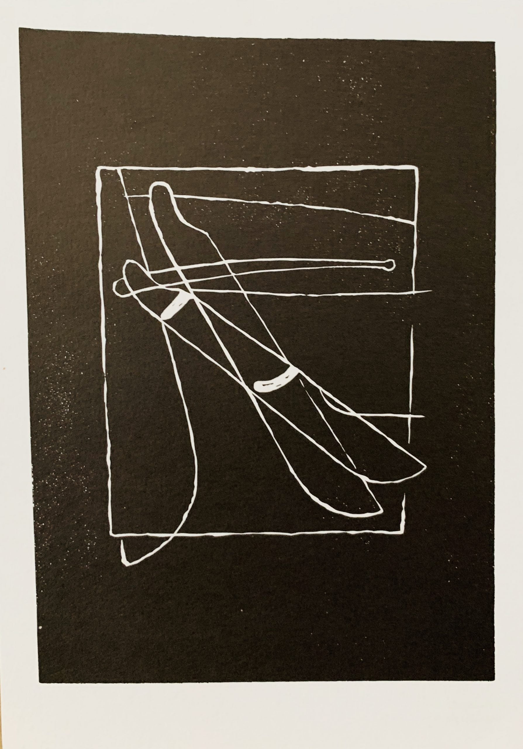
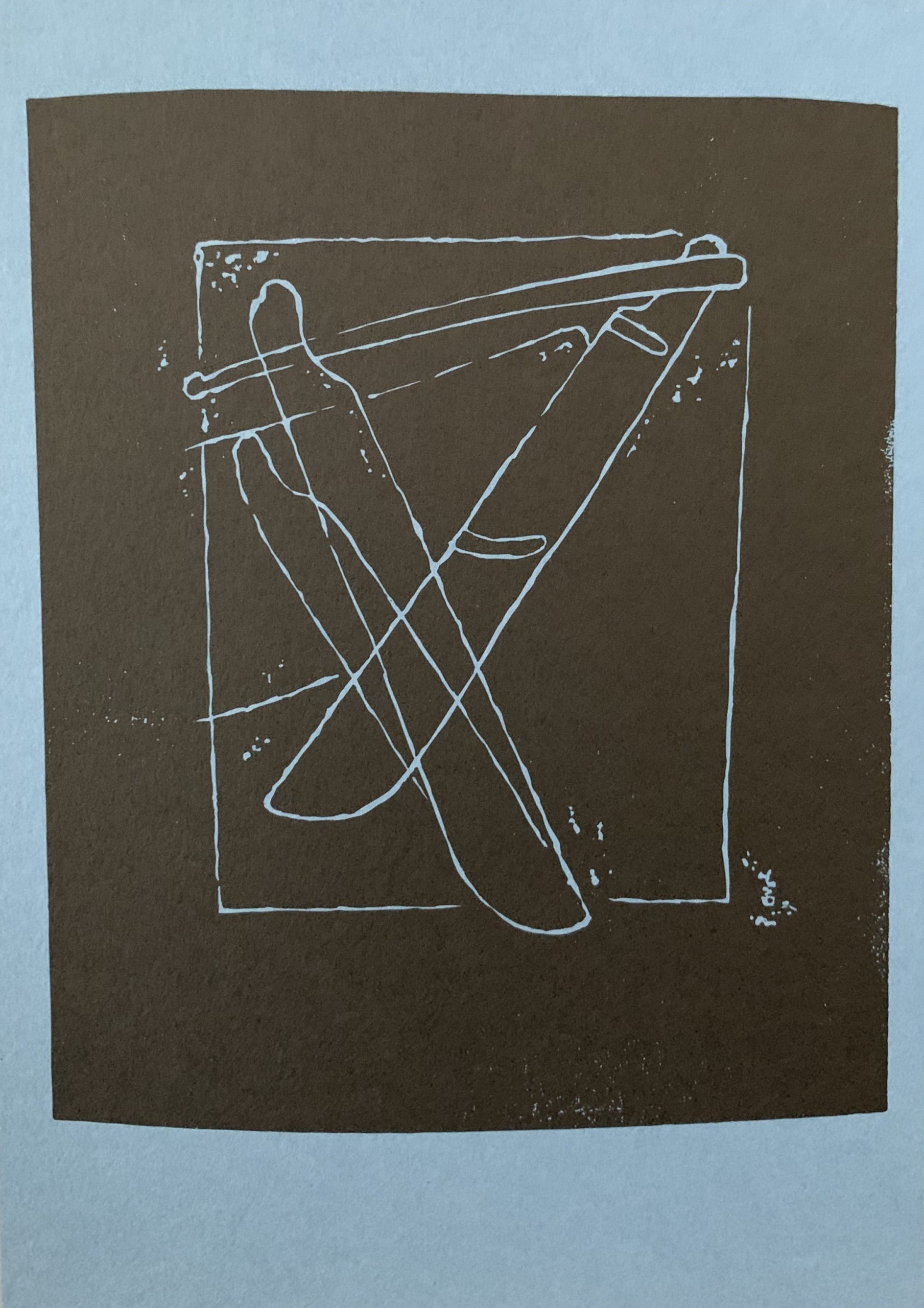
15.5 x 10cm, 4pp (asymmetric fold). Black on yellow card.
One of Finlay’s most early of concrete works, this Xmas card has the two texts printed in such a manner that the overlapping front of the card reads LAPPY ISTHMUS FISHES but when opened HAPPY CHRISTMAS WISHES.
The text references the format of newspaper headlines (which Finlay used in several early postcard and bookworks) and suggests the unlikely idea of circulating fish found near a long strip of land which when opened reveals the season's greetings. This card is not found in any catalogue raisonne and is very rare. This example has a handwritten and signed greeting from Finlay.


