STRAWBERRY HILL IN 5 VISUAL POEMS. 1986.
STRAWBERRY HILL IN 5 VISUAL POEMS. 1986.
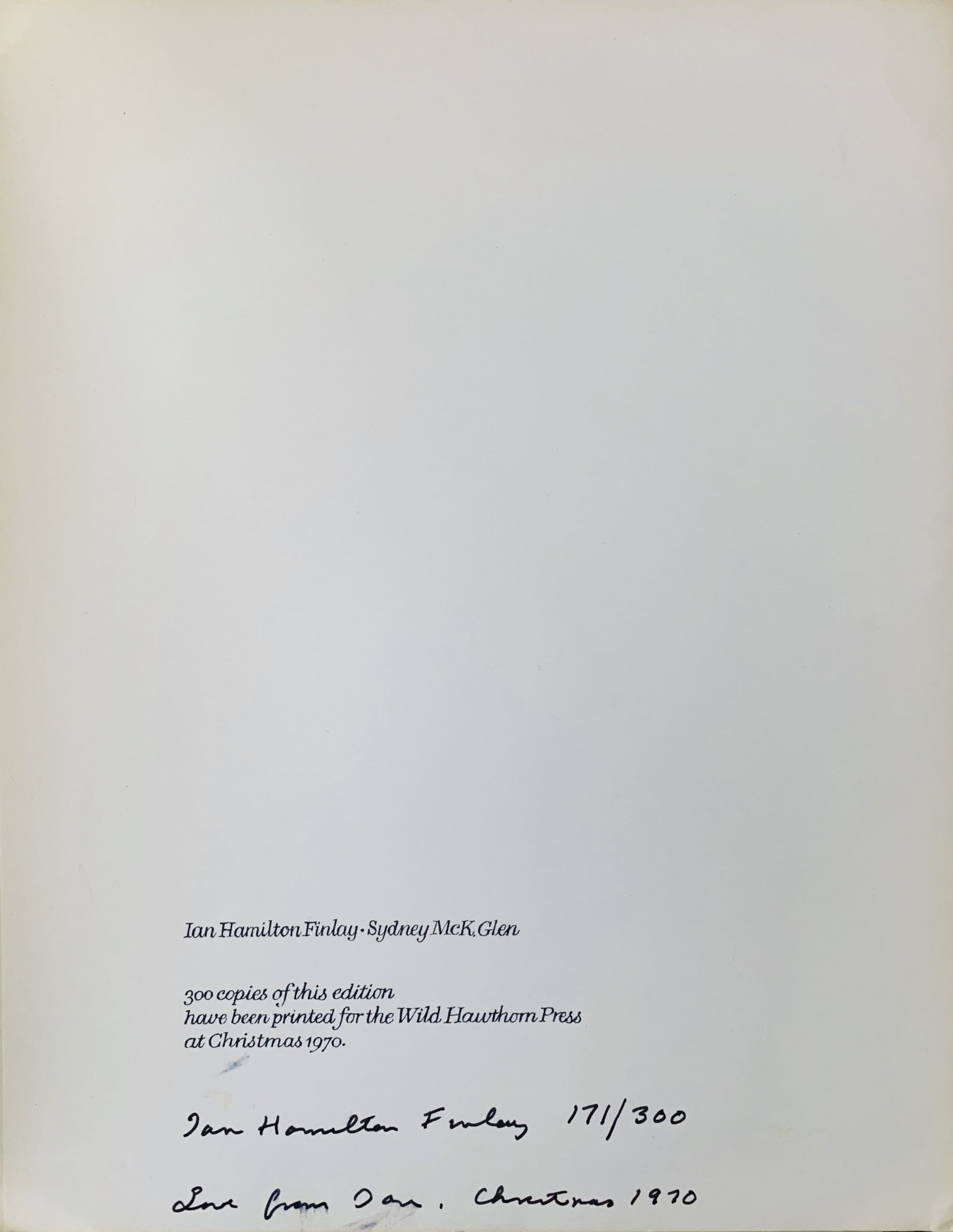
Minneapolis : Phil Gallo at the Hermetic Press, 1986
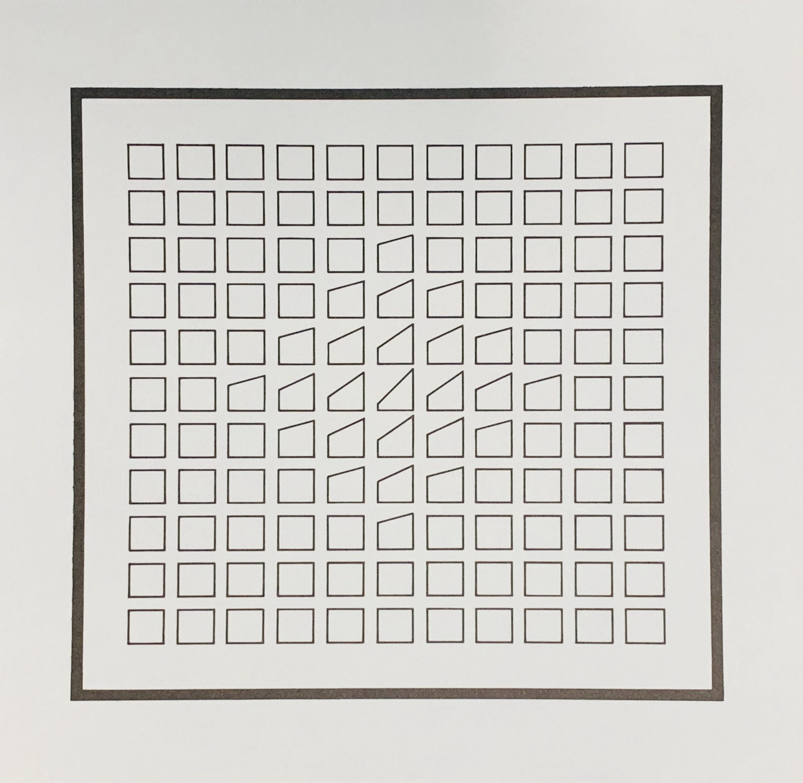
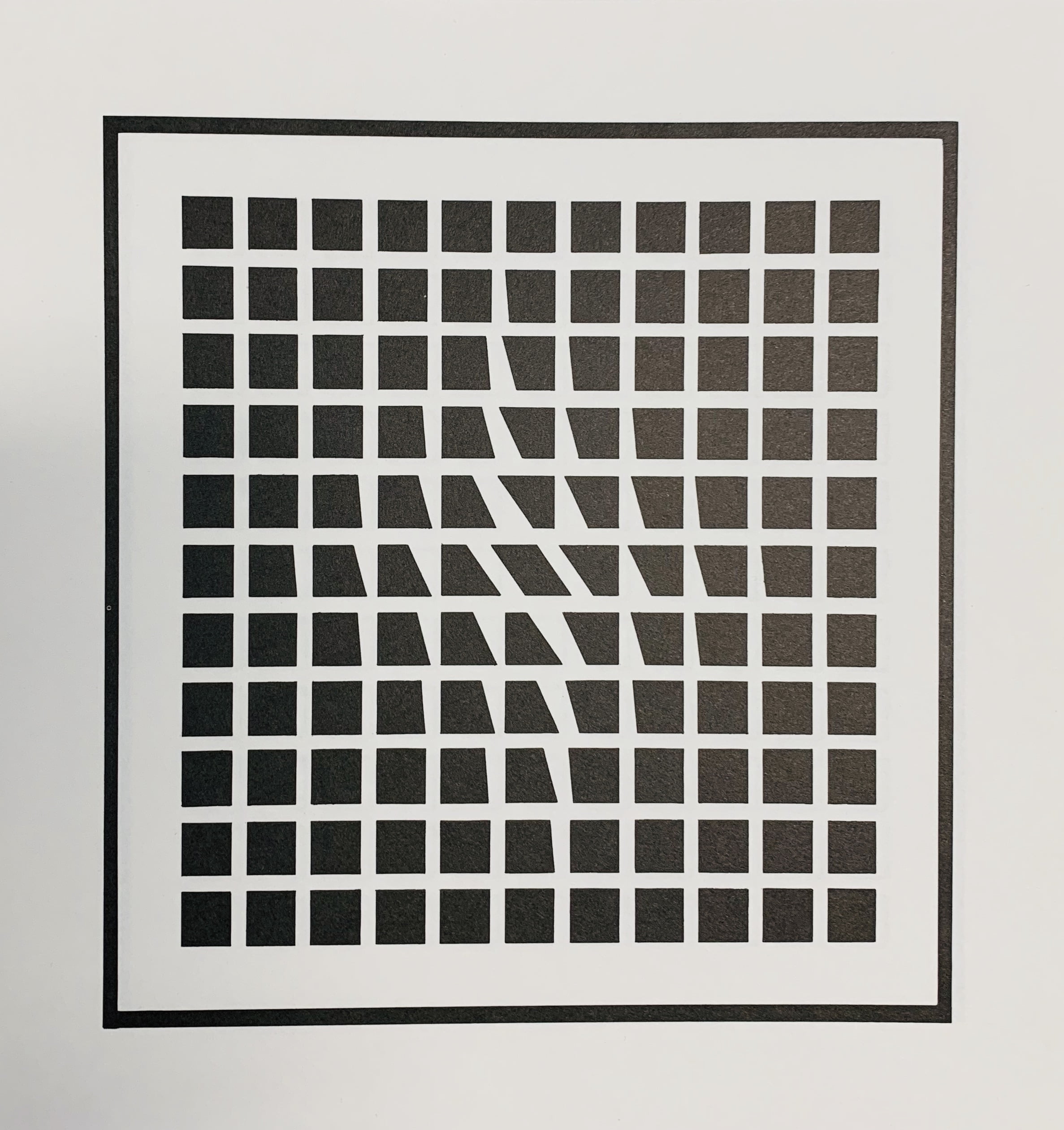
28 x 40cm, yellow printed folder in the form of an envelope content of 5 "visual poems" on various papers:
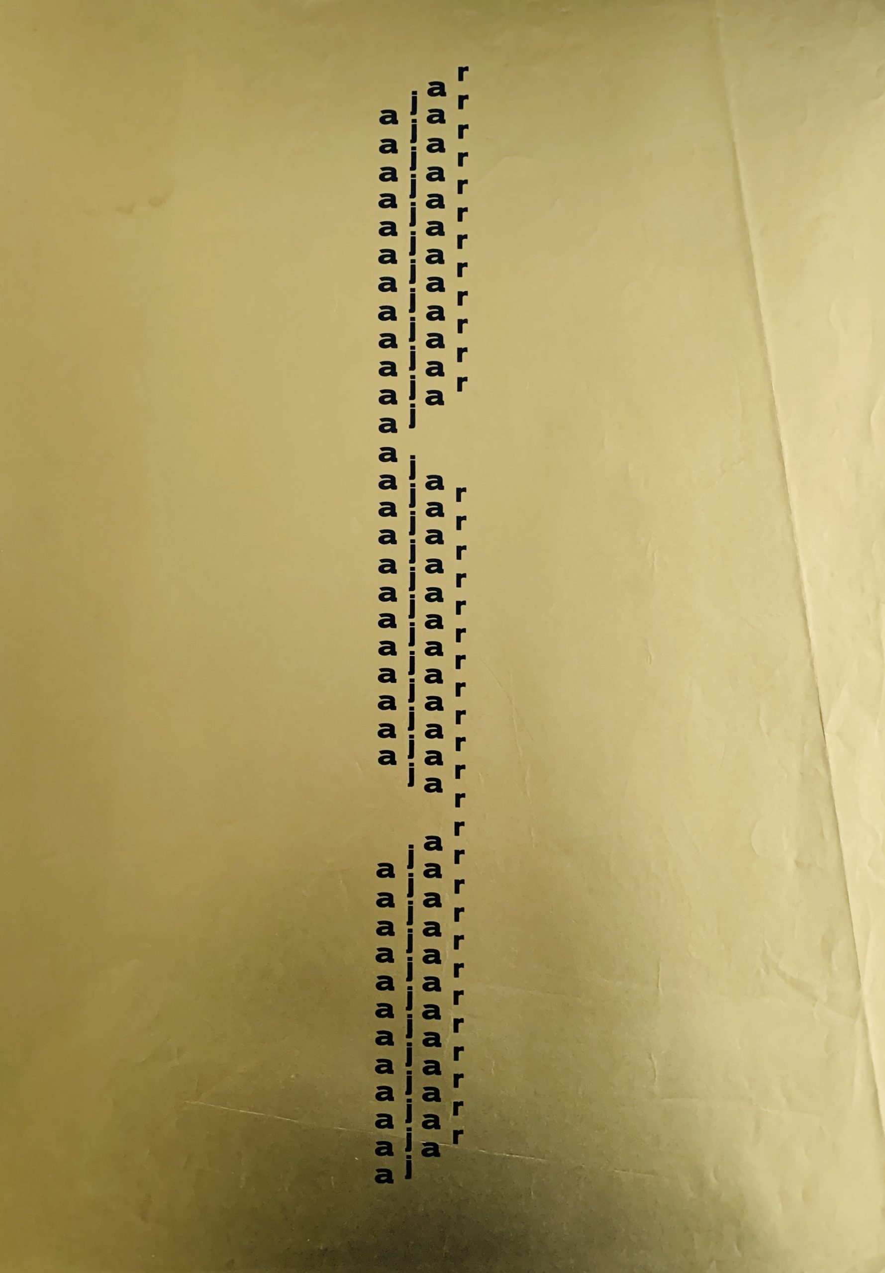
1) A Discrete Sign on the Steinway., by Jonathan Williams. One of 130 copies.
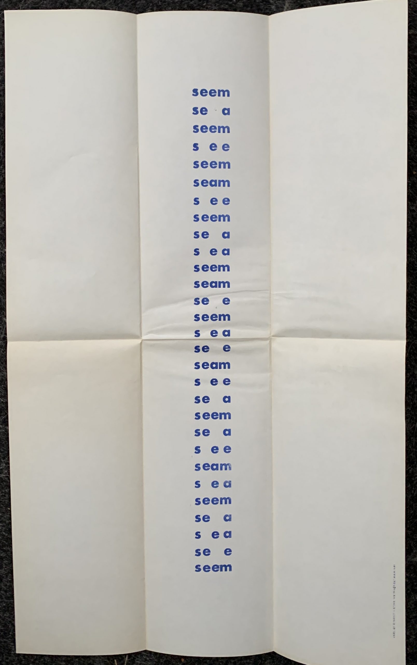
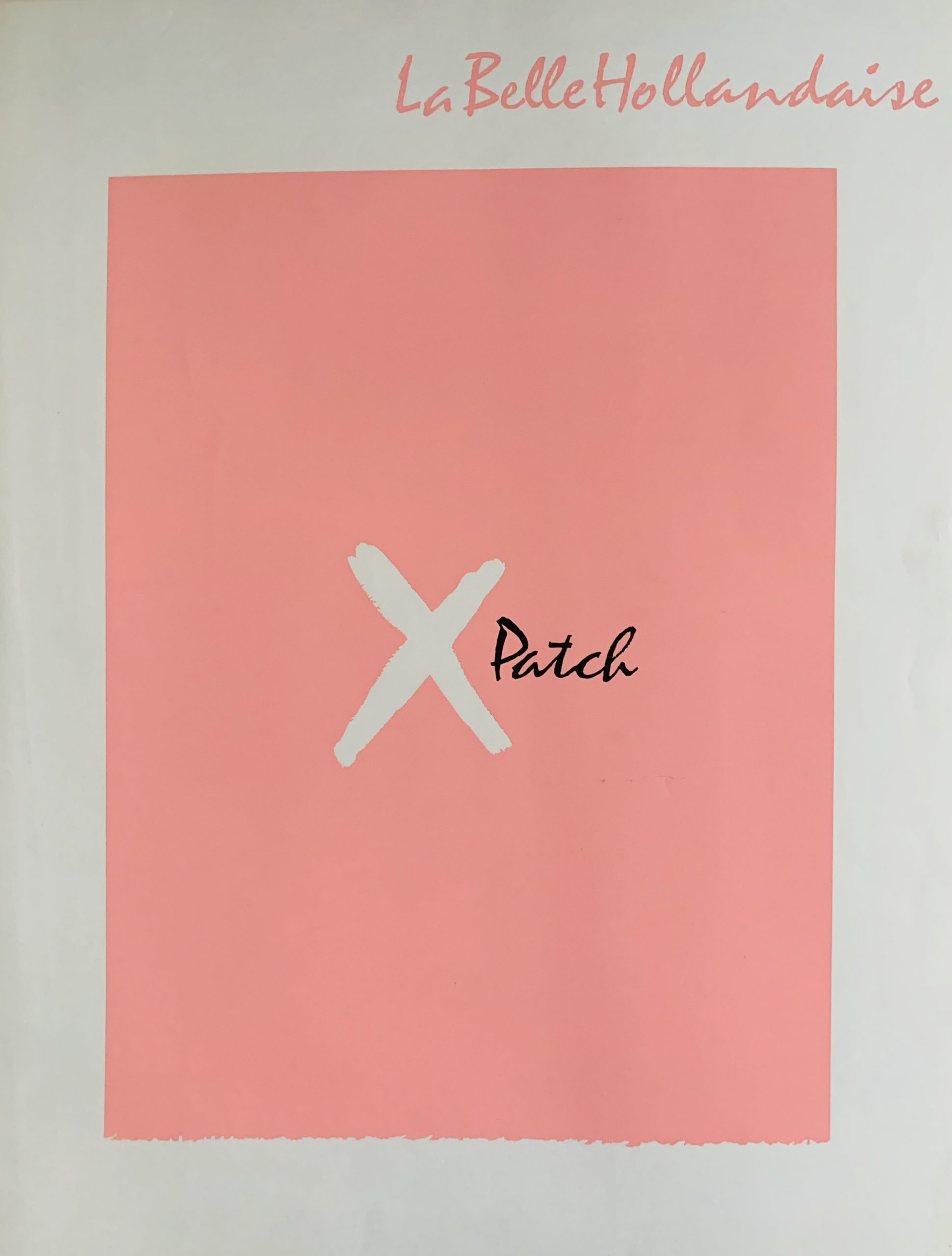
2) My Lipstick.from His Lips.To Your Teeth, by Phil Gallo, edition limited to 100 copies.
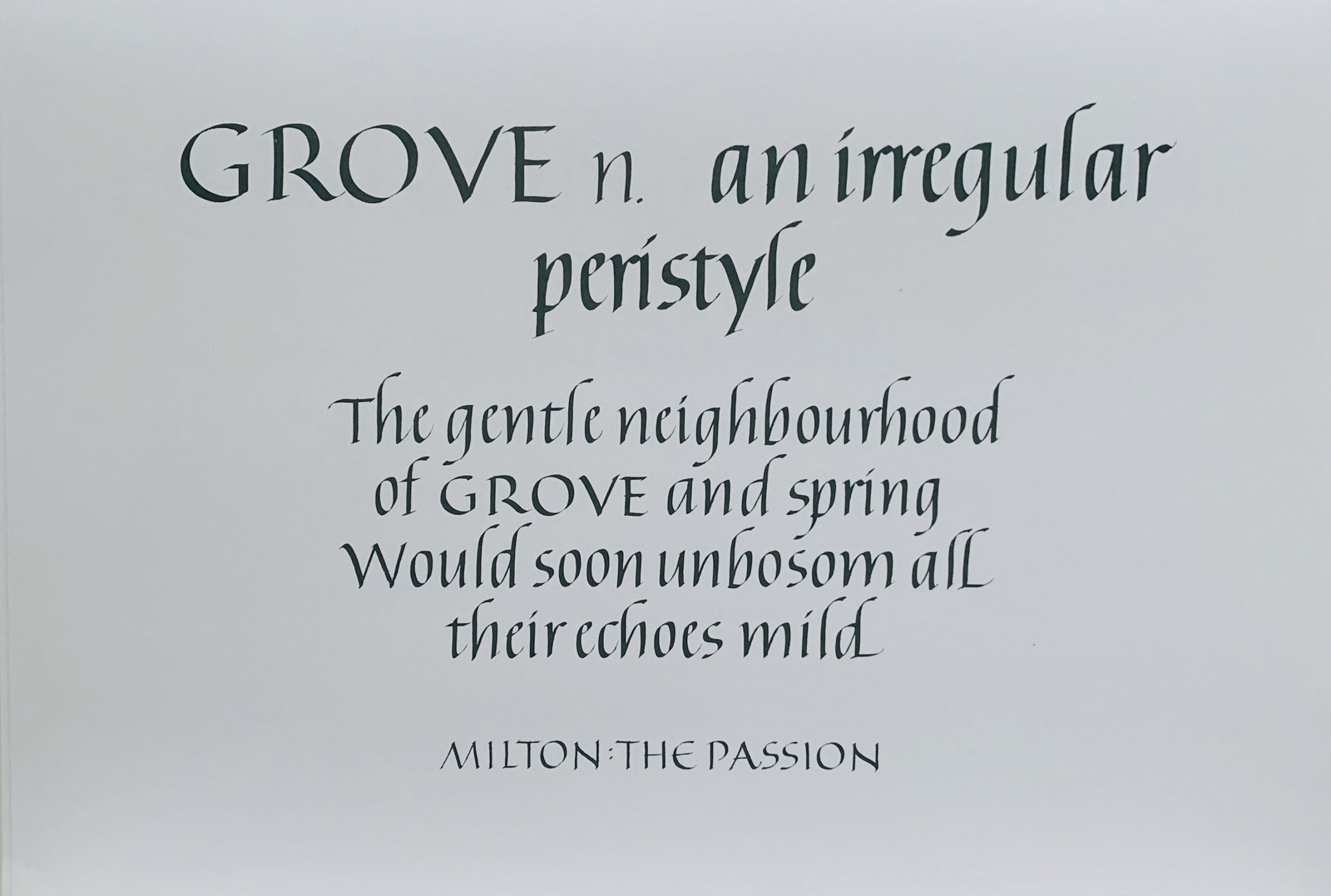
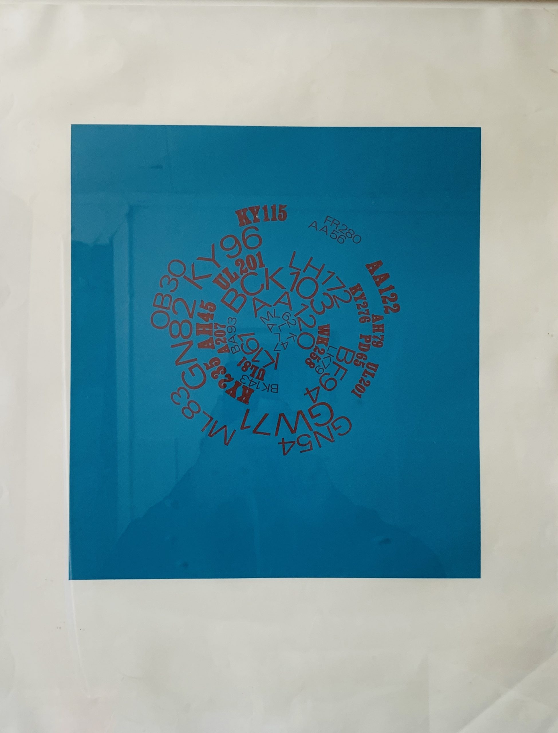
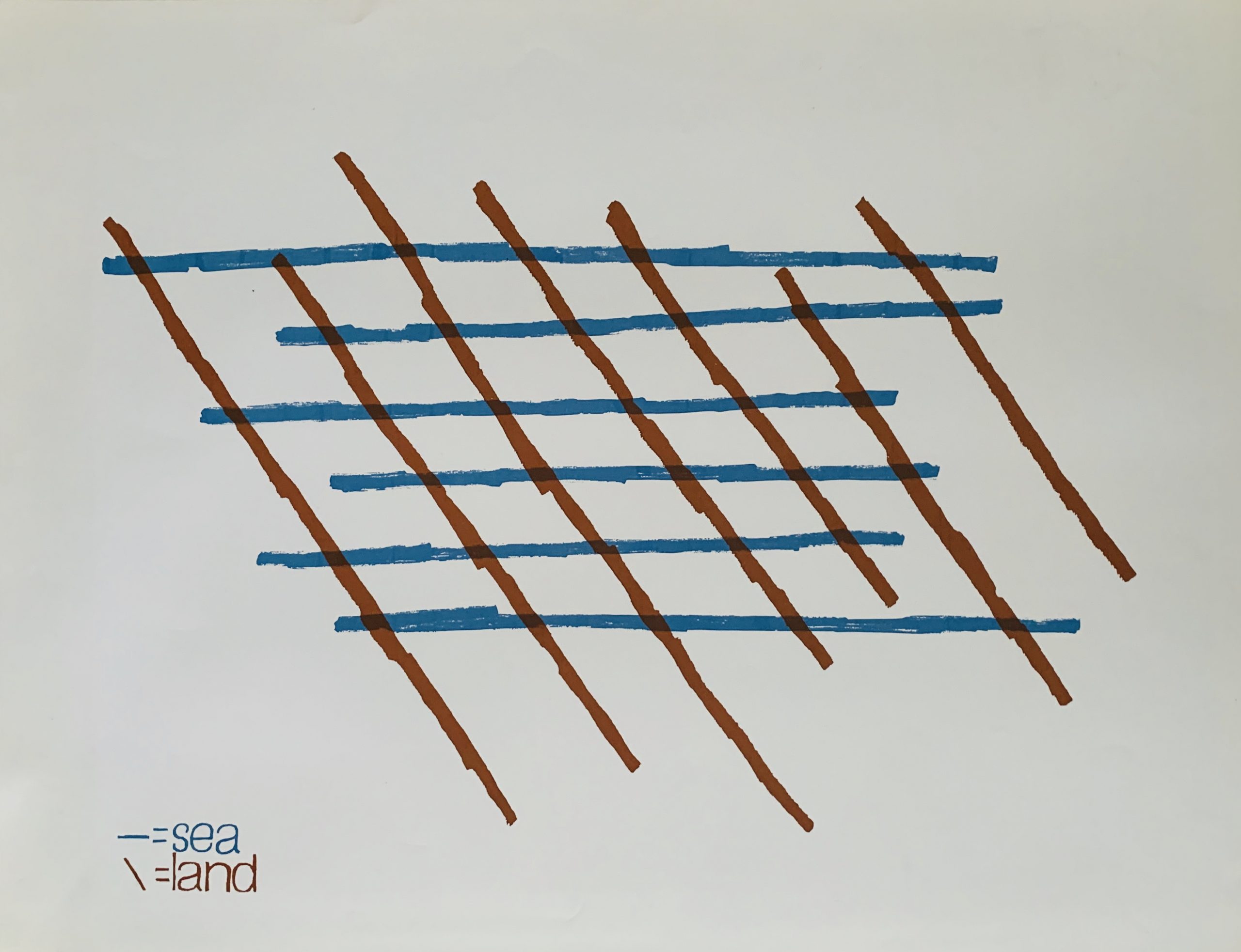
3) EMPO POEM, by Karl Kempton, edition limited to 100 copies
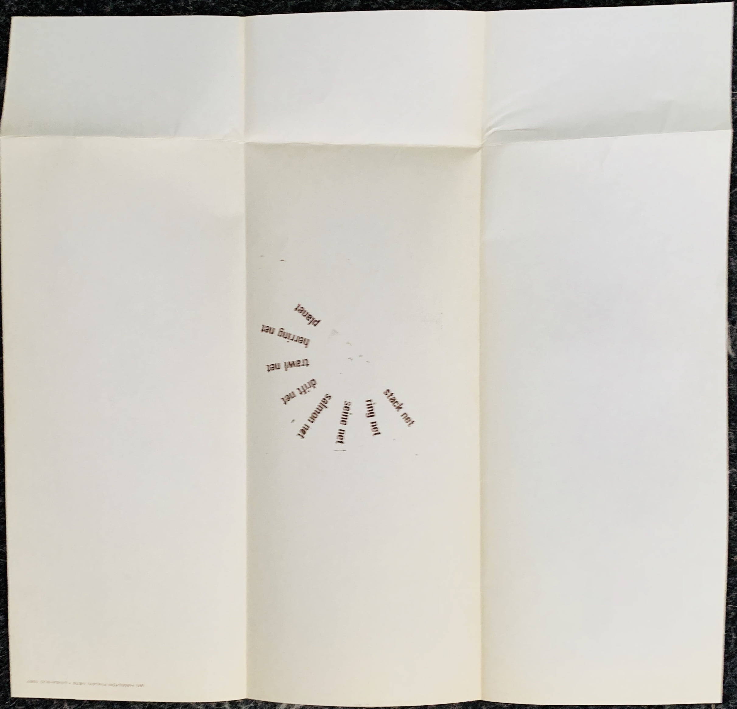
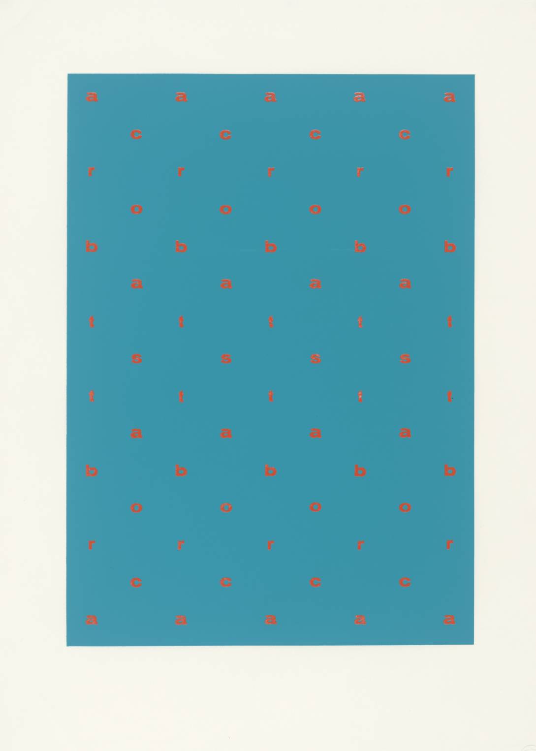
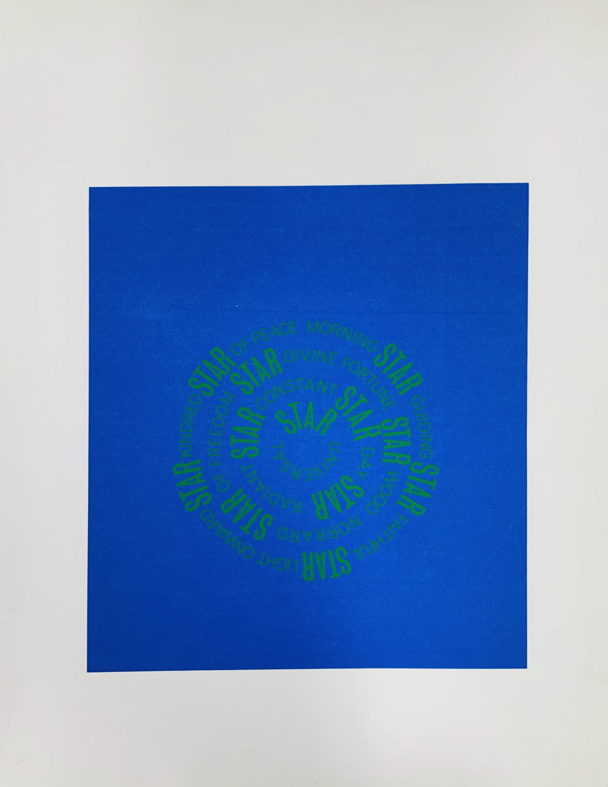
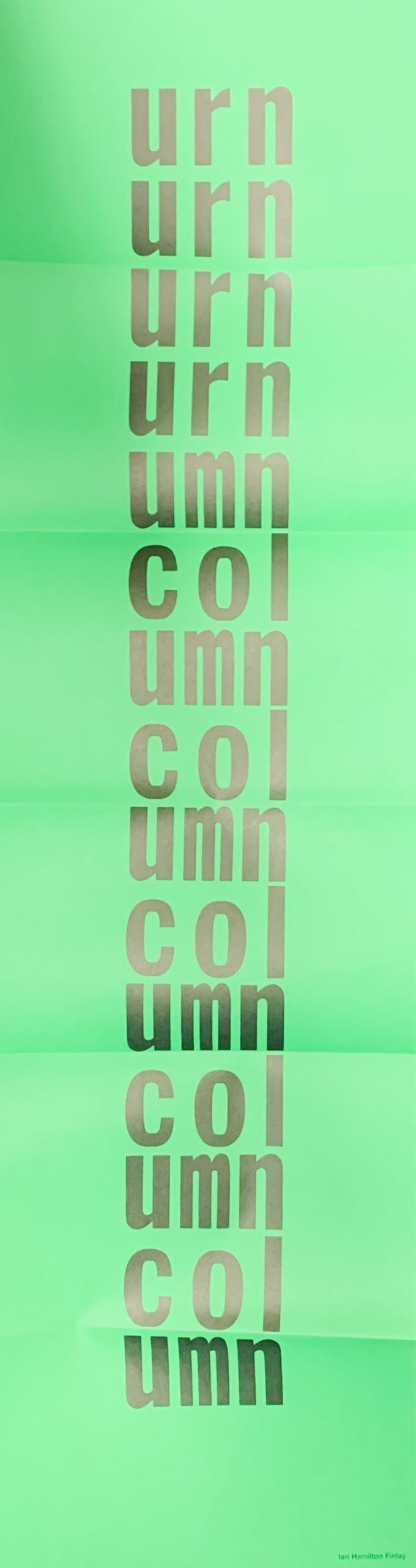
4) Language, by Scott Helmes, edition limited to 100 copies
and Finlay's contribution:
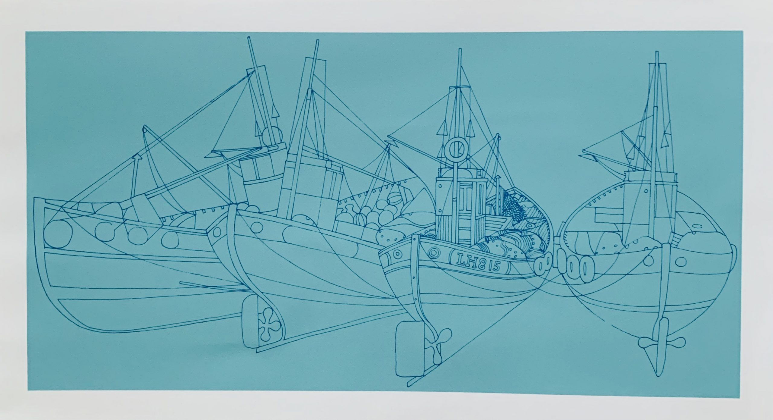
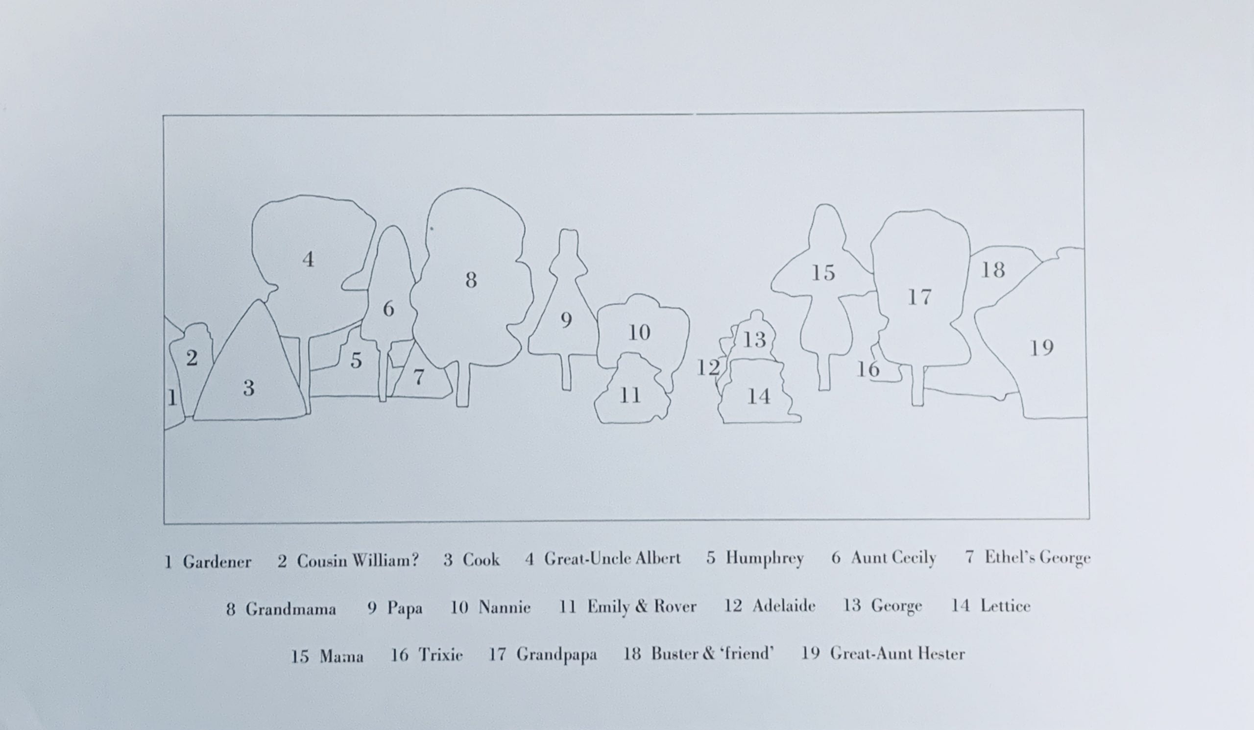
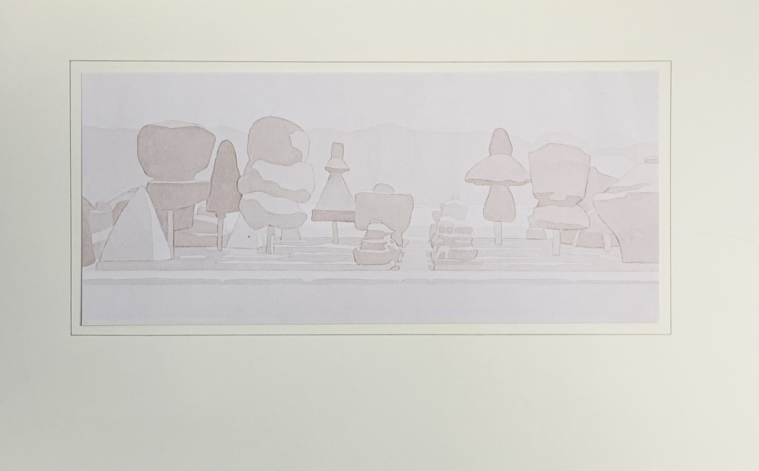
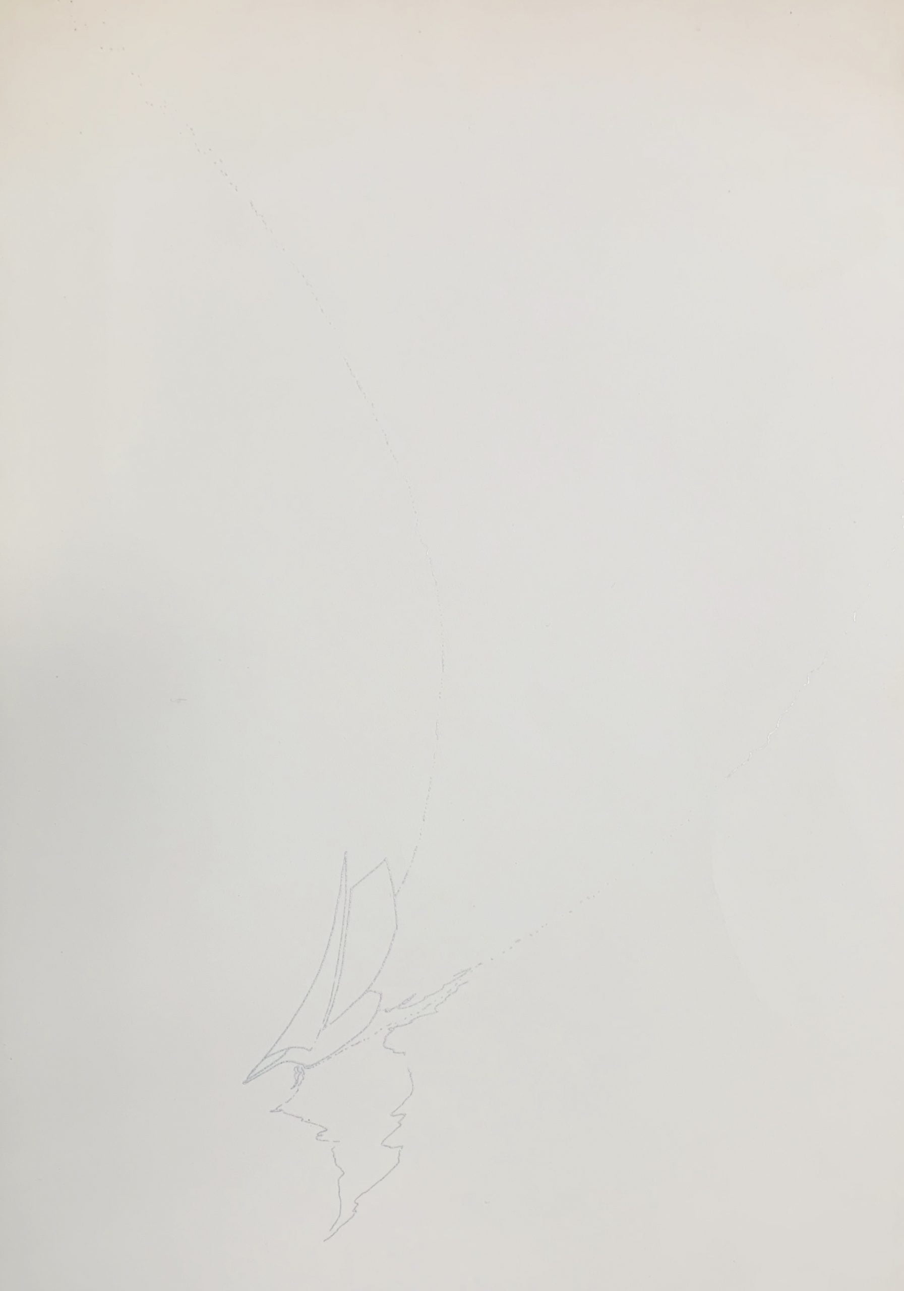
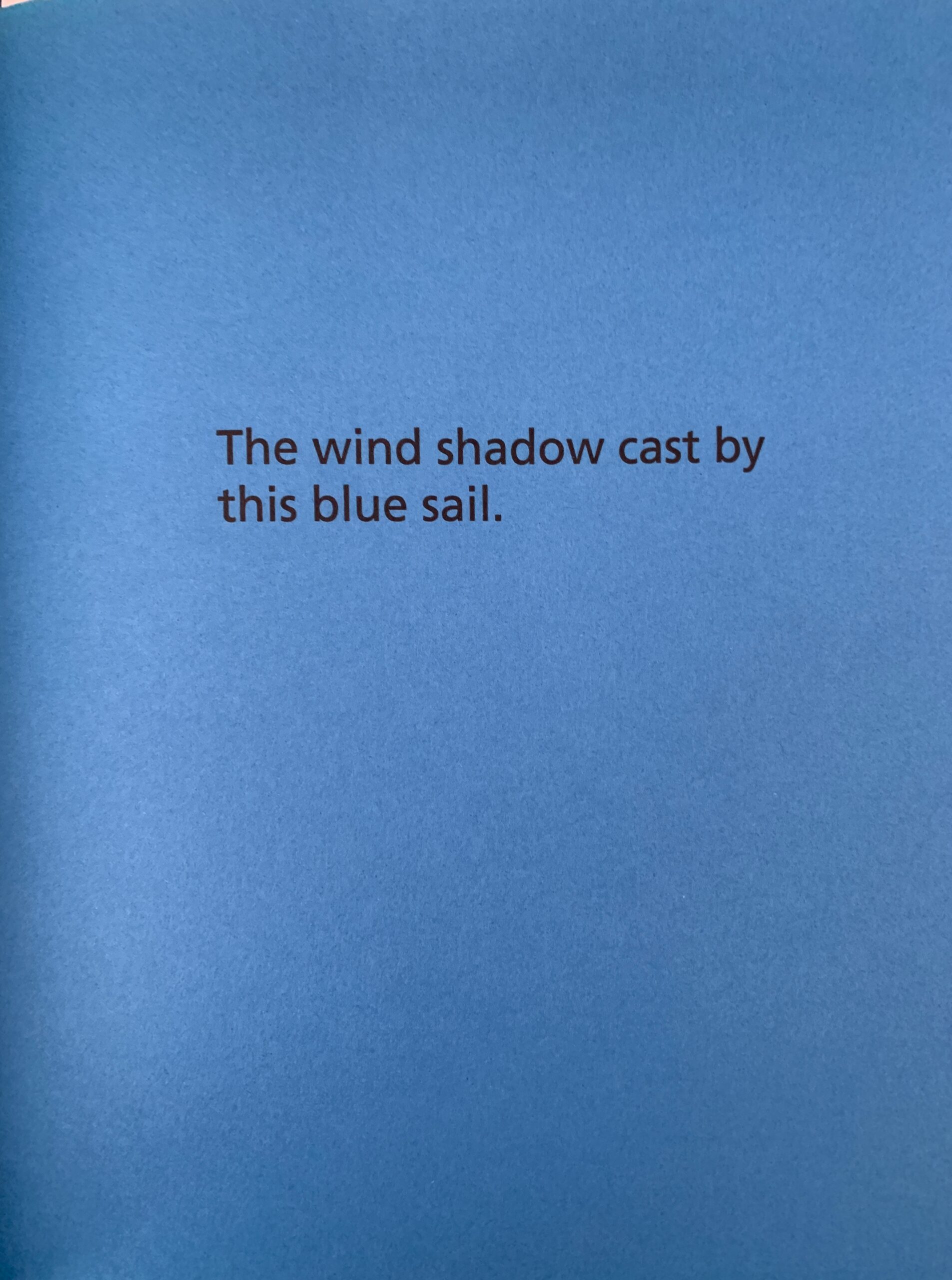
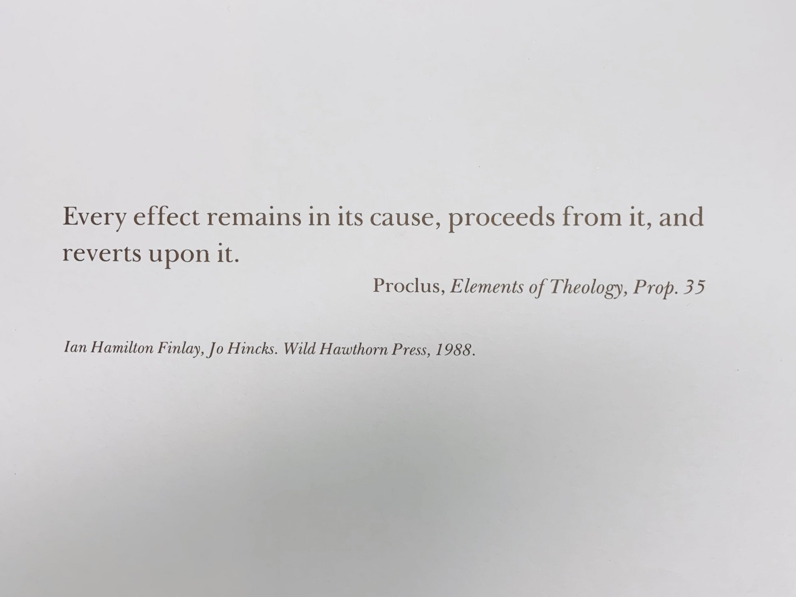
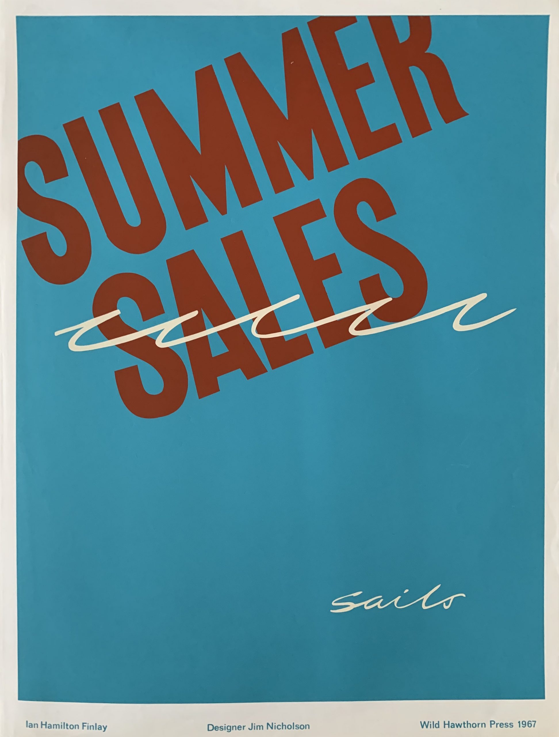
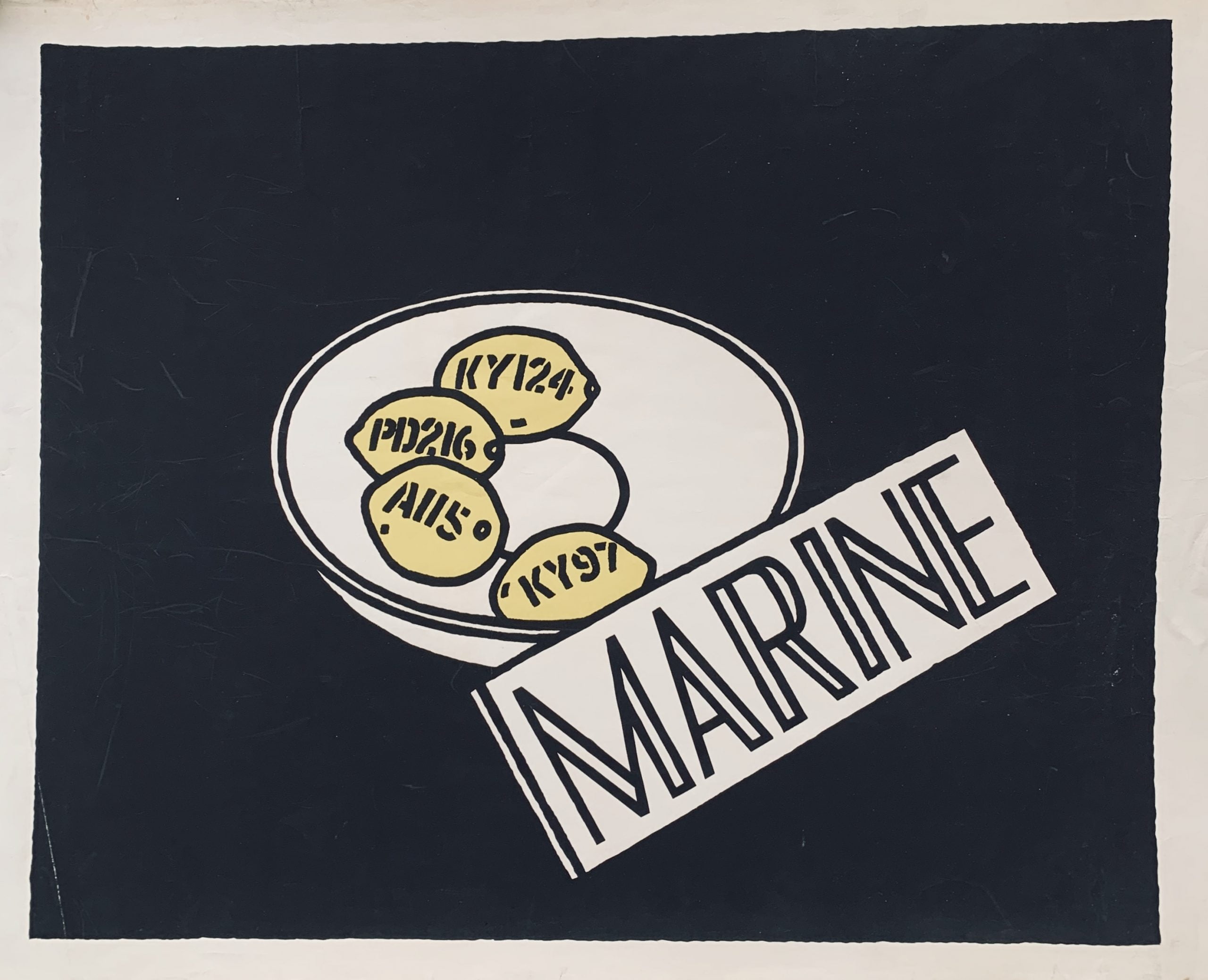
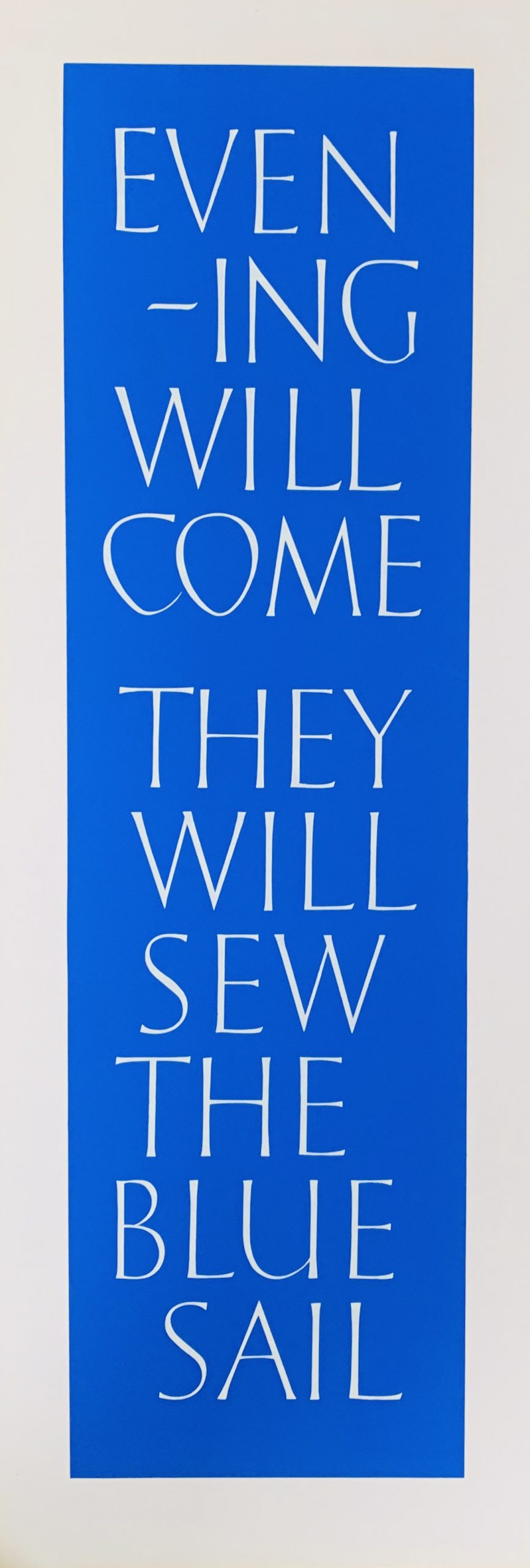
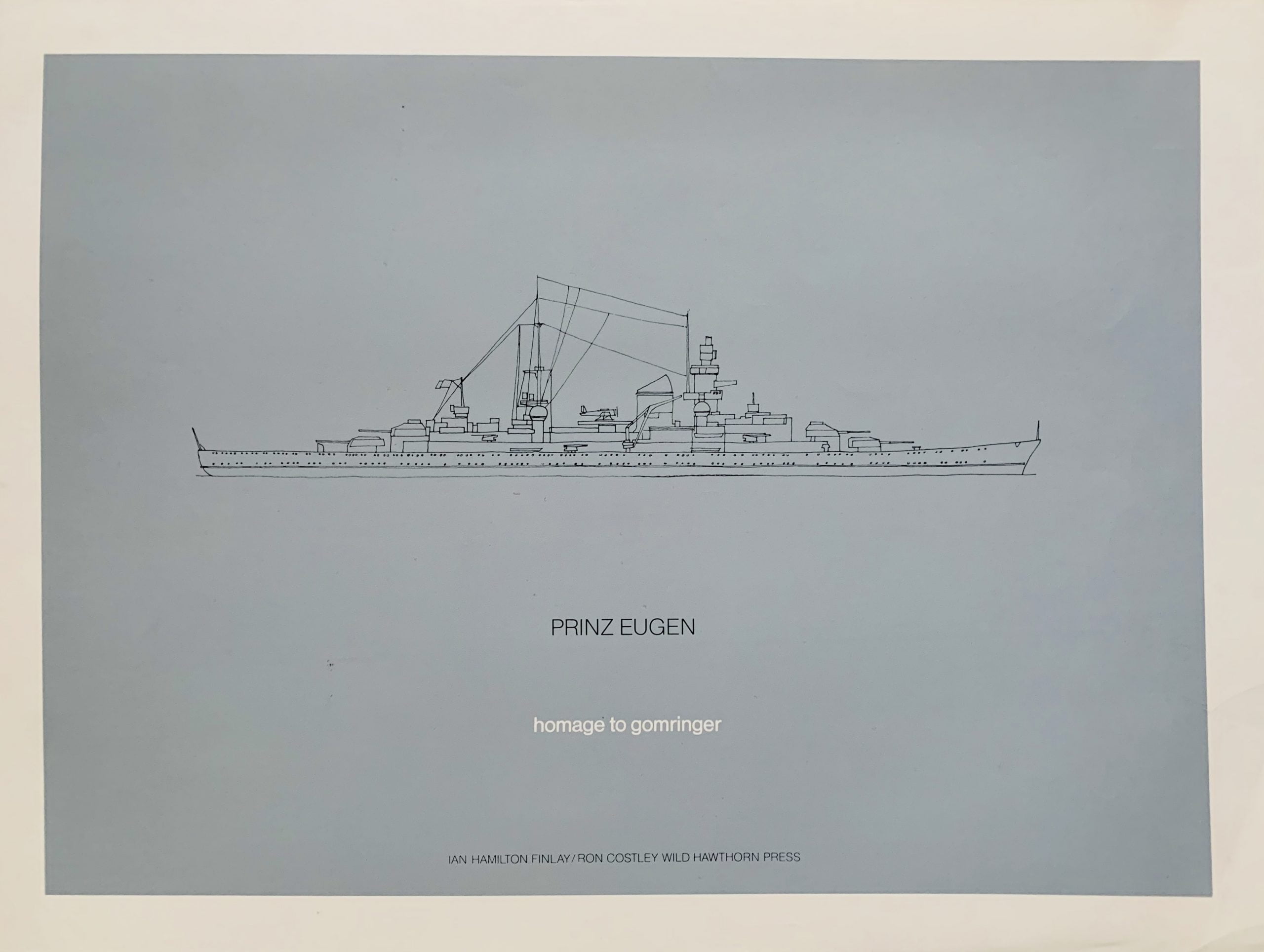
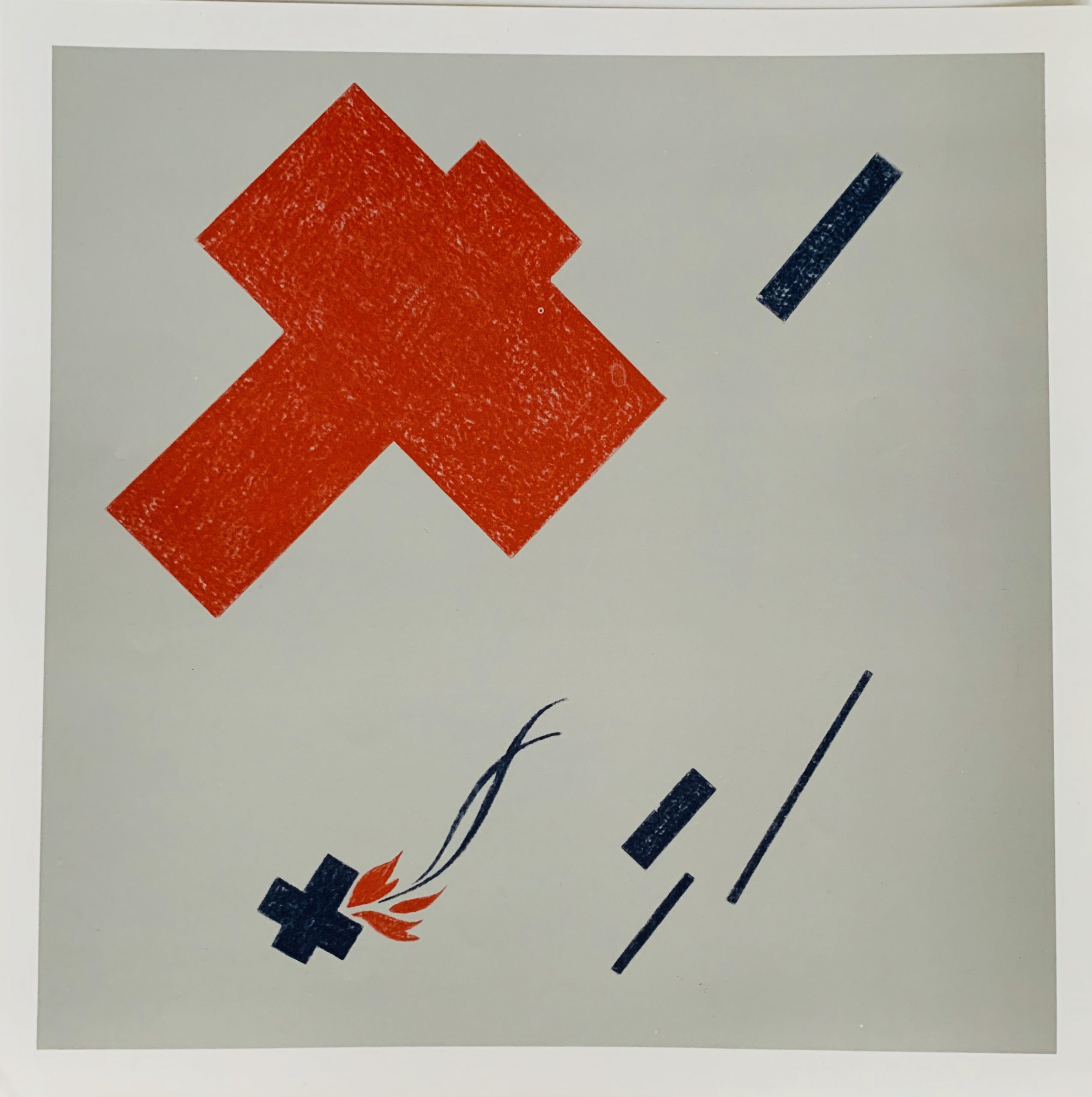
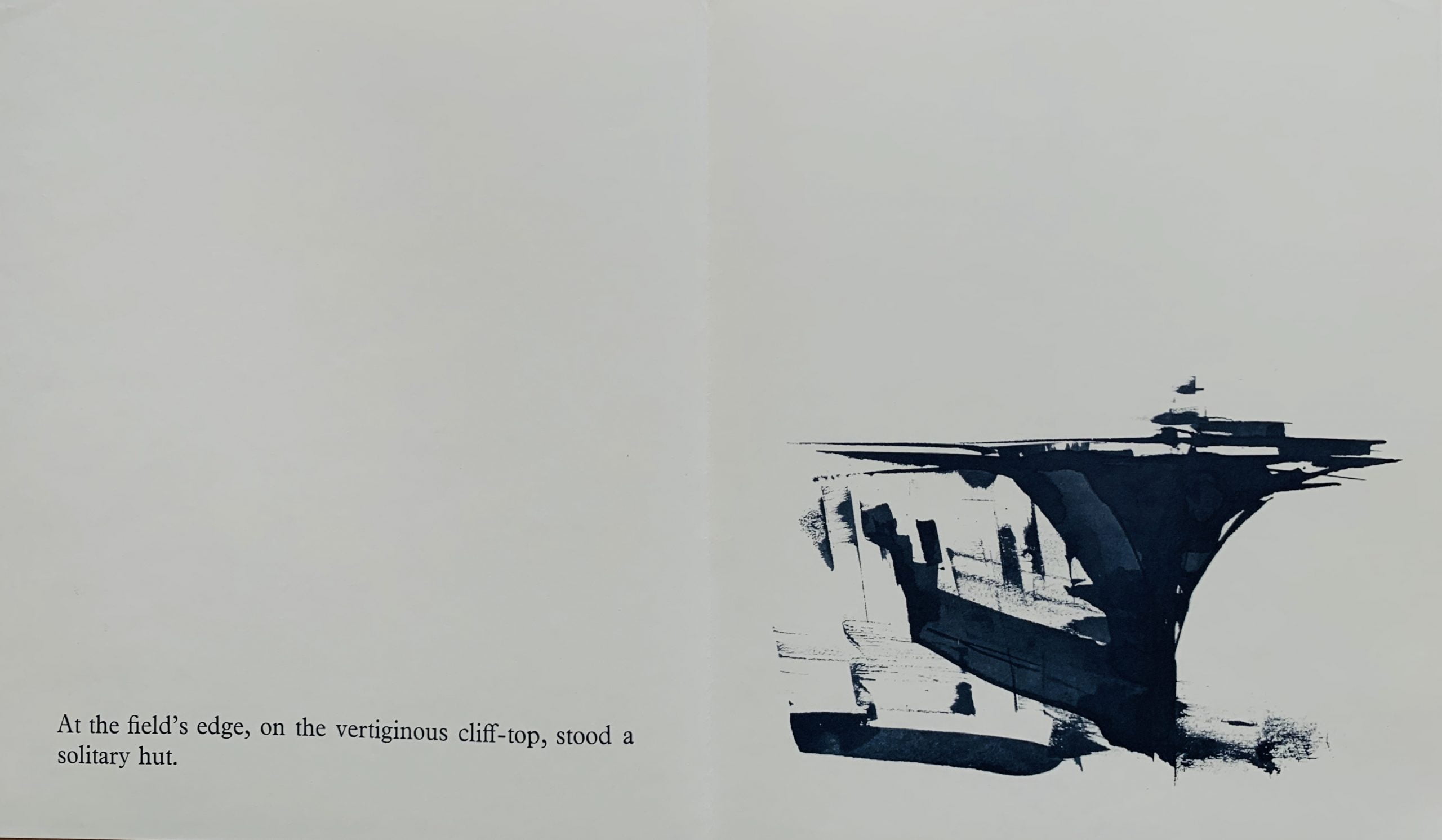
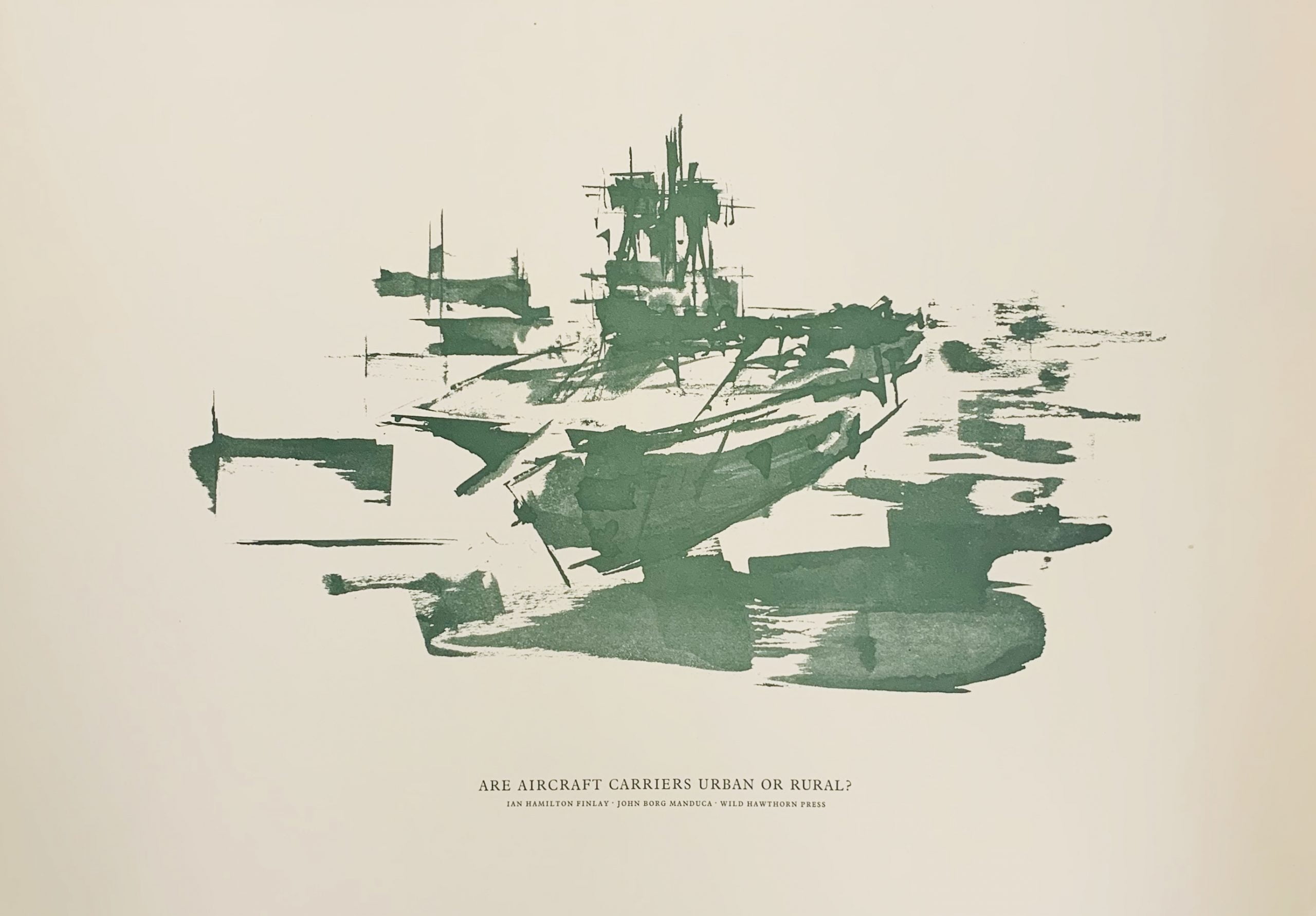
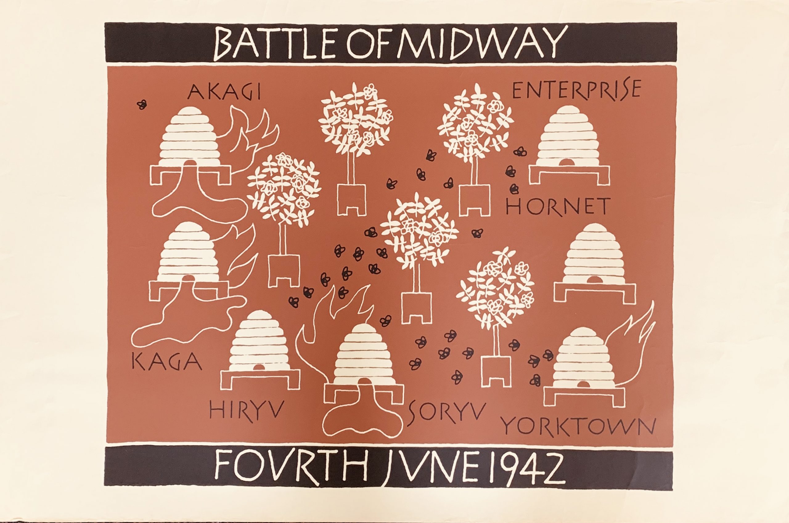
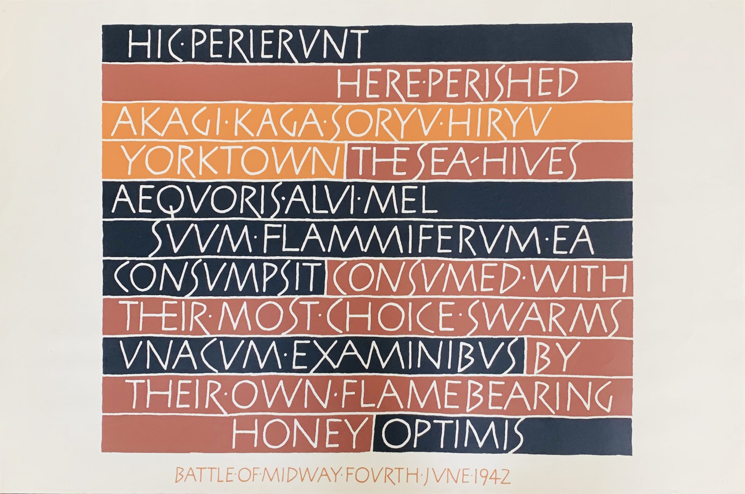
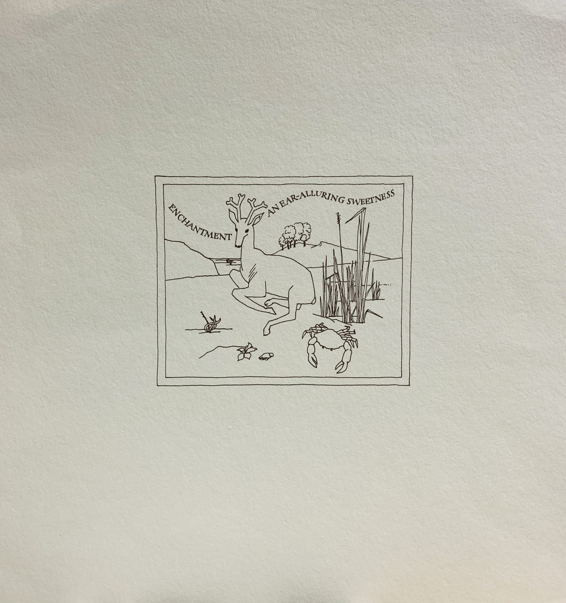
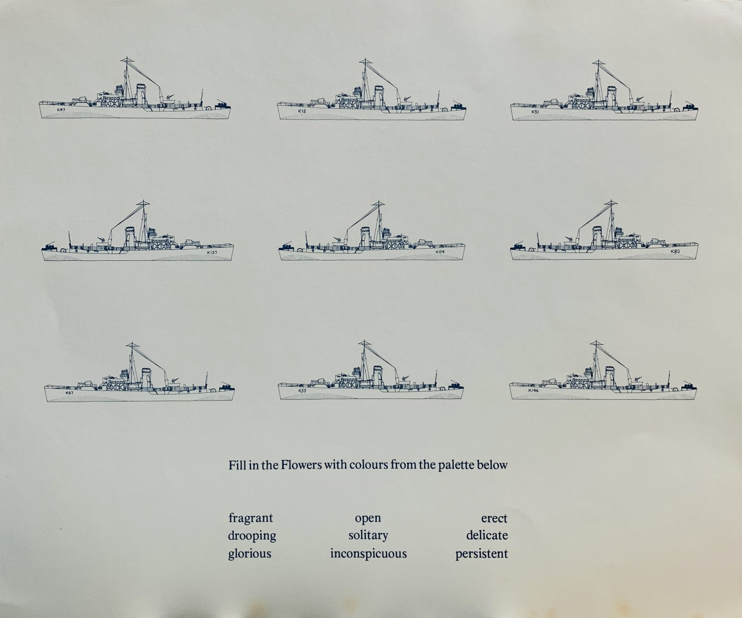
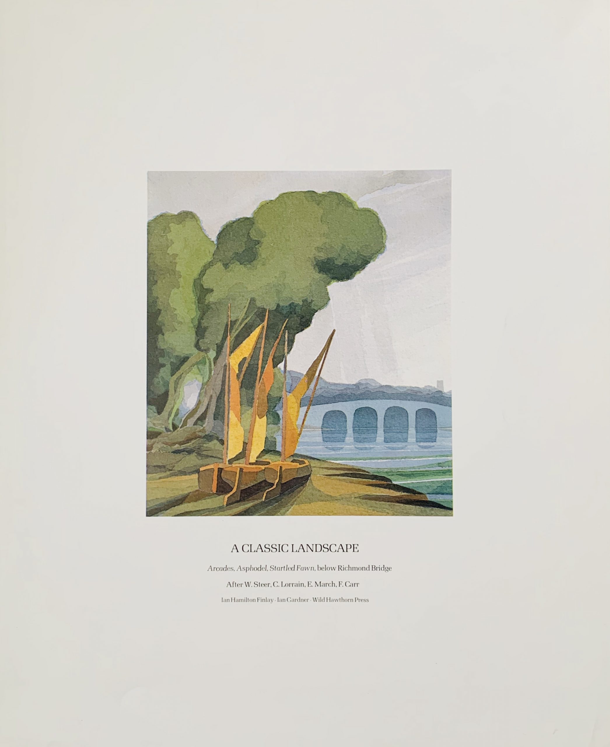
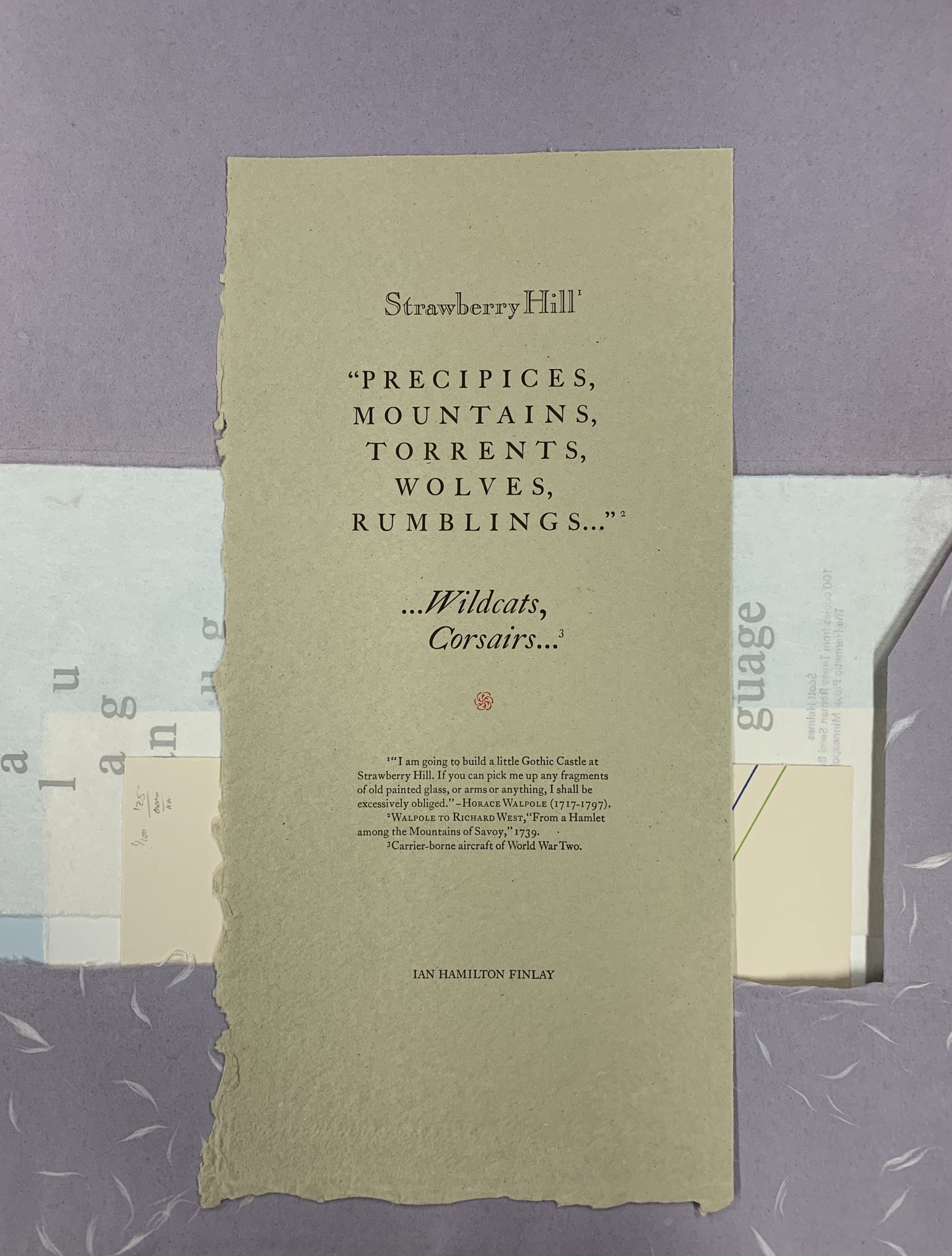
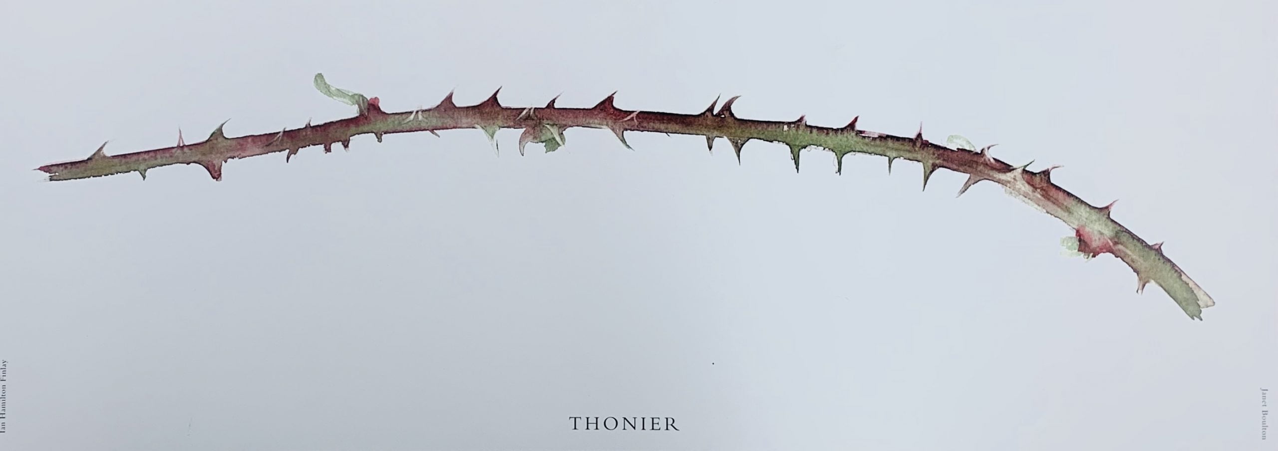
5) Strawberry Hill "Precipices, Mountains.," by Ian Hamilton Finlay, edition limited to 140 copies. 35.5 x 17cm, 1pp. The print is a letterpress on deckled paper - which quotes Horace Walpole on his intent to create a "little Gothic Castle at Strawberry Hill". Below that quotation is a further quotation from Walpole (the son of the then British Prime Minister) describing the environment on Strawberry Hill namely "Precipices, mountains, torrents, wolves, rumblings" and the below that a final pairing of "Wild cats, Corsairs..." which are the names of carrier-borne aircraft from the Second World War. Finlay seems to be comparing the wilds of Walpoles imaginings to the fires of the weapons of an aircraft carrier. A carrier after all is a wild hill on the sea.
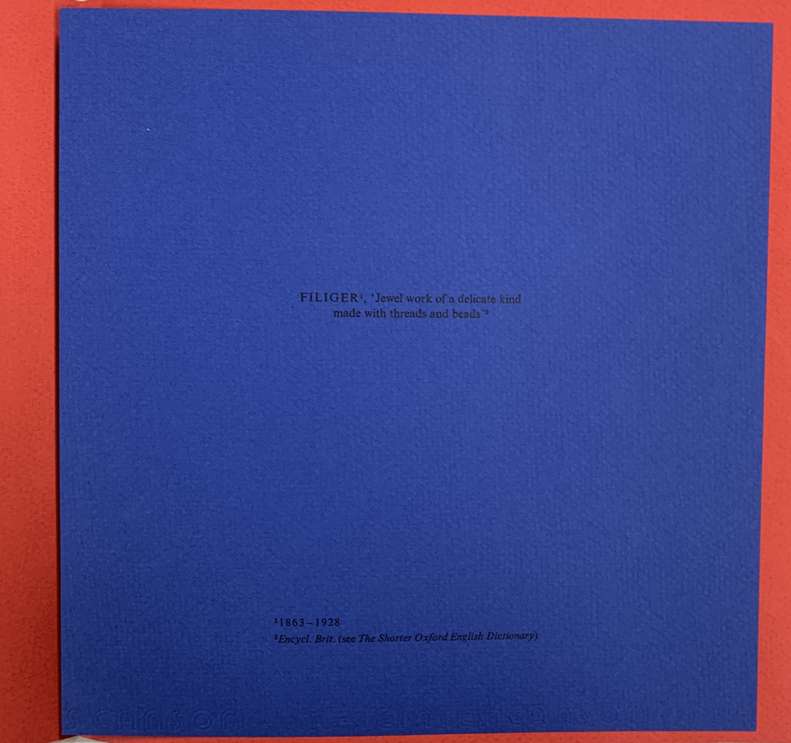
This is one of two colour variants of the outer envelope - there was also a light green version.
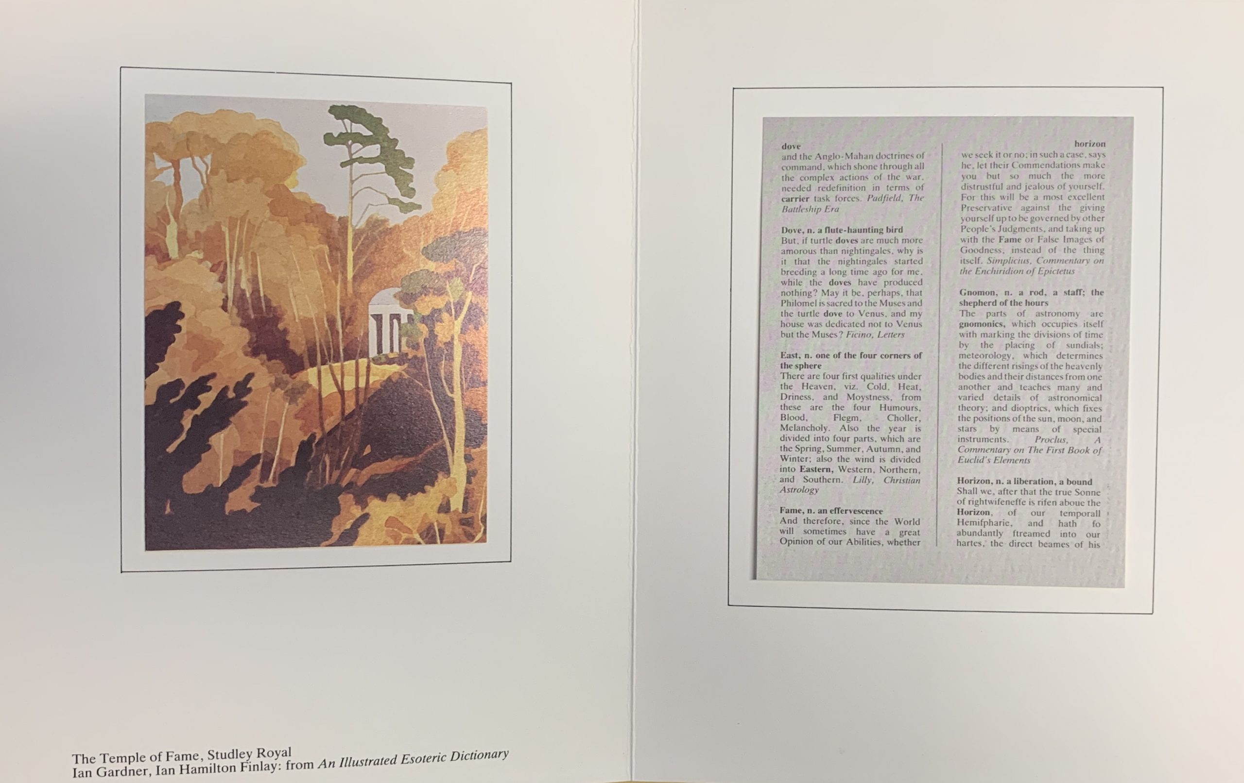
Wikipedia explains that "Strawberry Hill House—often called simply Strawberry Hill—is the Gothic Revival villa that was built in Twickenham, London by Horace Walpole from 1749 onward. It is the type example of the "Strawberry Hill Gothic" style of architecture, and it prefigured the nineteenth-century Gothic Revival." Walpole was also the author of ‘The Castle of Otranto’, the world’s first Gothic novel. Finlay's work might be seen as a word picture of Gothic landscape.


