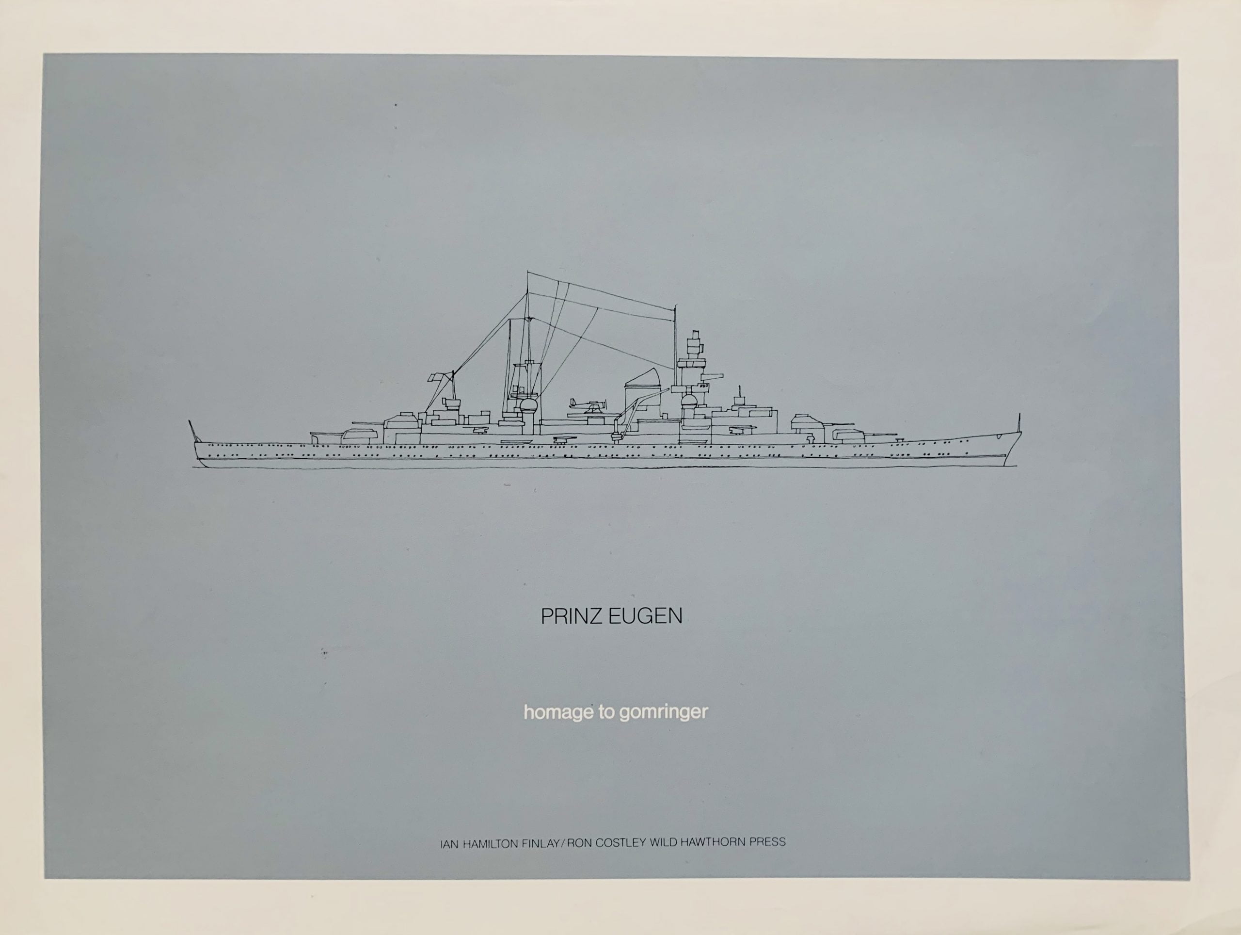
Dunsyre: Wild Hawthorn Press, 1972
38 x 51cm black on grey silkscreen with a drawing of the Nazi Admiral Hipper-class heavy cruiser Prinz Eugen by Ron Costley. Prinz Eugen served with Nazi Germany's Kriegsmarine during World War II.
The work is a "homage" to the concrete poet Eugen Gomringer - and by the correspondence of the entitled ship with the artist, FInlay is suggesting Gomringer is a prince amongst poets. One of 300 signed and numbered prints.

...

Dunsyre: Wild Hawthorn Press, 1972
5.4 x 17.6cm, 6pp (single paper sheet printed one side only), the image is a b/w photograph by Dianne Tammes of a tree branch above a stream over laid with the title words - BLUE/WATERS/BARK. "Blue water" is a term usually used to mean deep ocean but here the water is shallow. The addition of the word bark indicates "surface" - hence a shallow stream is the "bark/surface" of a deeper sea. VG+.

...

Dunsyre: Wild Hawthorn Press, 1972
13.5 x 16cm, 2pp - Gardner's drawing of an old fashioned cast metal iron on its side references the sinking of the civil war "Iron Ship" Monitor 16 miles off Cape Hatteras with the loss of sixteen men. Paintings of the ship show it floundering on its side before going down. VG+

...

Dunsyre: Wild Hawthorn Press, 1972
22.5 x 15cm, 2pp - three colour screenprint with a drawing of sails by Ian Gardner on the front. Brown, and blue are colour associated with Wittgenstein's famous books which discuss the role of context in the understanding of language ("language games") and by extension signifiers such as a drawing. Famously Wittgenstein noted an ambiguous drawing such as the famous rabbit/duck was an example of "seeing that" versus "seeing as".
Here the abstract painting of a sail can also be seen as a river passing through the land to reach the sea. Deeper than one might imagine on first viewing this was also Finlay's largest silkscreen card. VG+

...

Dunsyre: Wild Hawthorn Press, 1972
10.5 x 15cm, 2pp - three colour screenprint with images of the Olympic rings on the two colour background red and blue. Design by Costley after Finlay's instruction. The card is a homage to the boat builders Walter Reekie at St. Monans where "ring netters" were built (a form of bottom fishing that was found not to be quite as environmentally destructive as pulling heavier nets over the bottom as the nets were much lighter). The boats are represented here by the rings and the blue is presumably the sea and the red a setting or early morning sky. 1972 was an Olympic year so the card was (unofficially) released as part of those events although those Olympics became the most tragic in history after the terrorist attack on the Israeli athletes.
Finlay re-issued a similar card in 1996 - another Olympic yearVG+.

...

Dunsyre: Wild Hawthorn Press, 1972
45 x 18.5cm, orange silkscreen on shaped card with additional triangular card both spiral bound to create a stand-up paper sculpture that resembles a yacht with sails up. This is one of Finlay's most rare works only issued in 70 signed and numbered copies (there were blue versions of the work also). Co-designed with Ron Costley. This examplee has a very slight bend at the top else VG. Murray places this as a print but it is clearly closer to an object multiple and that is where we have catalogued it.

...

21 x 17.8, 4pp (each recto only, stapled top left). Original carbon copy of a typed letter on red Wild Hawthorn Press stationery to Christopher Carrell of the Sunderland Ceolfrith Bookshop. A long discussion of the budget and content of a putative exhibition of works by Finlay. at the MacRobert Centre at Stirling University. The original budget and size of the exhibition seems to have been reduced to Finlay's unhappiness but he is willing to continue to create new work. Interestingly the costs to create the works are discussed here as well as other prosaic matters as to why some works are not going to be made - including a fear relating to one glass sculpture that "the students would kick it in". An interesting letter in relation to the way such a show was organised and how Finlay couold easily be upset when things did not go immediately as planned. The letter has some hand-written annotations by Finlay in black in and it is signed in ink by Finlay also. Slight wear but over all VG+.

...

Nottingham: The Tarasque Press, 1972
22.5 x 20cm, 28pp plus pictorial wrappers. Exhibition catalogue of show of concrete poetry works edited by Stephen Bann. Contributions by Simon Cutts, Ian Gardner, Stuart Mills and Finlay who has three pages of b/w photographs (4 images) taken by Stuart Mills. Slight grubbiness along outer spine else VG. Scarce Catalogue.

...

Dunsyre: Wild Hawthorn Press, 1972
10.5 x 15cm, 2pp - artist card printed purple on white with a "join the dots" drawing on the front which if completed shows a harbour scene with three boats that could well be the subject matter of a Seurat painting. And by the use of the dots Finlay also references the pointilliste technique of painting with small blobs of colour (Seurat being the best known of that art school and thus the card becomes an homage to him.) Drawing by Ron Costley. VG+.

...

Dunsyre: Wild Hawthorn Press, 1972
7.5 x 8.6cm, 6pp (single folded sheet printed only one side). One of Finlay's most accessible and popular cards, the images on both sides by Ian Gardner are very similar only one is a path leading to a house, the other a wake on water leading to a boat. The text in the middle tells a story in very few words: "They returned home tired by happy. The End." As with many of Finlay's card and prints that show returning boats this can be seen as a metaphor for the end of life or just the end of a nice tale. VG+

...

Sutherland: George A. Oliver, 1972 25.5 x 20.5cm, b/w silver gelatine photographic print showing a page from the artist's book "A Sailor's Calendar" as published by Dick Higgin's Something Else Press. The photo was taken by George Oliver and sent by Finlay to an Italian Collector. Label on reverse and photographer's stamp in red. Dated 29/2/72 in red ink....

Dunsyre: Wild Hawthorn Press, 1972
6.7 x 18.5cm, 4pp. Two photographs by Finlay of one of his home-made toys - here a frigate. On closer inspection one suddenly realises that the photograph is the same one only flipped so that the reflection from the water creates a visual illusion of solidity when it is dominant. Under one image the word "Fregatte" is set and under the other "Frigate" hence on the left the German and on the right the English words for the battleship. Hence by a simple rotation Finlay's photograph displays both sides of the conflict.
This card is signed on the back cover "Love from Ian" in blue ink. VG+.

...

Shopping cart0
There are no products in the cart!
Continue shopping