Posted at 19:04h
in
Artist's Books
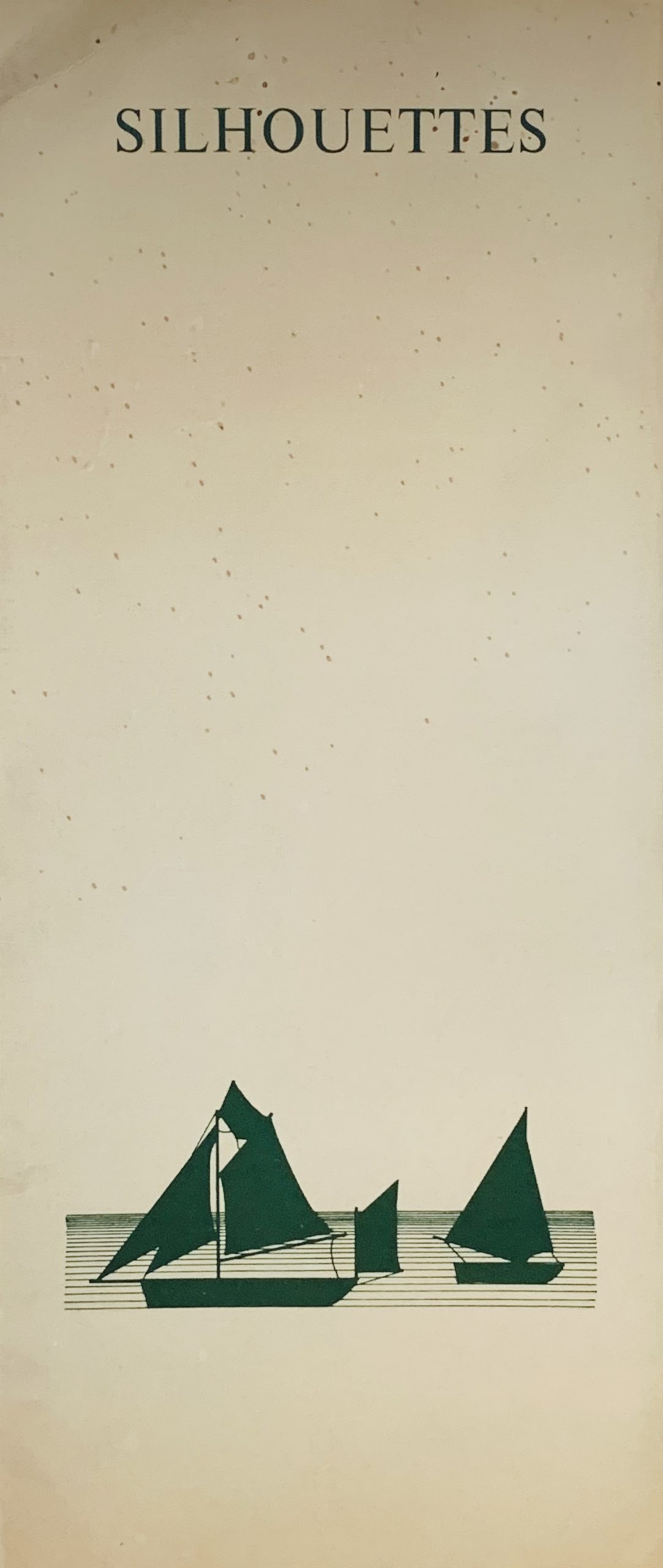
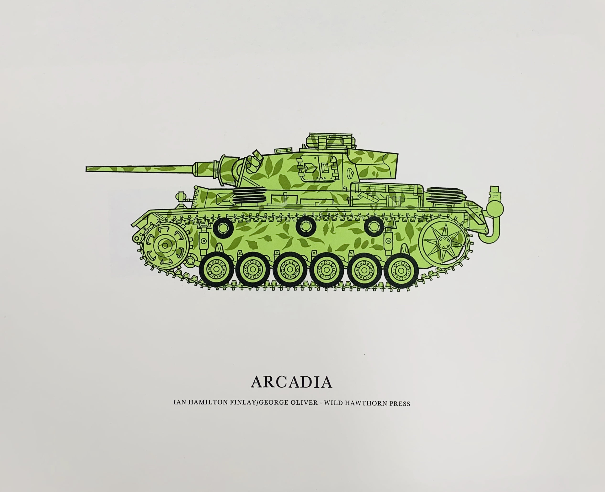
Dunsyre: Wild Hawthorn Press, 1973
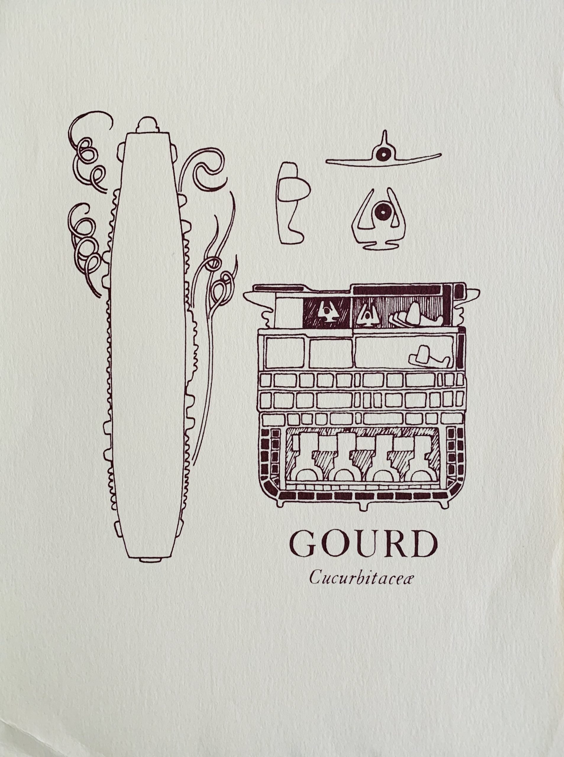
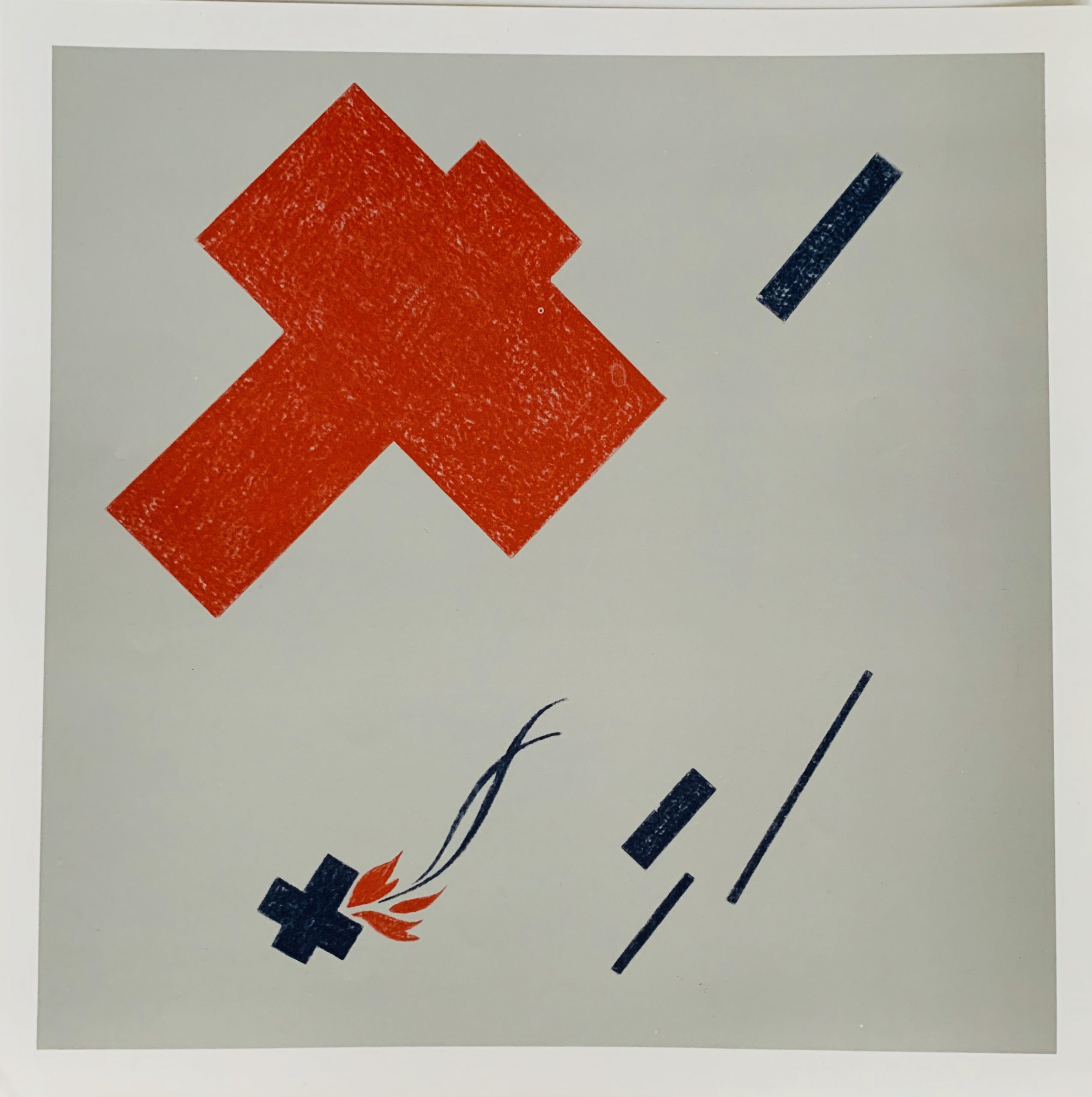
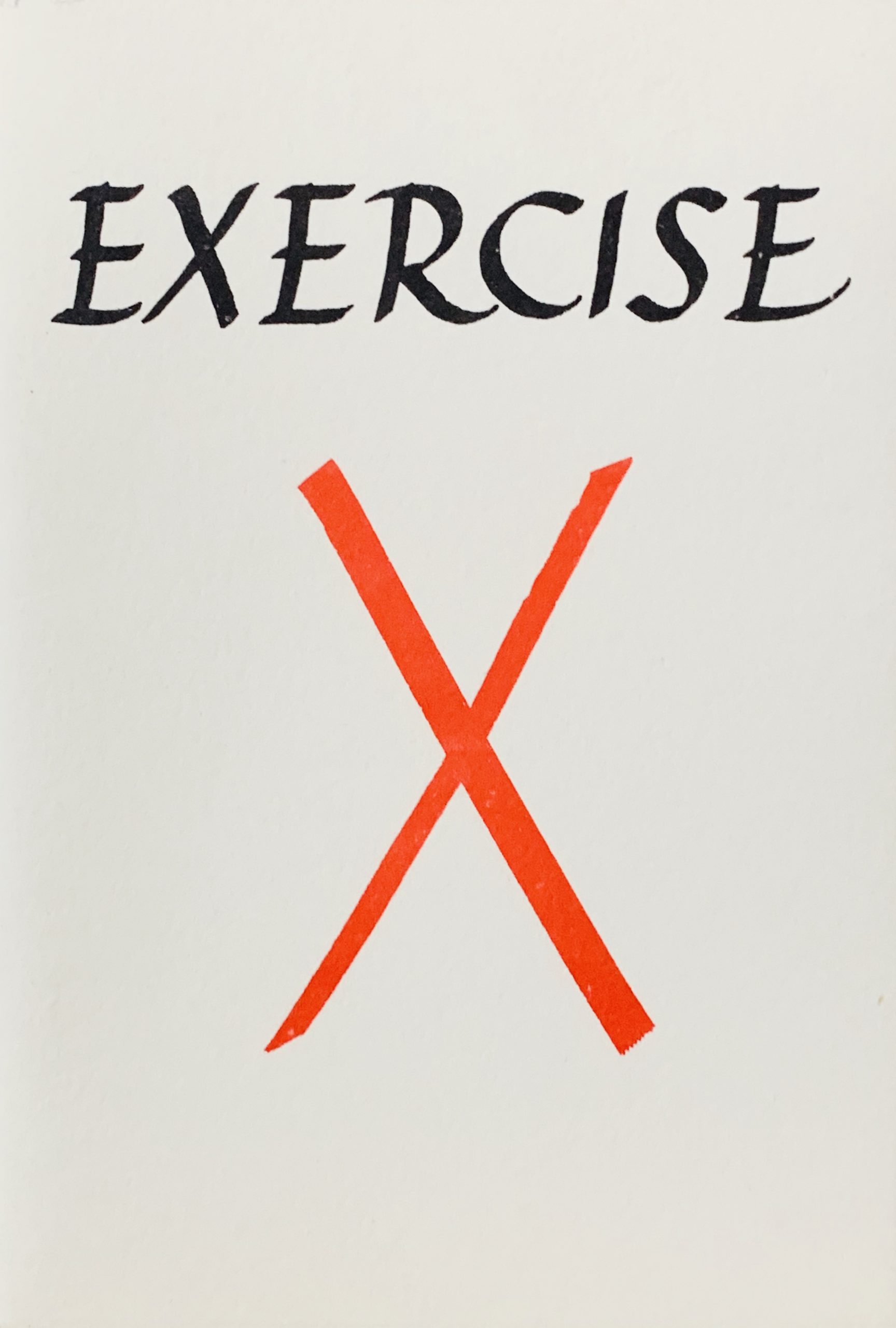
14 x 9.5cm, 24pp plus card covers and printed dust jacket. Artist's book where Finlay has listed a number of scenarios where an X might be created - each slightly different. The pages being drawn by George L. Thomson.
From a letter to Robin Crozier in 1970 - Finlay explained the idea: "Finlay says "I must stress that I don't consider this booklet profound. Everyone knows that nuance exists. On the other hand, I get pleasure from showing how much one can change a thing while scarcely from the spot , as it were. If we make dramatic (moving) differences between the visual representations of the Xs, we will undermine the whole point. If, for instance, "Two" and "Duet" are just noticeably not the same 2 crossing lines, we can rely on the words to complete the distinction, without taking it further than that. Likewise, "Duck-pond" needn't really try to depict the wakes left by 2 swimming ducks, but just by the merest alteration in the lines, allows the words to modify the image. Though obviously, if we had a blue rectangle on white one, there, and could have the lines white instead of black that would be pleasing.".
Finlay initially intended printing the book in 1970 with Crozier but changed his mind later for some unknown reason. VG+ although the cheap staples are showing some rust.
...