n.p. : The Wild Flounder Press, 1962
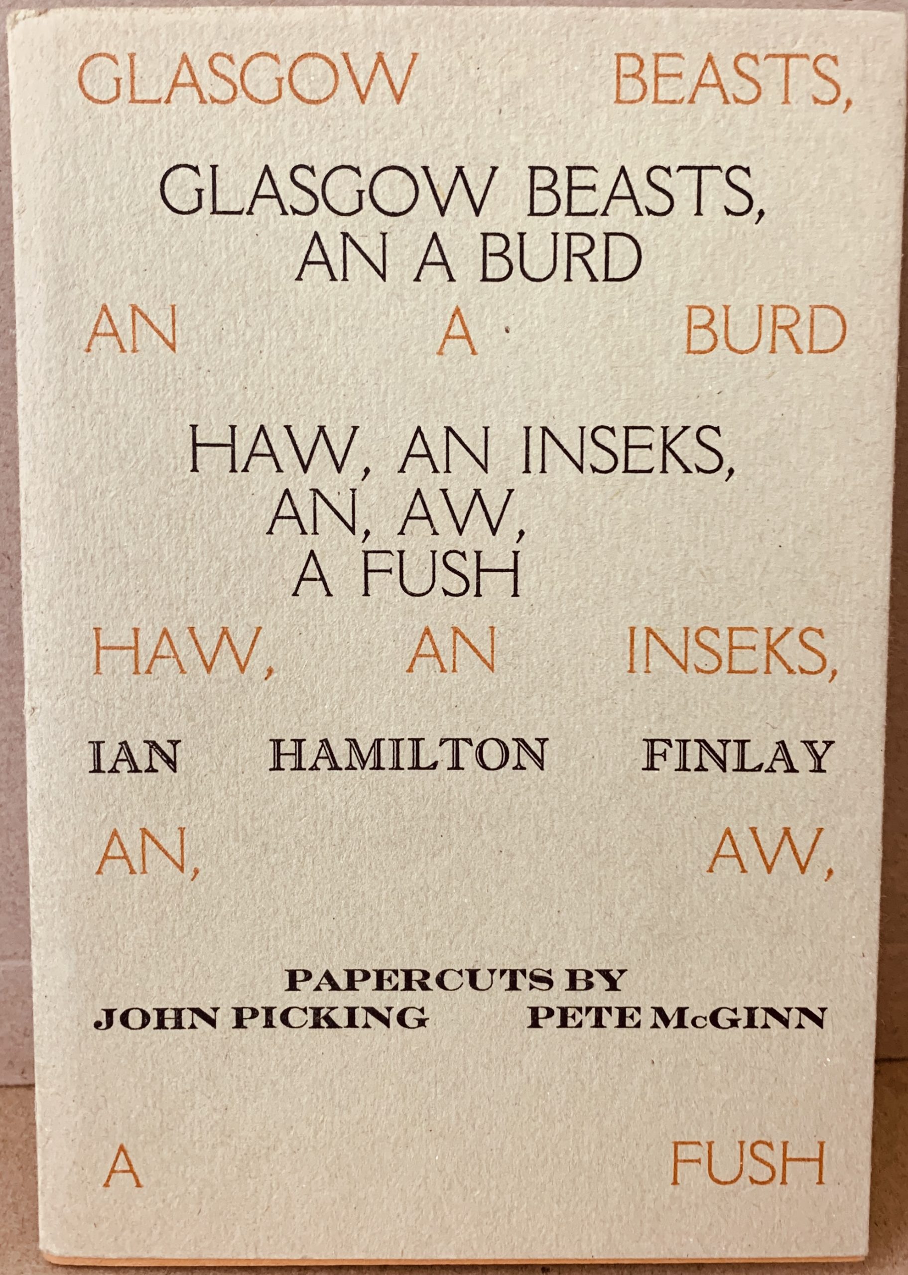
11.7 x 17cm, 32pp. Card wrappers with blue on brown typographic design dust jacket. Finlay's third book of poems - as with other early Finlay poetry the language is Scots with touches of Doric. The poems all relate to animals and other creatures ("inseks" and a "fush") and there are papercuts by John Picking and Pete McGinn. This is the fifth edition of this book and the orientation and design of the dust jacket has been changed. There is a hand written ink dedication on the half title "For Paul (Robertson) Pette McGinn / 05". VG+ condition.

...

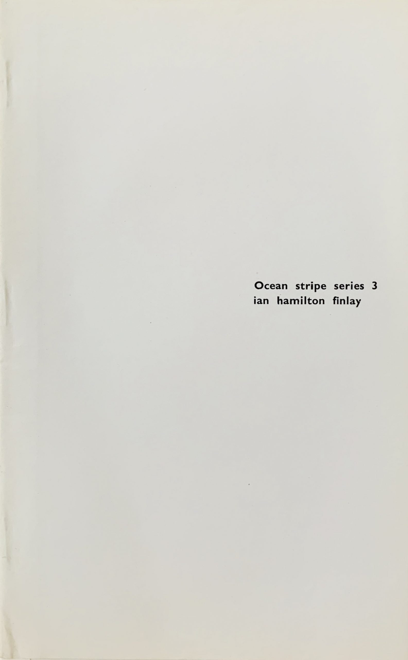
Edinburgh: Wild Hawthorn Press, 1965
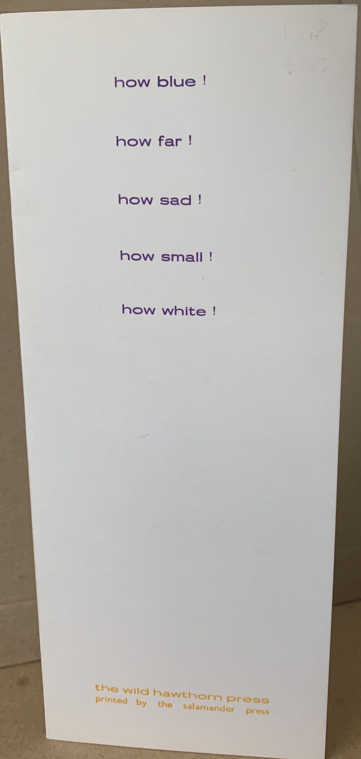
22.8 x 11.3cm, 4pp. Inner pages are black, text is only on front and back of card.
The text is printed blue on the front of the card and yellow on the back. The text is as follows:

how blue!
how far!
how sad!
how small!
how white!

and the back is the same only the ! is replaced by a question mark.
The front of the card is an exclamation about the experience of looking at things - the sky is blue, it is far away, it seems sad (blue) and yet small and white (clouds). The back by a simple change of punctuation indicates doubt.
The title of the card references the Russian artist Kasimir Malevich and the name he gave to the abstract art he developed from 1913 characterised by basic geometric forms and colours. The world is a simple place it seems to say.
This is the last of Finlay's earliest Standing Poems - he turned to publishing more standard formats of postcards for a while but returned later with D1 and the 4 sails works to the format.

...

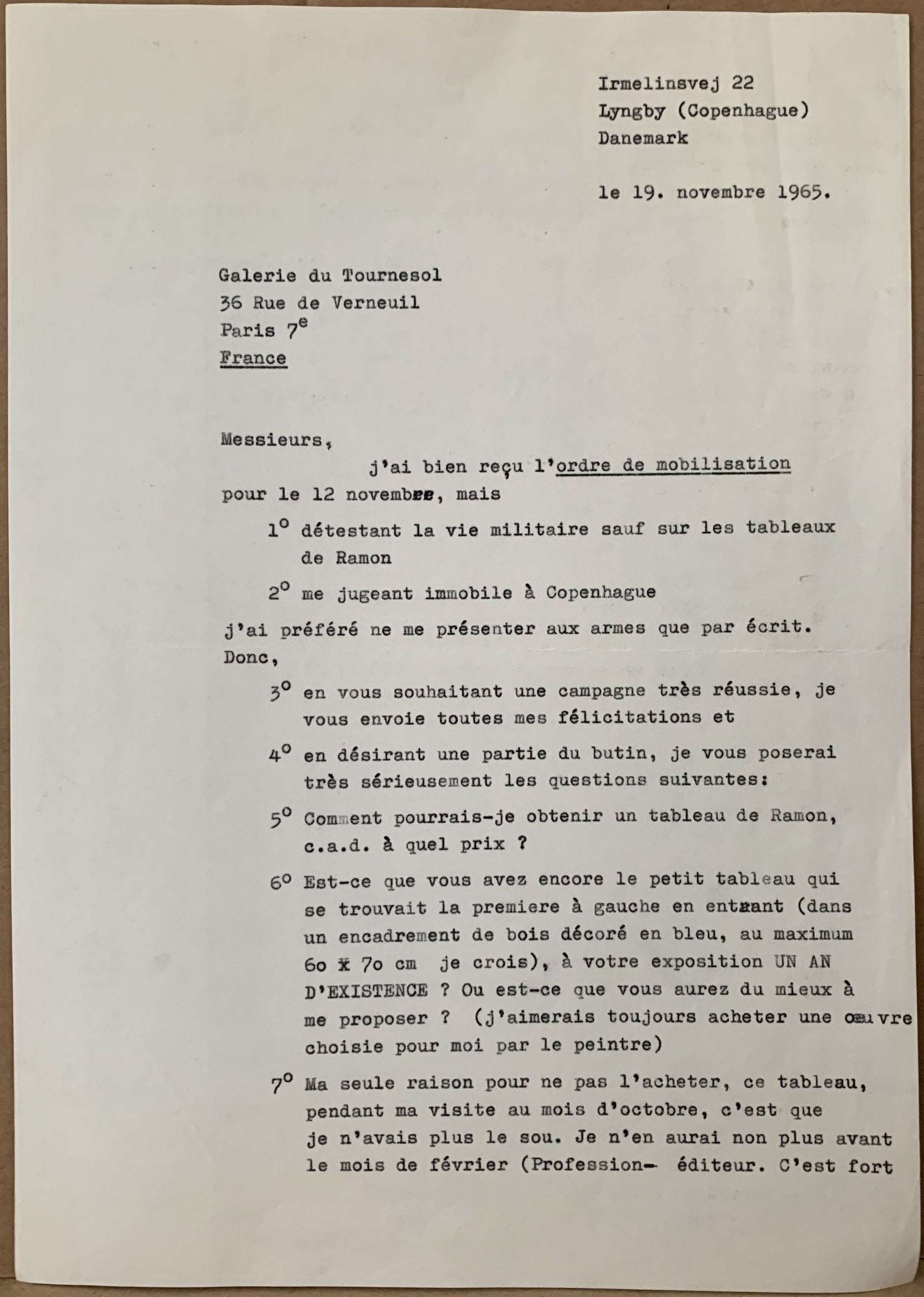
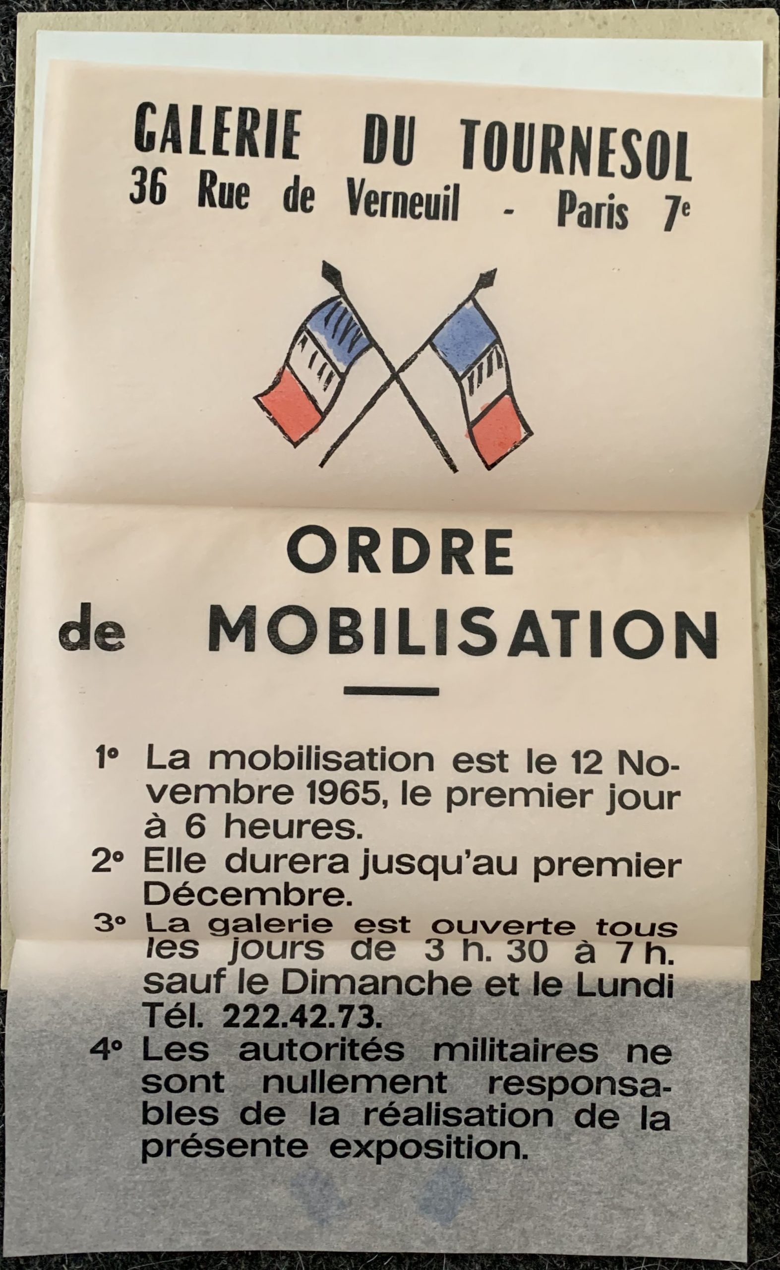
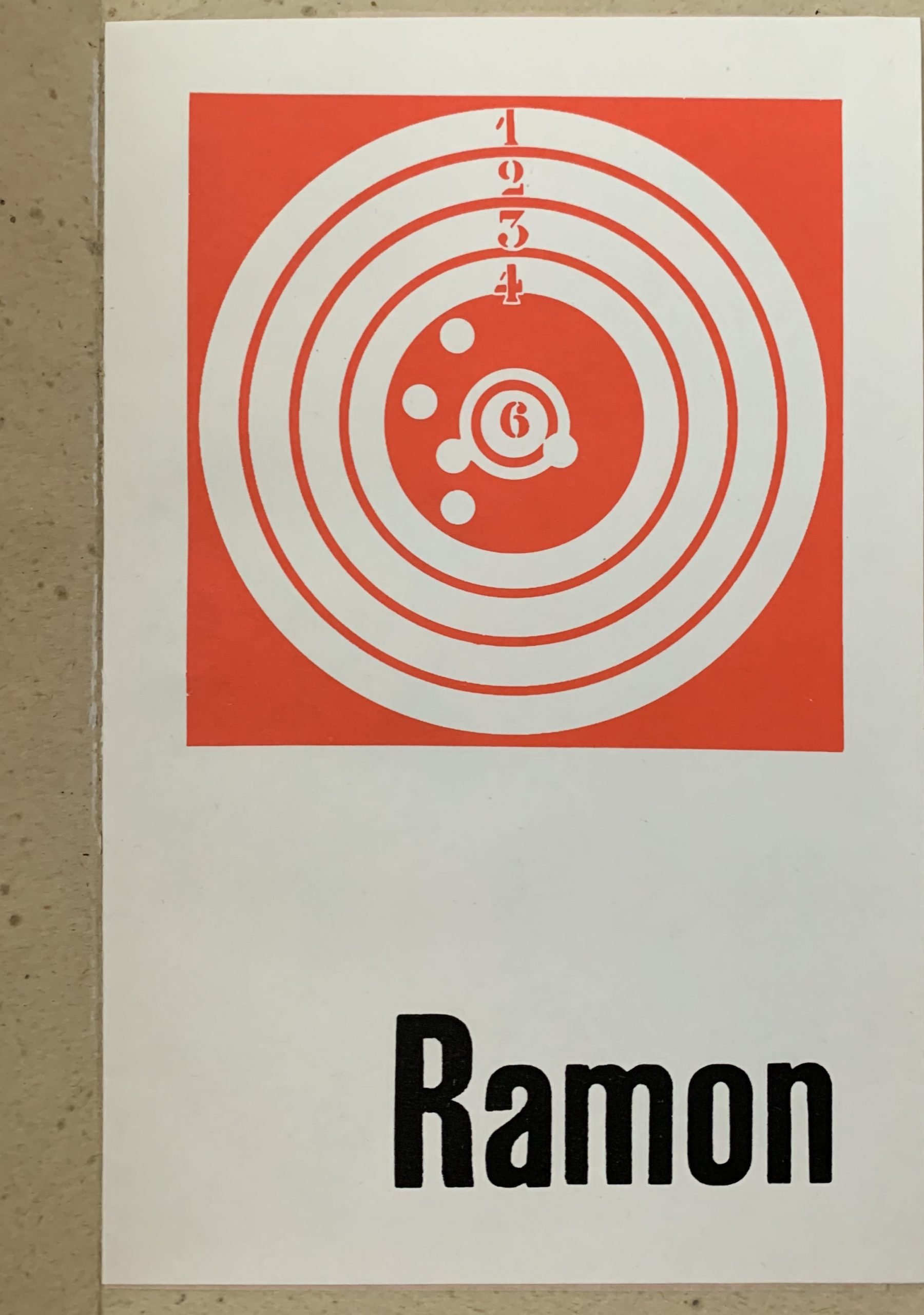
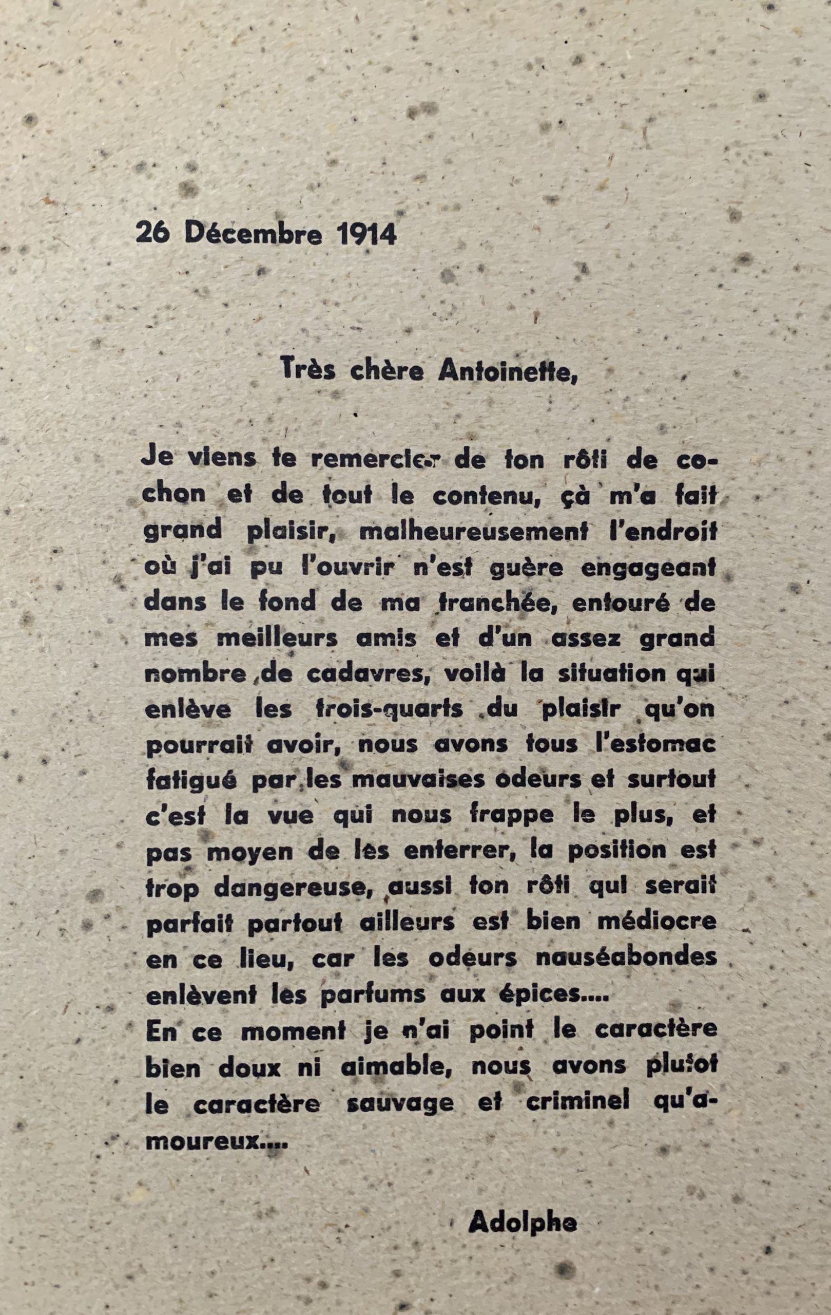
Paris: Ramon Gallery du Tournesol, 1965 21 x 13.4cm, outer folder with stapled in 4pp title page and a 6pp fold out "Ordre de Mobilisation" designed by the artist. Exhibition catalogue at the gallery where Boltanski was the co-ordinator/curator. The back of the booklet reproduces a silkscreen portrait in white of the artist's grandfather when he was in the military and the front a letter from his to his wife dated 26 December 1914.
VG+. Very scarce.

...

London: Institute of Contemporary Arts, 1965
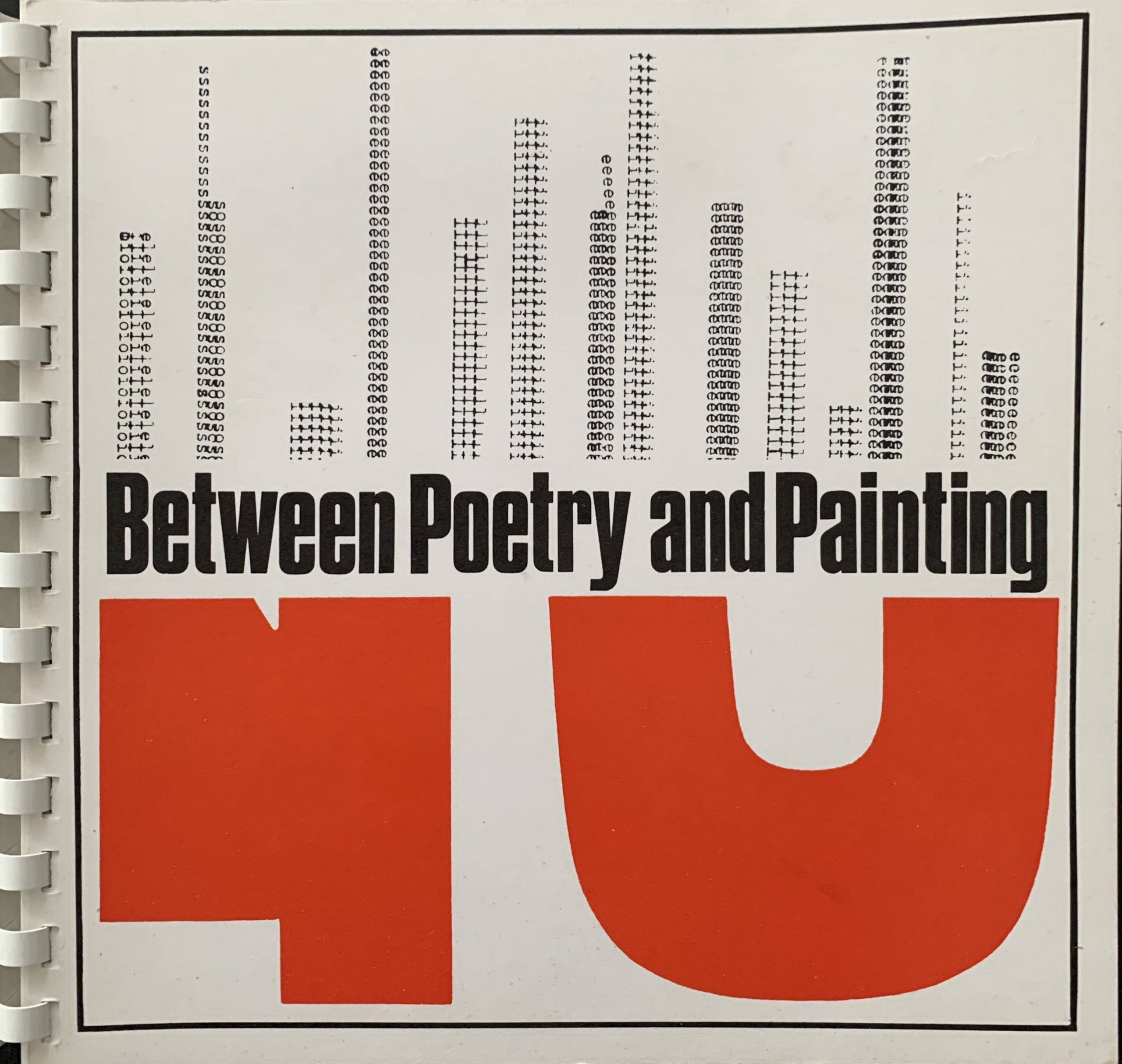
20.5 x 21cm, 82pp plus card covers. Spiral bound. An anthology of experimental and concrete poetry which was published as the exhibition catalogue for a show at the ICA of the same title. Curated by Jasia Reichardt - who also wrote the long text - this was a breakthrough exhibition which brought works by Ian Hamilton Finlay, Jiri Kolar, Hansjorg Mayer, Pedro Xisto, Ladislav Novak, Dieter Rot, and numerous others to the attention of the British public.
Finlay like the others has a short biography and then Reichardt lists a number of works and publications up to 1965. EarthShip (the rare paper sculpture) is reproduced in b/w and a letter from Finlay to Pierre Garnier from 1963 is also printed which could be regarded as the former poet's credo. Similar texts for the other artists. VG+.

...

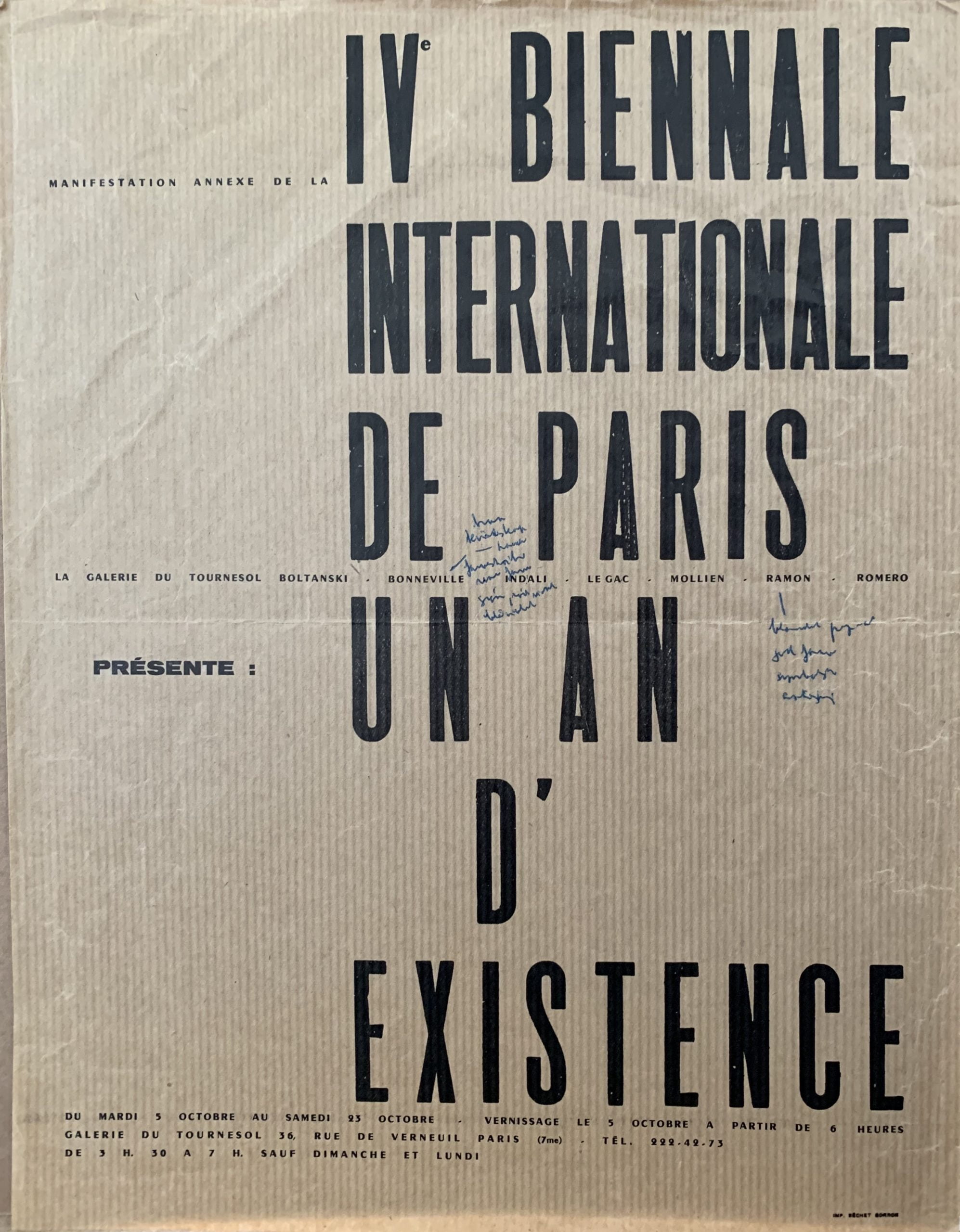
Paris: IV Biennale Internationale de Paris, n.d. (1965)
30.5 x 23.5cm, 1pp printed black on brown manilla paper. The small typographic poster for the Galerie du Tournesol's "annexe" for the Festival with Boltanski, Bonnevill, Indali, Le Gac, Mollien, Ramon and Romero noted as being included. The poster has blue ink handwritten annotations by Boltanksi relating to Benneville and Ramon but these are very hard to read. One of the very first documents that show Boltanski as an artist not just the director of the gallery.
In The Possible Life of Christian Boltanski" 2007, Boltanski claims his first ever public artistic endeavour was the showing of a film "The Impossible Life of Christian Boltanski" at the Ranelagh Cinema jn May 1968 (coincidentally the month and year of the student -worker revolts in Paris) but this poster suggests otherwise with Boltanski's name as one of the artists exhibiting at the Galerie du Tournesol. What was shown is not known but it is unlikely that Boltanski included his own name without showing something.
Extremely rare documentation in VG+ annotated condition.

...

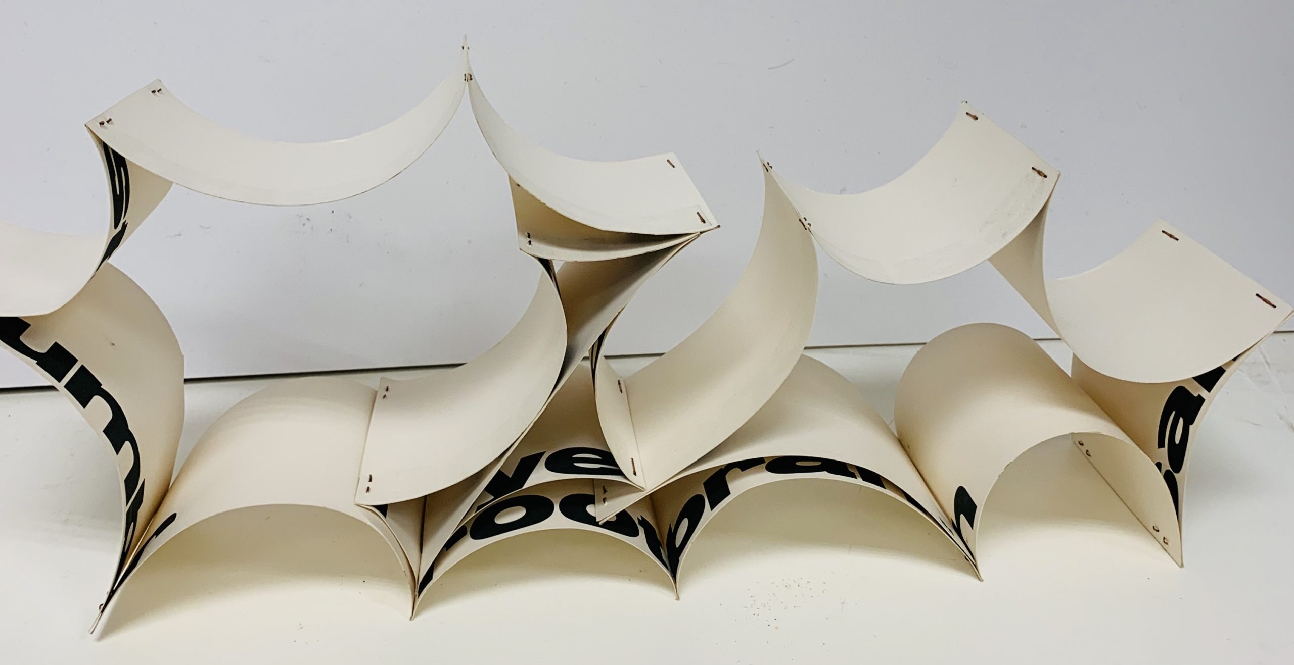
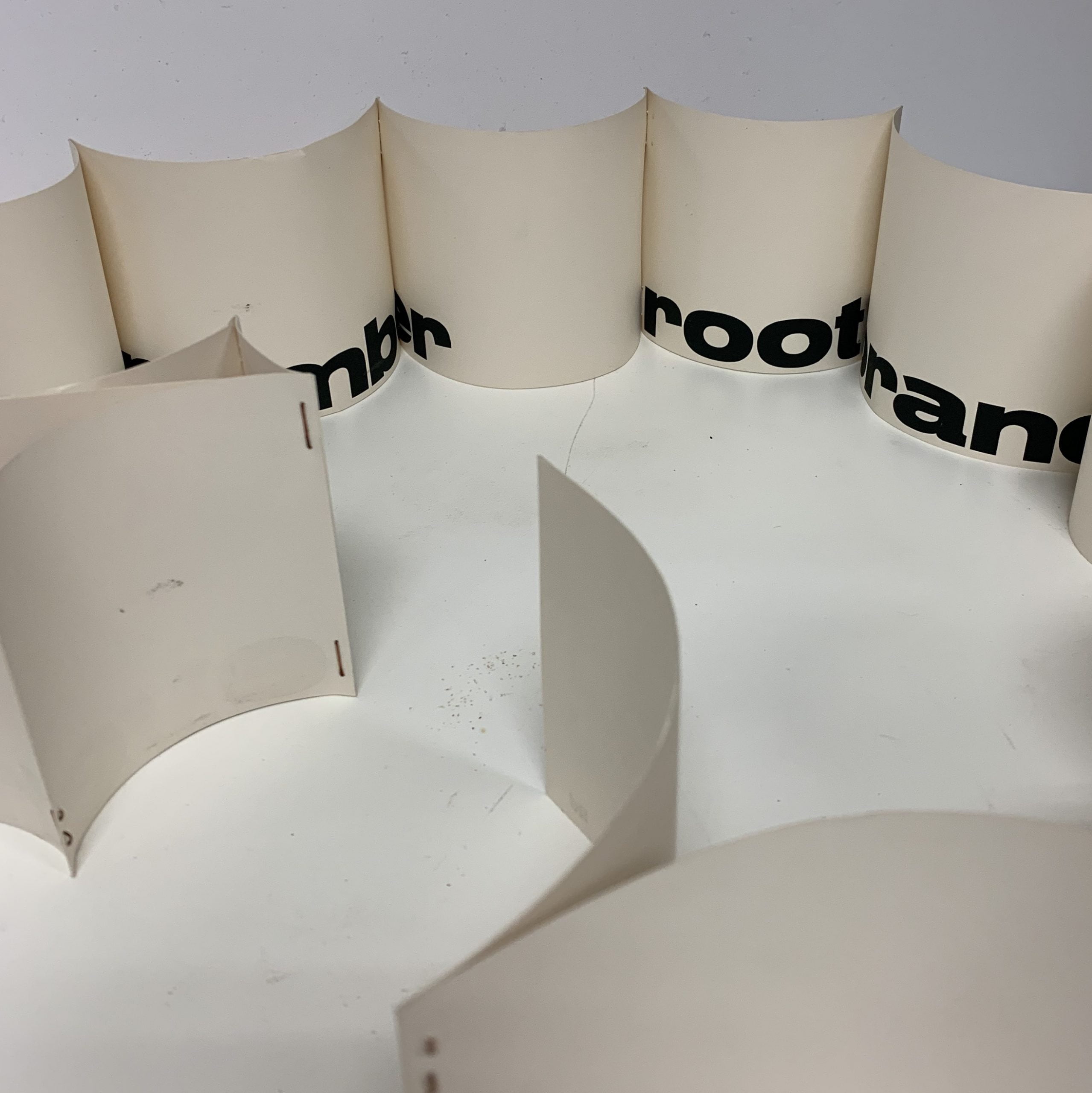
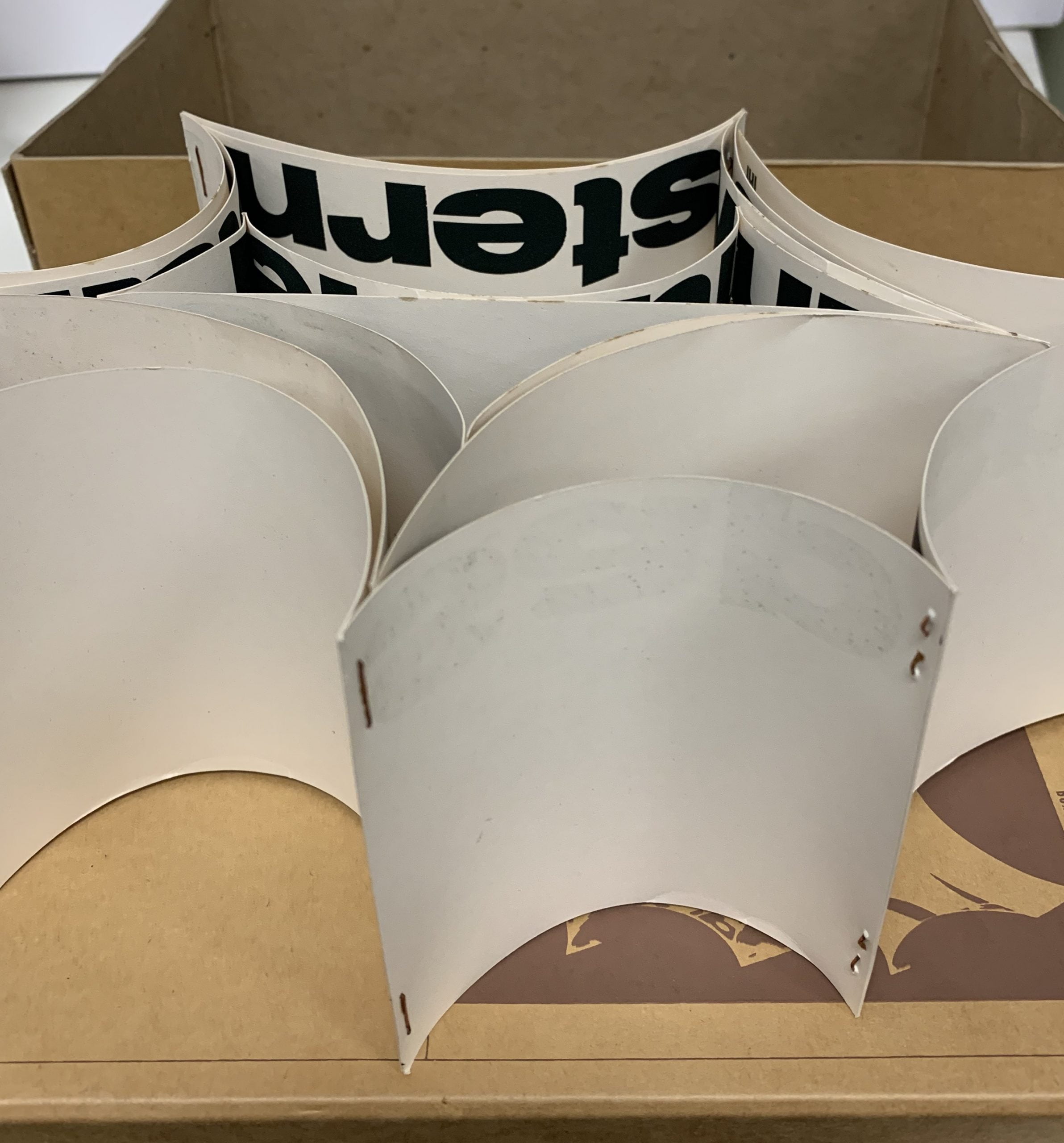
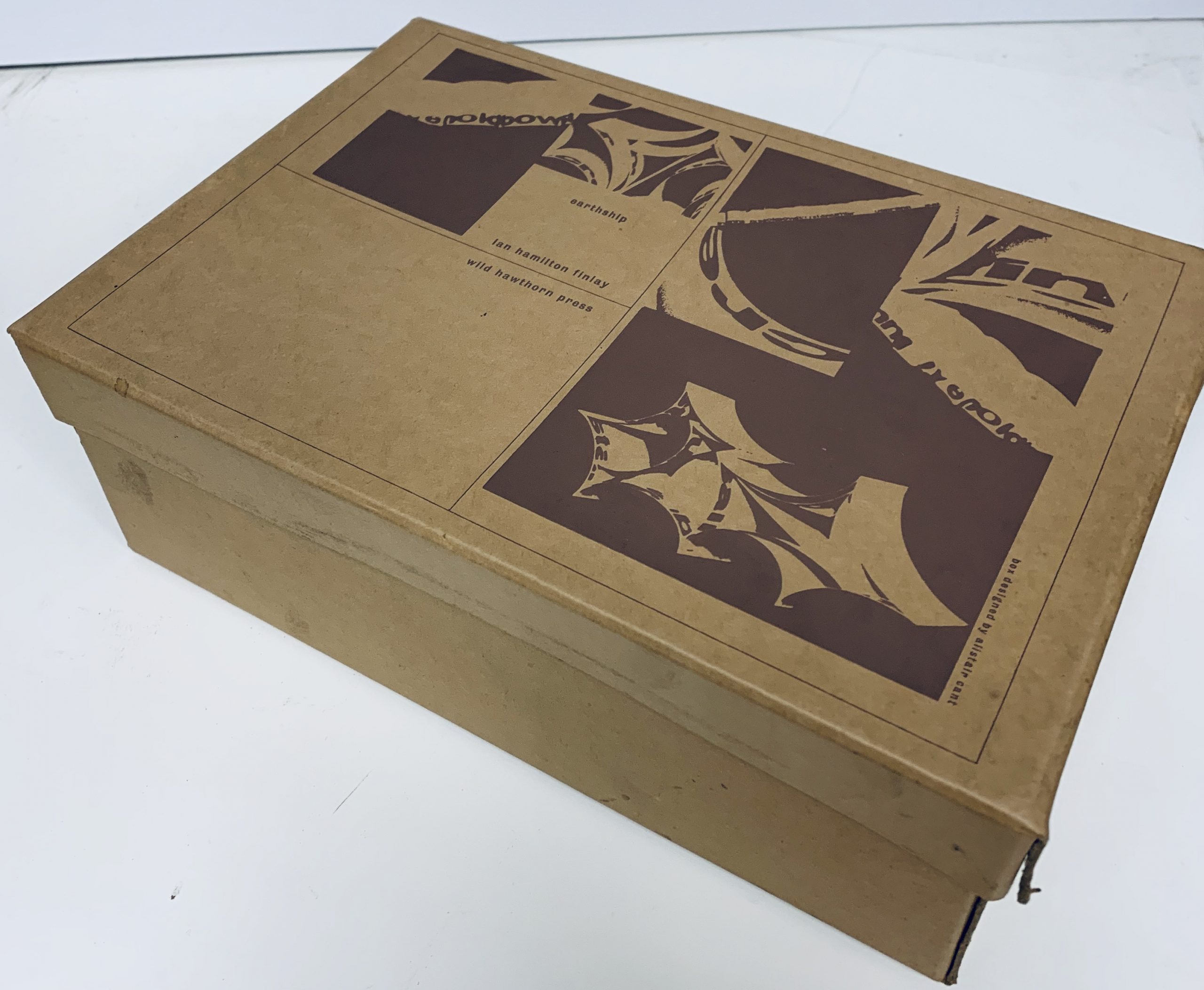
Edinburgh: Wild Hawthorn Press, 1965
31 x 21 x 18cm., printed shoebox content of a paper sculpture made up from 19 printed cards that are stapled together in such a way that the shape can be varied to create "various permutations of the poem depending on arrangement of the organic curved shapes". The work is most probably meant to be placed to resemble a ship at sea. The words all relate to the earth and elements.
This is by far one of the most rare of Finlay object multiples - it is estimated that fewer than 50 were made. The staples after 60 years are very minorly rusted and the outer box lid has one tear along the fold but else this is in remarkable shape.

...

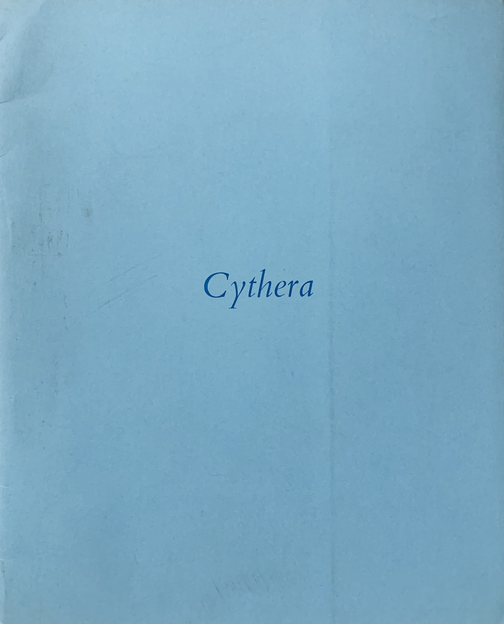
Edinburgh: Wild Hawthorn Press, 1965
5.5 x 20.6cm, 28pp. Original wrappers and typographic blue dustjacket. The inner pages have single words or short phrases printed in an italic font. The text in page order is: "air/ in blue/ leaf/ blue bark/and blue leaf/ a leaf/ a barque/a blue leaf/ a barque in leaf-blue/aire" The book title Cythera is from the title of the painting - The Embarkation for Cythera ("L'Embarquement pour Cythère") by Jean-Antoine Watteau. The painting is usually regarded as highly romantic (in a love sense rather than the movement) and the couples represented by Watteau are heading to board a boat to go to the mythical idyll.
When one reads Finlay's text the sense is of romance, beauty and of the joy of being at one with nature. The text also reflects the idea of a journey and, finally, the punning of bark/barque and air/aire brings a musical aspect to the poem which might also be inferred in the painting from the stylings of the putti dancing in the air. One of Finlay's most beautiful books.
This example has a handwritten dedication by Finlay to a "Janie R" in blue ink and is dated 1965.

...

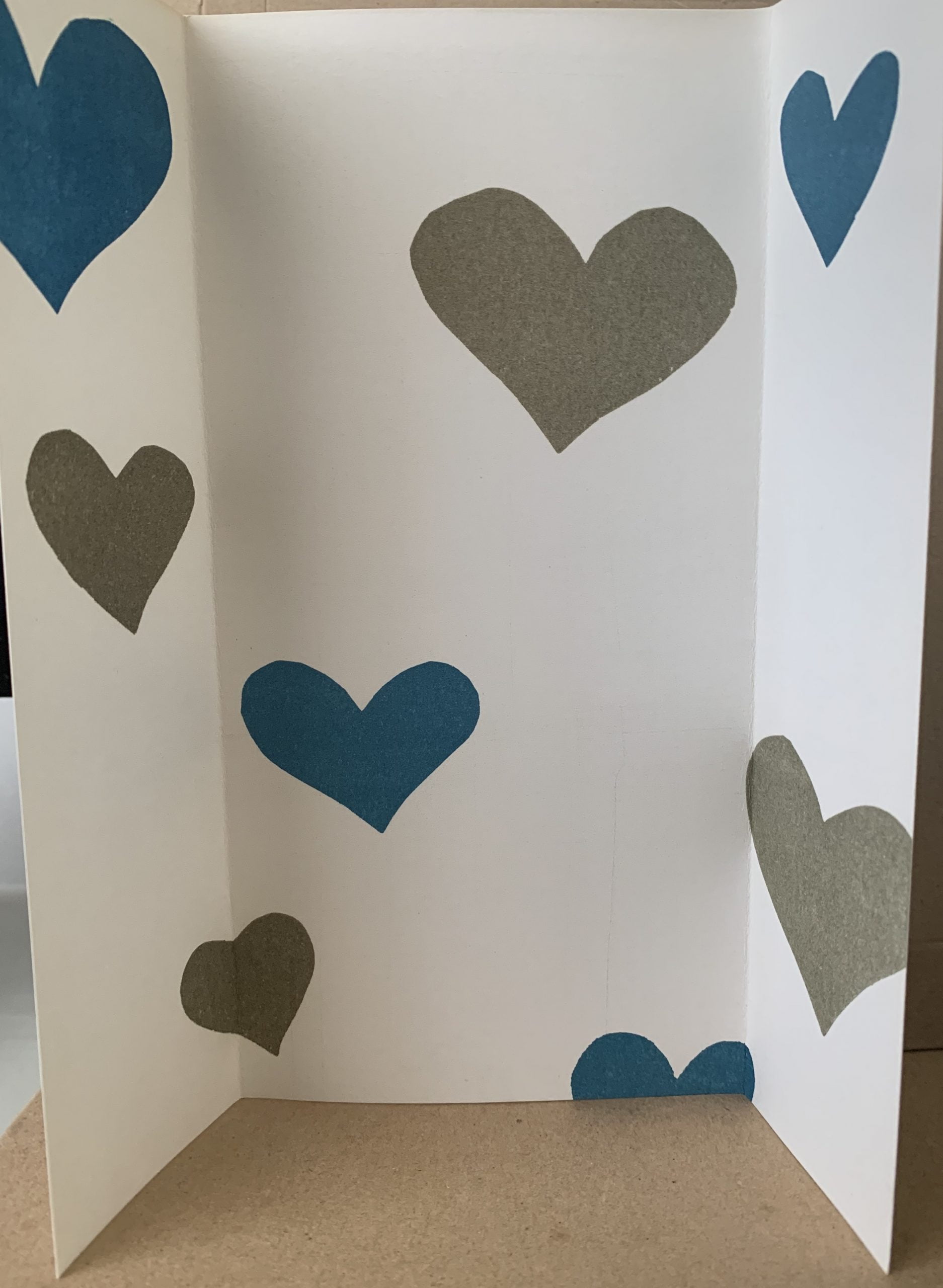
Edinburgh: Wild Hawthorn Press, n.d. (1965)
22.8 x 11.3cm, printed 1pp. Folded on both sides allowing the card to stand as intended. Printed olive green and blue on white.
JOINT WITH AS ISSUED:
13 x 11.4cm, 1pp diagrammatic card with a key to the various hearts in the standing card.

This (officially the third Standing Poem) is related to the earlier Standing Poems in various ways - firstly that the sides of the sheet bend in to allow the work to stand up, secondly a repeating pattern of shapes (roughly formed hearts) are printed in a lattice pattern over the sheet.
The Standing Poem 2 versions both have hearts as one of their motifs. It is almost as each card in turn was an evolution from the previous one (which is a reasonable argument and reflects the fact that the earlier cards had images on them that "evolved" within the card).
The colours used here differ though - olive green and blue on white is attractive but doesn't tend to evoke any particular meaning.
The separate key card that Finlay added to the paper sculpture indicates the hearts are all different and have titles - they are Little Heart, Wooden Heart, Pond Heart, Owl Heart, Jersey Heart, Umbrella Heart, Bobbin Heart and End Heart. It is hard to see any reason why these names are chosen. Other than the lazy distribution of the hearts (again somewhat loosely reflecting a constellation) it seems nothing more than a love poem of sorts. But a little thought reminds one that there are physical elements of the prefixed objects that look heart like - an owl's forehead, the point of the unfurled umbrella, a neckline from a Jersey and so on. Finlay loves a visual pun or simile and here it is if obscured.
This is a scarce card - Murray in his flawed catalogue raisonne claims it as the fourth ever card published but it is more accurately the sixth if one includes the earlier typescript from 1963 in this collection. VG+ condition.

...

Edinburgh: Wild Hawthorn Press, 1965
20.3 x 12.8cm, 32pp. Original wrappers and typographic dustjacket. Three pages have the word "ark" on thin paper followed by a group of differently sized pages that are white, red, yellow and blue in turn. On the first white page the word "arc" is printed. The biblical ark that Noah built was rewarded by the christian god with a rainbow "as a covenant between him and the earth". The book (again claimed to be kinetic) is a physical manifestation of that myth - the ark is given a colourful rainbow (with wrong colours) in page form. In case one had missed the meaning of the book a 19 x 8cm, 1pp insert was added quoting Genesis 2 13 - 15 which tells of the coming of that rainbow. VG example.

...

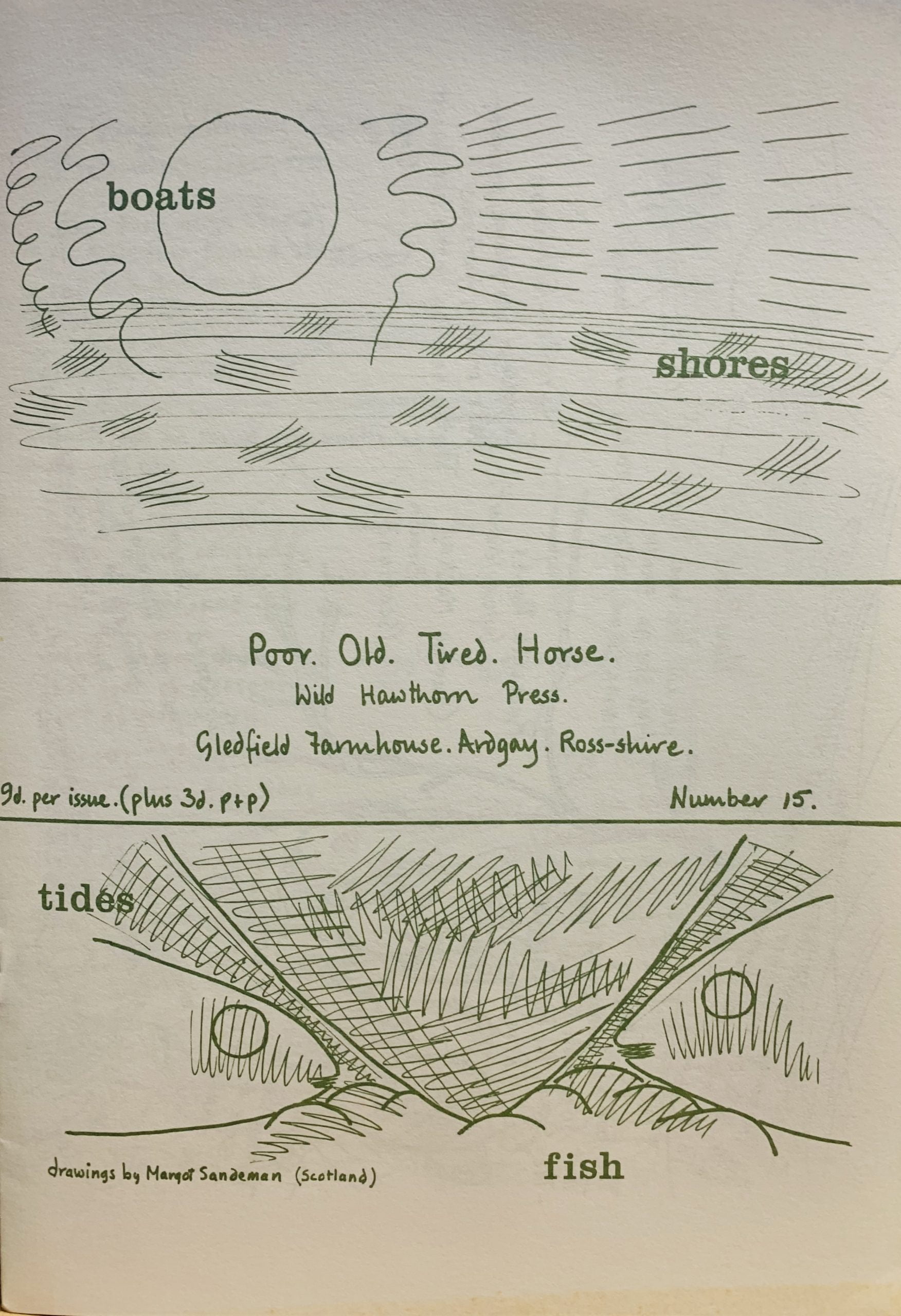
Ardgay, Ross-shire; Wild Hawthorne Press, 1965
26 x 21cm, 8pp. The fifteenth number of Finlay’s poetry publication with contributions by Margot Sandeman who provided drawings for the entire publication, George Mackay Brown, Eli Siegel, Edwin Morgan Ian Hamilton Finlay, Hamish McLaren, Theodore Enslin, Libby Houston and R.L. Cook. VG+ condition Scarce.

...

Shopping cart0
There are no products in the cart!
Continue shopping