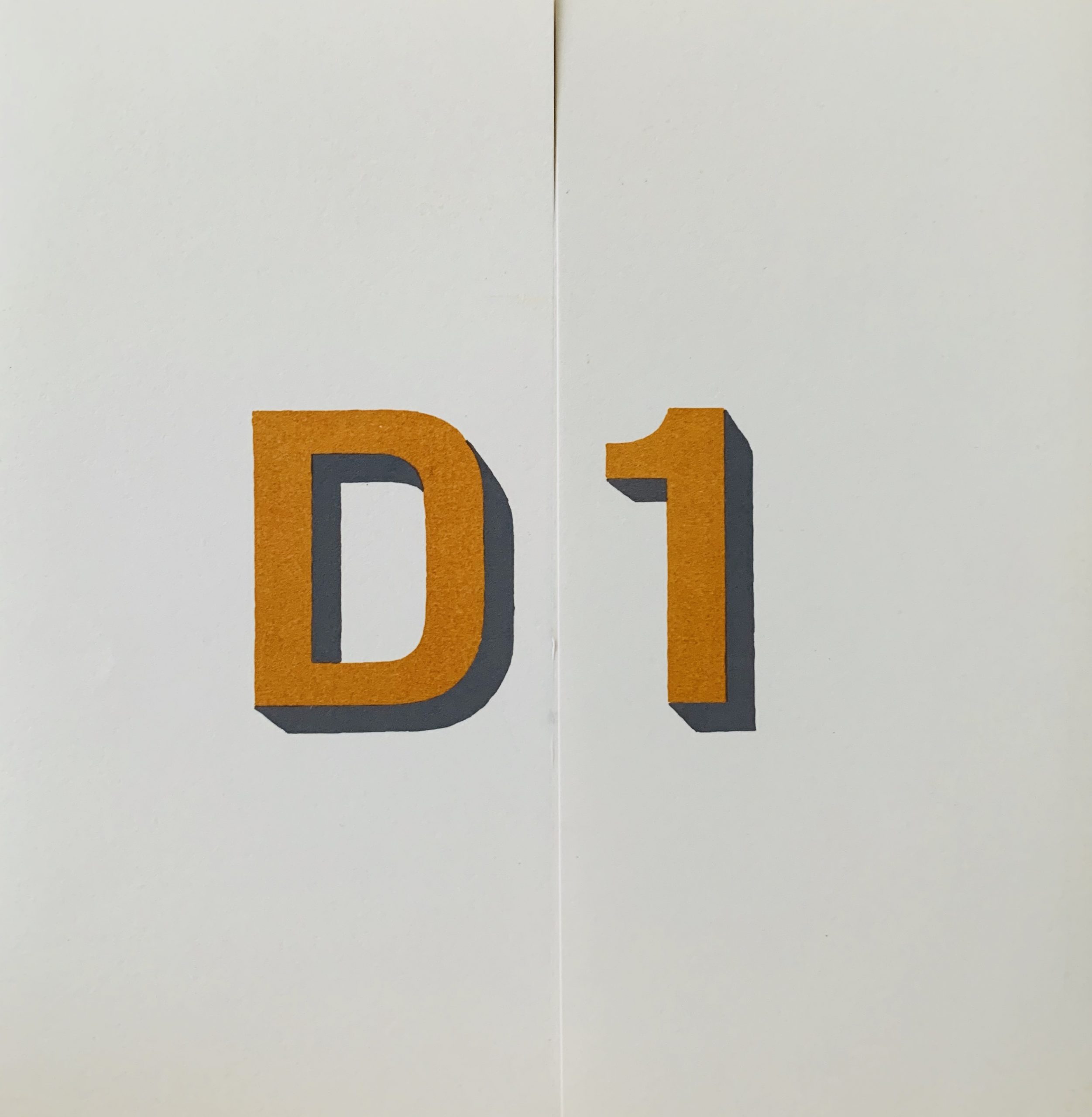
Frankfurt: AQ Photos supplement, 1973
22.5 x 14cm, 6pp (single folded sheet). A supplement to the AQ artist's journal entirely dedicated to five b/w images of Boltanski playing the role of his parents in posed photographs. The supplement was a publicity brochure for the journal but it is effectively a Boltanski artist's book. To our knowledge this is not referenced in any catalogue raisonne. VG+. Scarce.

...

Dunsyre: Wild Hawthorn Press, 1973
9 x 7.5cm, 12pp plus card covers and printed dust jacket. Artist's book with Simon Cutts where similar sentences as subtly changes each illusrated by Sydney McK Glen with a landscape vignette. The sentences are "I prefer the streams of the mountains to the sea"/"I prefer the street of the mountains to the sea"/"I prefer the streaks of the mountains to the sea"/"I prefer the straiks of the mountains to the sea". The last work straiks is an unusual one - a less used version of the word stroke. Each slight change to the sentence gives a different poetic image of the landscape.
VG+ although the cheap staples are showing some rust.

...

Dunsyre: Wild Hawthorn Press, 1973
15.2 x 11.6cm, 16pp plus card covers and printed dust jacket. Artist's book listing a series of forenames in facsimile of handwriting in red
The names are "Rufe Betty, Val, Tony, Kate, judy, Nick, Cherry, Jill, Jake, Nell, Emily, Zeke" which are all nicknames of world war aircraft.
"In the second half of 1942, a colorful set of code names was developed in the Southwest Pacific Theater by the Air Technical Intelligence Unit (ATIU) of the Allied Air Forces in Australia. The head of the unit, Captain Frank T. McCoy Jr. was from Nashville, Tennessee, and the first few code names were hillbilly names such as ZEKE, NATE, PETE, JAKE and RUFE, as they were simple, short and distinctive. The basic system spread rapidly, and by late 1942, was adopted for use by both the USAAF and USN. In general, the code names were assigned using the following system, although several exceptions exist:". Hence Finlay shows the various aircraft as a related family because of this familiar way of reference. VG+.
A 3 x 14cm, 1pp "bookmark" which has the name of the Press on it and a red circle - referencing the Japanese origin of these airplanes.

...

Heidelberg: Edition Staeck, 1973
10.5 x 14.5cm, 2pp. Artist designed postcard issued as Series D, Nr 1 with the reproduced title text "Gib mir Honig" on the front which translates into “Give me honey”. This example is signed by Beuys in pencil on the front and rubber stamped with a FIU impression in blue, verso standard postcard design. VG+. Ref: Schellmann P 9.

...

NYC/Koln: Avalanche Magazine/Kolnischer Kunstverein, 1973
15 x 10.5cm, 4pp. A subscription card for the WIlloughby Sharpe and Liza Bear conceptual art magazine which displays the cover of the first number on the front which features a portrait of Joseph Beuys. Internally the first 8 magazines are show with short contents - all in German which is a little surprising given the magazine was in English and published in the USA but the card also notes an exhibition of the magazines in the Kolnischer Kunstverein. VG+.

...

Milano: Studio Marconi, 1973 12 x 15cm, 1pp typographic announcement card for one of the first manifestations of "Arena—Dove sarei arrivato se fossi stato intelligente!"(Arena—where would I have got if I had been intelligent!) which consisted of a large number of panels with photographs covering the span of Joseph Beuys’s career up to 1972, including documentation of key objects, concerts, and actions, as well as personal life events. Ranging from the late 1940s to the early 1970s, Arena is usually regarded as "less an autobiographical statement than an allegorical portrait of Beuys’s artistic persona." The work was shown a number of times after this exhibition with changes in placement of the panels and other items as well as additions. The card is signed by Beuys in pencil. VG+. ...

Beckett, Samuel NOT I London: Faber & Faber, 1973 19.5 x 12cm, 16pp plus original wrappers. First edition of this printing of the famous solo play where an isolated mouth tells a rambling tale of a life from the point of death backwards. Byars has appropriated this important book as he often did with publications he deemed important or, in some way, conceptual and has written in pencil "J. LOVES J." on the first blank page in his starry letting. He then sent the book to James Butler - his close friend and gallerist. The text means "James Loves James". A unique work with amazing association....

London: Studio International Ltd, 1973
30.5 x 24.5cm, 160pp plus card covers. Single number of the long running and very important art journal - to which Boltanski has added a page work (taken from the book of the same title) of a child making a paper airplane. Offered as part of a section on contemporary French art. Some wear to spine and glue beginning to weaken after nearly 50 years. Else VG.

...

Karlsruhe: Galerie Grafikmeyer, 1973 12.07 x 20.6cm, 1pp letterpress printed black on light brown thick cardboard. A printed limited edition multiple in card format by Beuys created after his dismissal as a lecturer at the Dusseldorf Akadamie for protesting. and shows the artist's Only 300 such signed copies after 50 artist's proofs were released. VG+. Schellmann nr 69. VG+. ...

Woodstock, NY: National Shakespeare Company Experimental Art Center, n.d. (1973) 35.4 x 25.5cm, 1pp poster printed black on yellow for a three-day festival including work by over 15 artists; Jud Yalkut being one of them. Folded horizontally for storage else VG. ...

Shopping cart0
There are no products in the cart!
Continue shopping