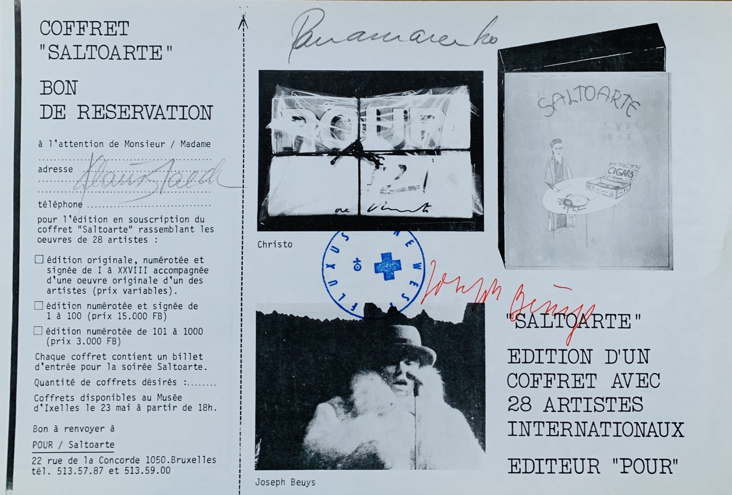
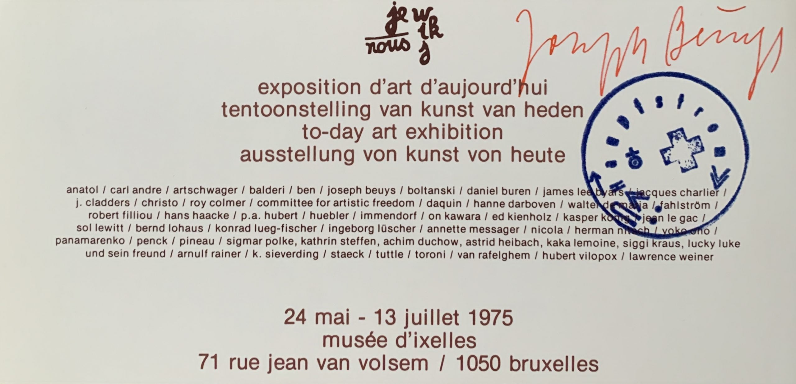
Little Sparta: Wild Hawthorn Press, n.d. (1976)
15.3 x 15.3cm, green on white ceramic tile with typography by George L. Thomson - the various port letters of Scottish fishing boats are placed in a circular design (similar to Sea Poppy and earlier prints) to create a "world" or to remind one of the way stars circle in the sky over time.

...

Genova, Samangallery, 1976
10.5 x 15cm, 2pp, commercial postcard of Genova which is overprinted in thick brown paint and rubber stamped on the reverse with the gallery details. This is exactly the same as the edition card (see Schellmann Nr 1880 only not signed and numbered. A rare item in VG+ condition although a mailed example.

...

Genova, Samangallery, 1976 10.5 x 15cm, 2pp, commercial postcard of Genova which is overprinted in thick brown paint and rubber stamped on the reverse with the gallery details. This is one of a few known versions of this invitation card where a commercial card was adapted by over-printing with different landscape scenes. Here the underlying card shows a view of Church of Santa Maria Assunta di Carignano, Genoa. Edition Schellmann released a numbered and signed edition of these postcards as an original multiple. This card is a mailed example with stamps and a postmark dated 7-2-76, and is hand-addressed to Lucrezia De Domitius. There is a slight diagonal crease top right but else VG+. Scarce....

Edinburgh: Scottish Arts Council, 1976
15 x 10.6.cm, 48pp plus pictorial wrappers and bound in errata slip. Exhibition catalogue for a group show at the SAC which not only included Finlay but also Eileen Lawrence, Will Maclean, Glen Onwin, Fred Stiven and Ainslie Yule, the whole curated by Paul Overy of "landscape" inspired art. The cover has a Finlay small work on the front (Landscape/Interior) and 16 works are listed internally as well as two others in b/w ('Homage to Kandinsky' and 'Emden Relief' (a sculpture of a cruiser at Stoneypath). The errata slip has two mistakes of names of Finlay works on it which no doubt irritated the poet. Looking at the catalogue is is clear Finlay is by far the most significant of the artists showing.
This was a show at a time when Finlay and the SAC were willing to work together - later the poet withdrew works from a planned SAC exhibition in 1977 because he felt the organisaiton insufficiently supported him in various disputes he was becoming embroiled in. Some nascent foxing to wrappers and end papers else §VG+. Scarce....

Dunsyre, Lanark: Wild Hawthorn Press, n.d. (1975)
10 x 5.2cm, 18pp (printed on one side only) accordion fold.
The first of three such "textbooklet"s which have similar formats. Here three texts are all displayed vertically: "Concrete effect?", "Crossword effect?" and "Weather effect?".
Finlay is playing with the three reasons why text might be shown in such an unusual manner - the concrete poem that uses verticality in many ways including inferring direction and falling, the crossword which needs vertical text to allow the words to be, well, crossed, and the weather where rain and snow falls and is a direct reference to the famous (and one of the first ever concrete poems) by Apollinaire "Il pleut" which Finlay knew well as he later parodied it in an artist's card. VG+.

...

Dunsyre: Wild Hawthorn Press, 1975.
22.2 x 14.6cm, 8pp (single card folded twice) . A "calendar" designed by Laurie Clark for Finlay with each of the months being given new symbolism. For example, January has a drawing of "black bees and white bees", March is "glider-days", October - blue swan lake and December - the silent hive.
The use of symbols for each month is reminiscent of Le Calendrier Republican that was introduced on 24 October 1793 by the National Convention where the names of months were replaced with objects relevant for that season or month with the year beginning in March. Finlay/Clark's is less radical in that the names and dates of the months are not replaced but the symbolism is similar if more modern.VG+.

...

New York: Galerie Sonnabend, 1975 17 x 11.6cm, 2pp. Announcement card with an image of Boltanski pretending to be a drunken clown in b/w on the front. On the back are found gallery information. This is a mailed copy hand addressed to M. Berg by Boltanski which also signed by Boltanski in black ink. VG+.

...

Dunsyre: Wild Hawthorn Press 1975
74.9 × 36.8cm, red on light brown silkscreen. A diagramatic drawing and typography by Michael Harvey is of a sundial and is joined with the Latin inscription UMBRA SOLIS/NON AERIS and the English alternative "The shadow of the sun and not of the Bronze."
The Latin and English phrases together remind one that the source of the shadow is in fact the sun not the gnomon in itself.

...

Devon: Beau Geste Press, Nov. 1975. 30 x 21cm, 98pp. + pasted in booklet by Ben Vautier "Me Ben I Sign". 133 illustrations. Flip-flop perfect bound wrappers with pasted-on pictorial design (front and back - as is the pagination - creating the illusion of two back-to-back books). An especially noteworthy issue with pagework contributions by Filliou, Vautier (beyond the booklet), J.C. Lambert, Marcel Broodthaers, et. al. Issued in an edition of only 550 examples.
Christian Boltanski's contribution is a reprint of the pages from his second artist's second published book Description de Mon Accident from 1969.

...

Shopping cart0
There are no products in the cart!
Continue shopping