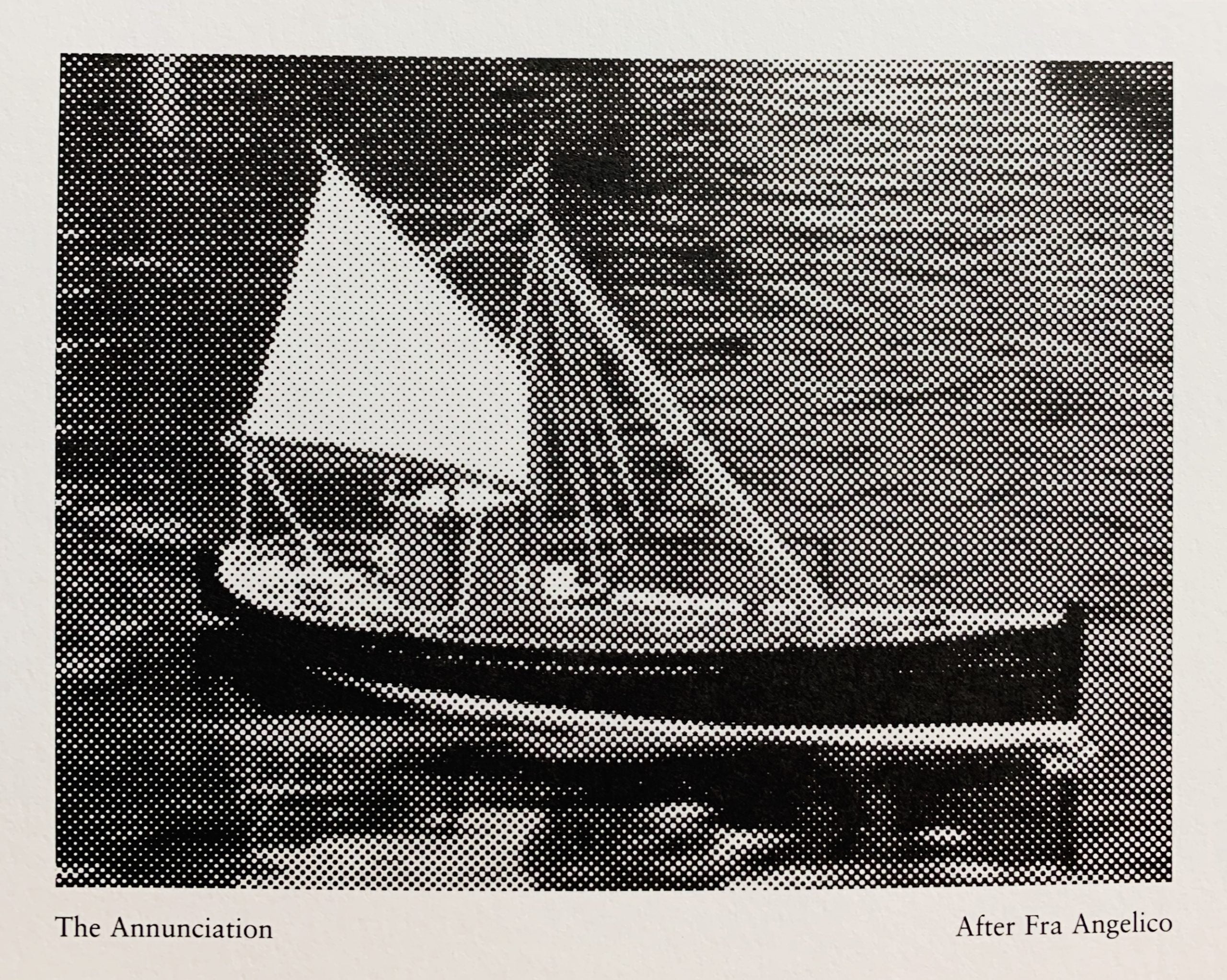
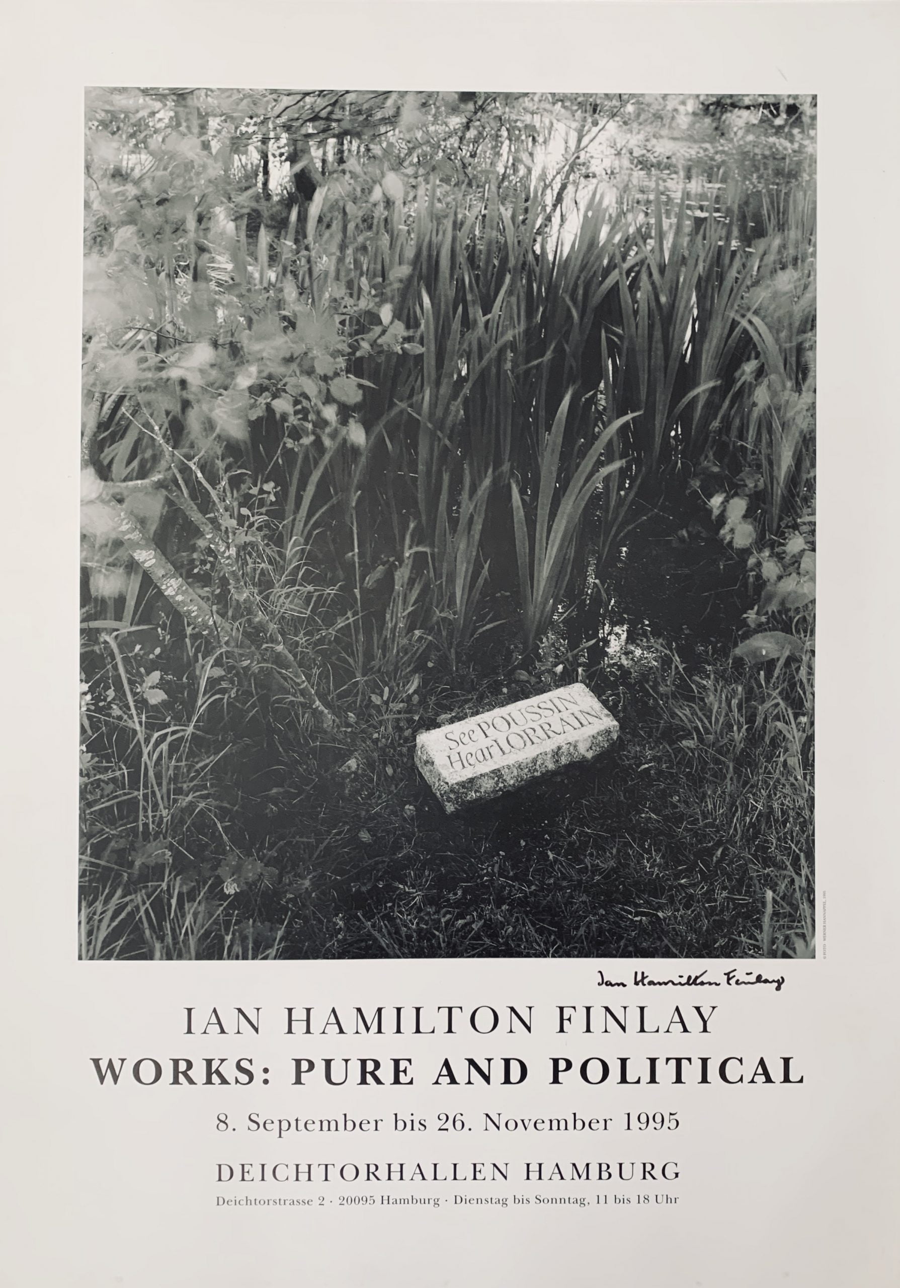
Venice: S.N.E., Sans Lieu, 1995
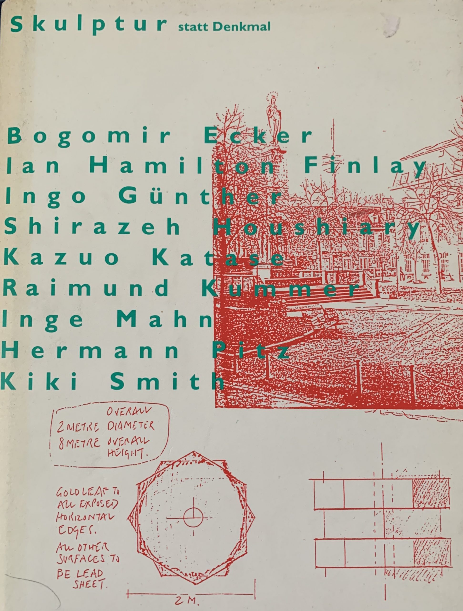
27.5 x 24cm, 154pp plus typographic wrappers. Published during the artist's intervention in the Venice Biennale this artist's book lists all of the names of others officially participating in the Biennale since 1895 to 1995. Afterword (really just thanking people) by Jean Clair and a small b/w image of the main Pavilion building at the Gardini. VG+.

...

Little Sparta: Wild Hawthorn Press, 1995 10.6 x 11.3cm, 4pp outer folder in grey with tipped on 9.5 x 44cm opened out, 8pp concertina folded, white paper with the text: "a line of foam along an empty shore" which is printed with a font that is not solid to reflect the form of the foam. VG+. ...

Eindhoven: Peninsula, 1995
30 x 21cm, 22pp. Original printed card covers. Artist's book with 6 b/w images by Robin Gillanders of a dog bowl with the name Brount on it. Robespierre wasn't all bad - he greatly loved his dog Brount and took it everywhere. This book, one of my favourites, has the tale of how Robespierre bought his dog and the walks he went on together. VG+

...

Little Sparta: Wild Hawthorn Press, 1995
Two different cards - one is 9.4 x 8.3cm and the other 8.3 x 5.2cm

The first card has a text:

GILL SANS

Whatever
GILL SANS
says
it always
says
'Gill Sans"

The second card has a design by Gary Hincks, where the Underground sign has the station "GILL SANS" on it.
Gill Sans is the name of a sans-serif font family based on a design by the artist and typographer Eric Gill. It was originally inspired by another font by Edward Johnston in 1916 - an "Underground Alphabet" which Gill had helped develop as a younger man.
The font was very successful and was marketed for its clarity and lack of fuss: this seems to have caught Finlay's interest in the short poem whereas the second card is a clear reminder of the origins of the letting style. Both are VG+.

...

NYC: Public Art Fund, 1995
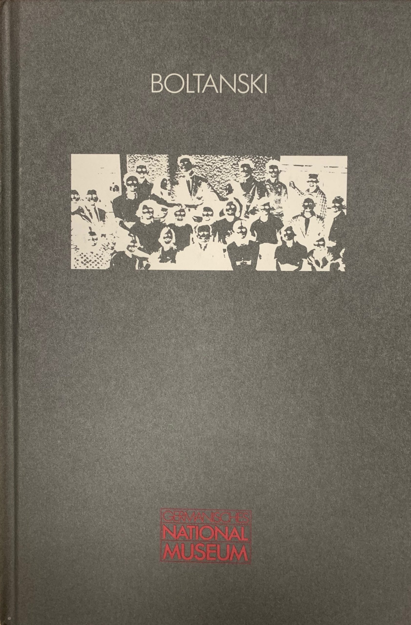
29.5 x 19cm, opens to 38 x 59cm. Single sheet printed black on light brown. The programme for Boltanski's huge intervention into New York City.- there were 6 different exhibition or installations including Lost Property in Grand Central Station, What They Remember in Eldridge Street Synagogue where children of Jewish immigrants were asked for memories of their childhood and their taped voices played at low volume in the building, Dispersion in the Church of the Intercession and Inventory in the New York Historical Society and others. The programme describes them all with black on brown images. Folded twice as issued. VG+. Not found in any catalogue raisonne.
BR>...

Little Sparta: Wild Hawthorn Press, n.d.
5.5 x 3.5 x 1.3cm, original "Scottish bluebell" matchbox which has been modified by the addition of a printed glued on card such that when the box is opened the "Sail" of a boat emerges with the text "WK279" upon it - the boat's number. If you wish to google it then it is a real boat - working trawler. On another part of the card the text reads: "BLUEBELL Call Sign GMWZ 38 net tons". The boat's name , of course, matches the brand of the matches.
An ingenious small object multiple that charms in the surprise of the pop up "sail". Edition size not known. VG+.

...

Firenze: Zona Archives, 1995 15 x 10.5cm, 36pp plus card covers and printed dust jacket. Monograph and review of international concrete poetry written by Maurizio Nannucci and Gabriele Detterer. Contains pageworks by most of the proponents of the genre - Mons, Gappmayr, de Vries, Kriwet, Spatola, Gomringer, Williams, de Campos, Mayer and Finlay's "Acrobat" in its b/w version is reprinted also. VG+. ...

Glasgow: Tramway, 1995
15 x 10.5cm, 2pp announcement card for the launch of Monk's first book "Lying Judas". On the front is a photographic work "It's a dirty job but someone's got to do it" of a cleaner looking up the skirt of a sculpture of a woman. VG+. Very early ephemera....

NYC: Public Art Fund, 1995
18 x 12.7cm, 4pp typographic announcement card for a city wide initiative where Boltanski opened four different major interventions. VG+.

...

Little Sparta: Wild Hawthorn Press, 1995
13 x 10.9cm, 1pp. The names of different fishing boats from around the coasts of Britain are arranged in a "constellation" form poem - the names are if read aloud sound poems - Mans Nobby and Manx Nickey, Fifie Skiff and Scaffie Yawl, Banff Zulu and Buckie Scaffie are matched up in pairs for instance.
The names and forms of boats has always fascinated Finlay who lived in a fisherman's community in his early life. VG+.

...

London: Edward Woodman, 1995
20.5 x 25.5cm, b/w silver gelatine original photograph of the Finlay public work "THE EVOLUTION OF THE BOAT" installed on a canal side in London. The work being a metal plaque with the text:

EVOLUTION OF THE BOAT

long boat
narrow boat
Short flying BOAT

Unique print showing a close up of the metal plaque.

...

Shopping cart0
There are no products in the cart!
Continue shopping