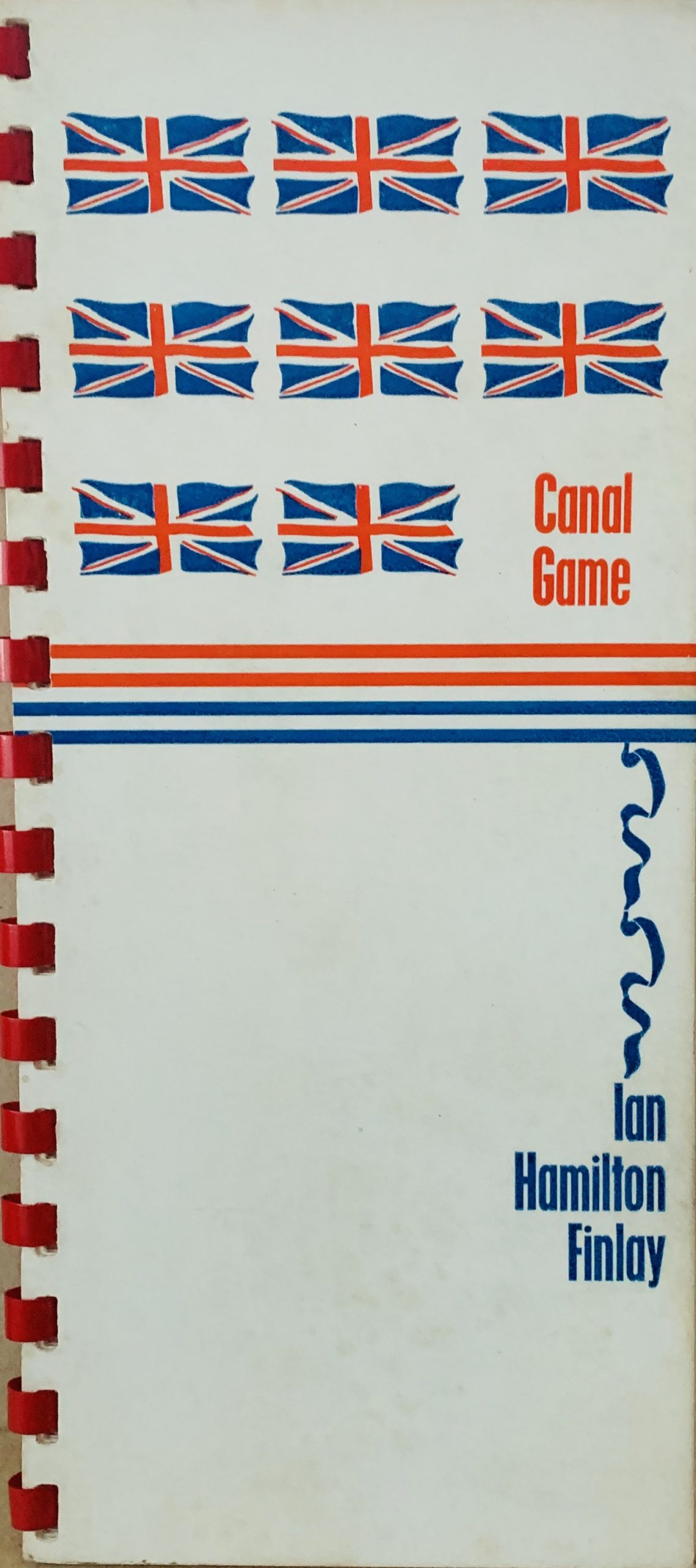
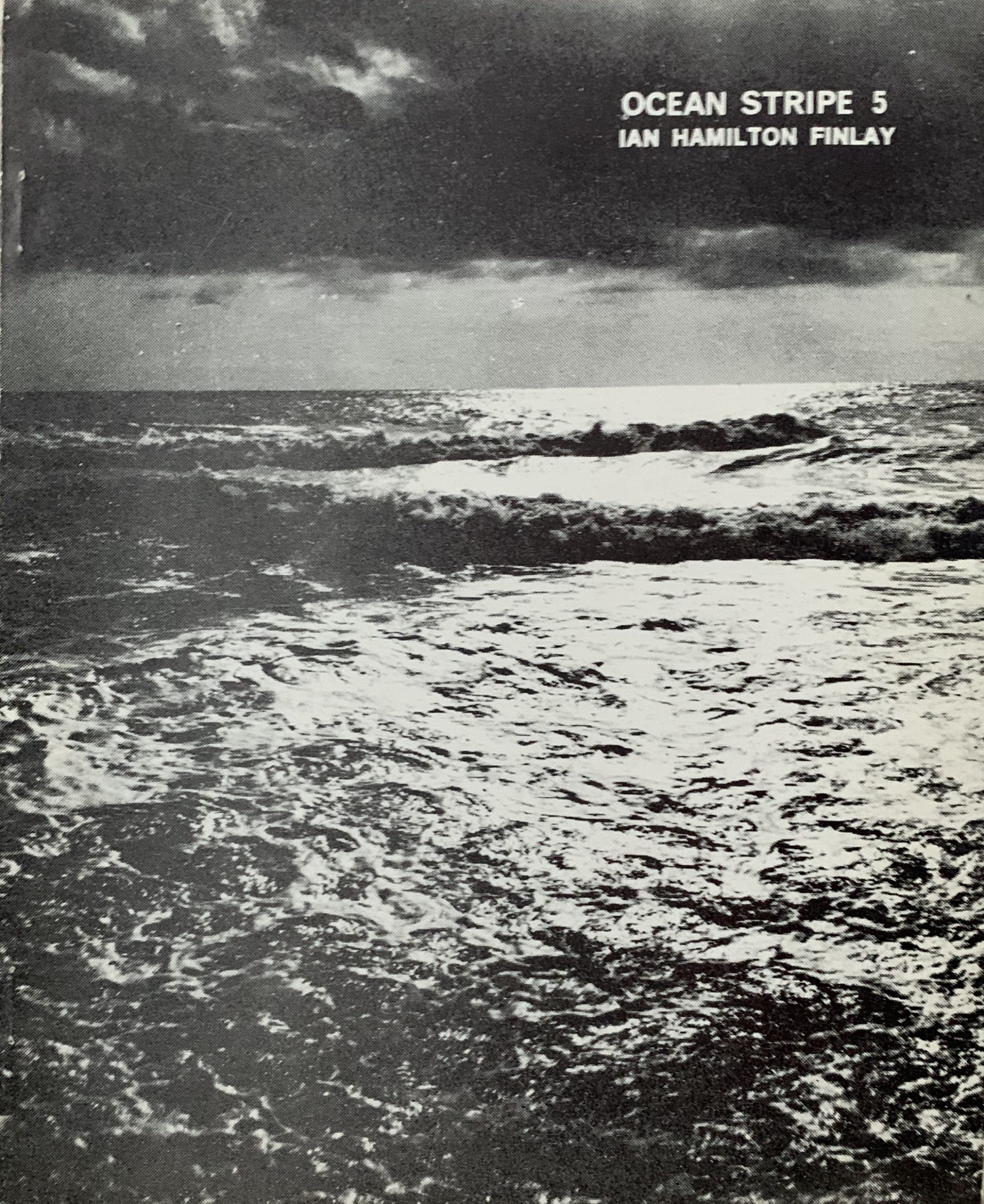
NYC: Film-Makers' Cinematheque, 1967 28 x 21.5cm, 1pp b/cream offset leaflet for a Bardo Matrix ""lite show"" (Angus Maclise) at the Film-Makers Cinematheque which featured a film by Yalkut, other instllations by USCO, and a "Supermodel Fashion Show" by Hope, Sachiki, Jeneview and Marcelle. The design of the leaflet is ornate and instructs those attending to "wear colors flowers". VG....

Boston: Film-Makers’ Cinematheque, 1967 28 x 21.5cm, 1pp pink-red on white offset small poster for films by Yalkut. The design is typographic but a hand drawn psychedelic style which was common at the time. VG....

Boston: Film-Makers' Cinematheque, 1967 28 x 21.5cm, 1pp b/w on white programme for Flyer for Breer and Emshwiller's portion of the March 1967 screenings at FMC. Only briefly mentions Yalkut's screening, as coming next week." at the bottom of the leaflet along with Ron Rice's "The Flower Thief". The Boston Film-Makers' Cinematheque had opened the year before as an offshoot of Mekas' NYC venture. VG. ...

Oberlin: Oberlin College, n.p. (1967) 21.5 x 27cm, 1pp b/w offset small poster/leaflet for a performance by USCO at Oberlin College, with quotes from Harper's, Life and the Village Voice. VG....

NYC:Film-Makers' Cinematheque, 1967 27 x 21.5cm, 1pp b/w offset small poster with a design by Yalkut using the standard Sefirot design only replacing the 10 attributes/emanations in Kabbalah with ten of his films. Some of the works shown such as Turn Turn Turn and Pa+ A - I (K) involved Nam June Paik. VG. Scazce. ...

Boston: ICA, 1967 19.5 x 22cm, 1pp typographic design announcement card printed black on off white for a series of films by USCO; Les Levine, Stan Vanderbeek, Herbert Gesner and Robert Whitman. folded (as issued else VG....

Edinburgh: M. MacDonald, 1967 21.8 x 14.2cm, 48pp plus card covers. A single number (nr 23) of Alan Riddle's Scottish poetry magazine which includes a 10 page section on "Concrete Numbers". Poems by Tom Clark, Edwin Morgan and Riddle himself are presented along with five by Finlay: Funnel Geography (2), Line Boats, Purse-Net Boat, 2. From the Yard of Thomas Summers & co. and 3 Blue Lemons. Other traditional poetry is also included by Norman McCaig and Tom Buchan amongst others. VG+. ...

Napoli: Linea Sud, 1967
22 x 16cm, unpaginated (40pp) plus one fold out page and original printed wrappers. A single number of this avant garde art journal here dedicated to experimental and visual poetry (poesia visiva). Included are L. Caruso, G. Desiato, E. Villa, I. Isou, M. Lemaitre, (unusually this journal includes Lettrisme as experimental visual poetry when it is often overlooked) J.P. Garnier and others. However importantly there are also two folded poem silkscreen posters by Ian Hamilton Finlay (each opens to 60 x 36cm) which are different in format to other prints of the same works - one is Planet which is printed in brown and somewhat loosely - and the other - is SEEM SEA which appears to be very similar to the Wild Hawthorn Press print SEAM with a similar use of the space between the letters of the word. Printed in blue this is a another nautical inspired work by the poet - with elements of alliteration and homophony playing with the relative placing of the works on the page. This print was only ever published as this insert into the magazine and is very rare - the journal is often found without the prints or with one or the other missing. This is a complete publication in VG+ condition with like prints.
We feel these works should be categorised as prints in their own right and not as contributions to a magazine.

...

Dunsyre: Wild Hawthorn Press, 1967
57 x 44.5cm, black silkscreen on gold thin paper. A concrete poem where the word "ajar" is repeated several times in a vertical column. Because of the repetition of the same letters "wedge shapes" can be left in the text and the words still read easily diagonally - hence reflecting the angles of an item being "ajar".
Finlay's choice of paper was perhaps a mistake here as it is poor quality and many copies we have seen have the same fault as here - an ugly diagonal crease as the paper is brittle and always seems to us to be wrapping paper that could be better used for wrapping than print. Murray 5.9.

...

Shopping cart0
There are no products in the cart!
Continue shopping