Dunsyre: Wild Hawthorn Press, 1976
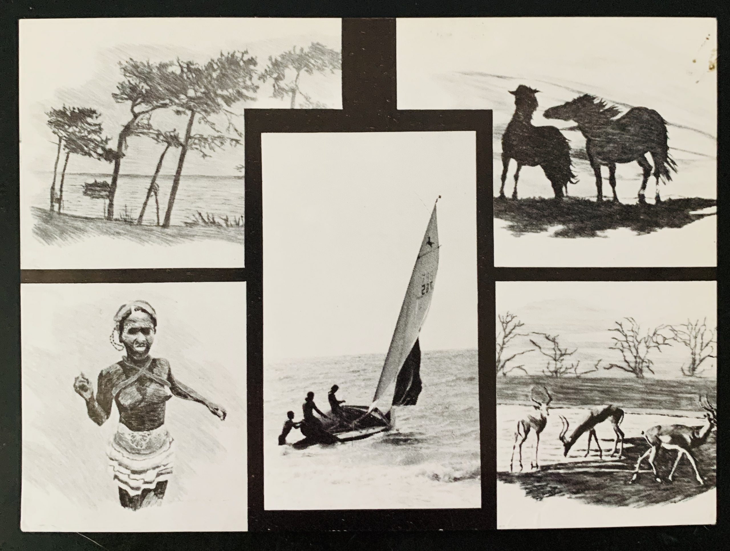
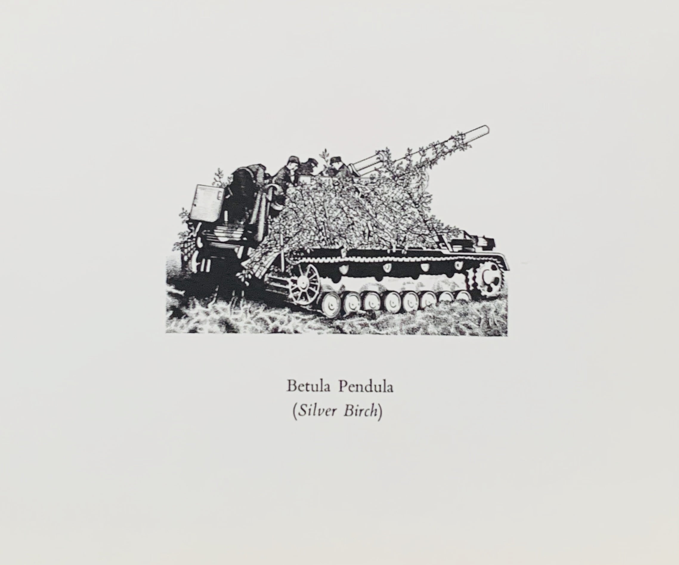
41 x 53cm lithograph in two colours on paper - German war plane markings are arranged as if by the Dutch master. Mondrian's decision to limit his formal vocabulary to the three primary colours, the three primary values and the two primary directions (horizontal and vertical) meant he created works that looked like grids. In particular this work reflects the drawn composition Jetty and Ocean from 1915 where in b/w Mondrian creates a work with many crosses. One of 350 released. Very slight crease bottom right but overall VG.

...

Little Sparta: Wild Hawthorn Press, n.d. (1976) 15.3 x 15.3cm, blue on white ceramic tile with a design by Jim Downie (who later fell out with Finlay by the way the image had been used) - the text reads "TREE-SHELLS. Instructions: Apply ear to Tree-Shell. Listen for lakes." This is a green on white variant - there are also blue on white tiles....

London: Coracle Press, n.d. (1976?)
10.5 x 13.5cm, 4pp (folded at top) announcement card for this show created from loans of works not necessarily with Finaly's permission. One "constellation" work is reproduced on the front: a peach an apple from Rapel, 1963. Internally gallery details. There is a paper scuff on the internal left of the card which affects the gallery details else VG. A very scarce card.

...

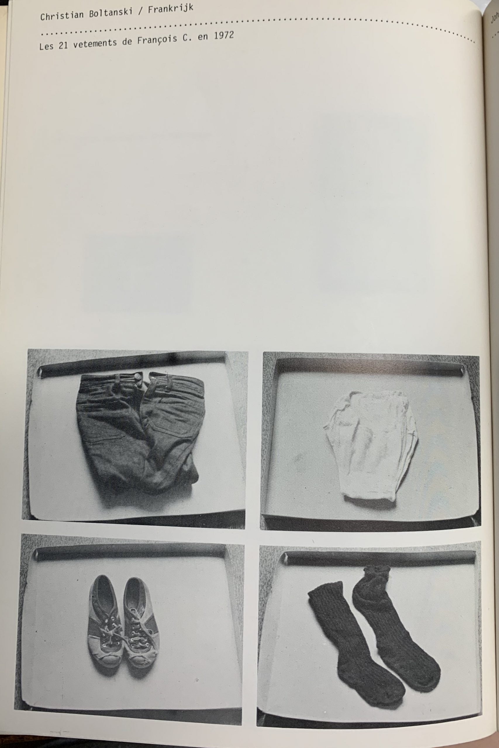
Paris : Christian Bourgeois, 1976. 32.5 x 23cm, 40pp plus wrappers. The first number (3 = all) of this art journal which was edited by Boltanski on behalf of the publisher Roman Cieslewicz. The large format allowed single images as contributions from various artists including Roland Topor and occasional texts.
Boltanski's contribution as well as being editor is a full page image "Photographie de Christian Boltanski mort.". VG+.
There were two later numbers of Kamizake - one in 1991 and another in 1997, both without Boltanski's involvement (Agnes b having a major role in these later numbers.

...

Paris: Musee Nationaal d'Art Moderne, 1976
10.6 x 21cm, 2pp b/w offset leaflet for a solo show of colour images by Boltanski. On the reverse there is an extract in the artist's holograph from a letter to Guy Jungblut which says:

"I make photographs, I am perfecting my technique and try to conform to rules of art which is difficult. I am making colour photographs of things that I am fond of, to show the beauty of simple things and a "joie de vivre". "

Boltanski's images were of food and family life and are very bold in technique. VG+. Scarce.

...

Dusseldorf: Galerie Schmela, 1976
10.5 x 15cm, 2pp announcement card for one of Beuys' many shows at the gallery. One work in b/w on the front and verso the gallery details. A mailed copy but still VG+.

...

Osaka: s.p. (Mieko Shiomi), 1976
21x 27.2cm, 72pp and pictorial wrappers. A major documentation by the Fluxus affiliated artist Mieko Shiomi where she wrote to participants the world over to create nine "global events" between 1965 and 1975. Each section has the original request and often a map showing the individual artist's response to Shiomi's letter.
A nice book to which Finlay contributed thus:
Spatial Poem No. 1 Word event 4 - "funnelwhelk" on the mantelpiece in the kitchen of Richard Morgan's house (known as eastview") Strathmiglo Fine, Scotland;
Spatial Poem No. 2 Direction event 4 - a concrete poem:

north south
no moon
fish pond
hot milk
in Ardgay, Scotland

After that Finlay did not involve himself in the later global events.
VG+ example of an increasingly difficult to find book.

...

Little Sparta: Wild Hawthorn Press, n.d. (1976)
15.3 x 15.3cm, yellow on white ceramic tile with a typographic design - the text A ROSE IS A ROSE IS A ROSE" (Shakespeare presumably) is printed along with the name Gertrude Jekyll - a turn of the century British horticulturist and garden designer. This is a yellow on white variant - there are also pink and red versions also on white tiles.

...

Little Sparta: Wild Hawthorn Press, n.d. (1976)
15.3 x 15.3cm, blue on white ceramic tile with a design by Jim Downie (who later fell out with Finlay by the way the image had been used) - the text reads "TREE-SHELLS. Instructions: Apply ear to Tree-Shell. Listen for lakes." This is a blue on white variant - there are also green on white tiles.

...

Shopping cart0
There are no products in the cart!
Continue shopping